Wells Fargo, a name synonymous with American banking history, has undergone a fascinating evolution in its branding, with its logo serving as a visual timeline of its journey. The various iterations of the Wells Fargo logo from the mid-20th century to the present day reflect shifts in corporate identity, market positioning, and design trends. Understanding these changes provides insight into the company’s continuous adaptation.
Wells Fargo Logo: A Historical Perspective

1852 – 1960
Wells Fargo’s history and visual style began in 1852 when William G. Fargo and Henry Wells established a service dedicated to helping the people of San Francisco transport valuables safely. To achieve this, they created an innovative startup that carried their names and quickly became a trusted institution. As the company grew, its services expanded beyond transportation, introducing steel vaults that provided secure protection against robbers.
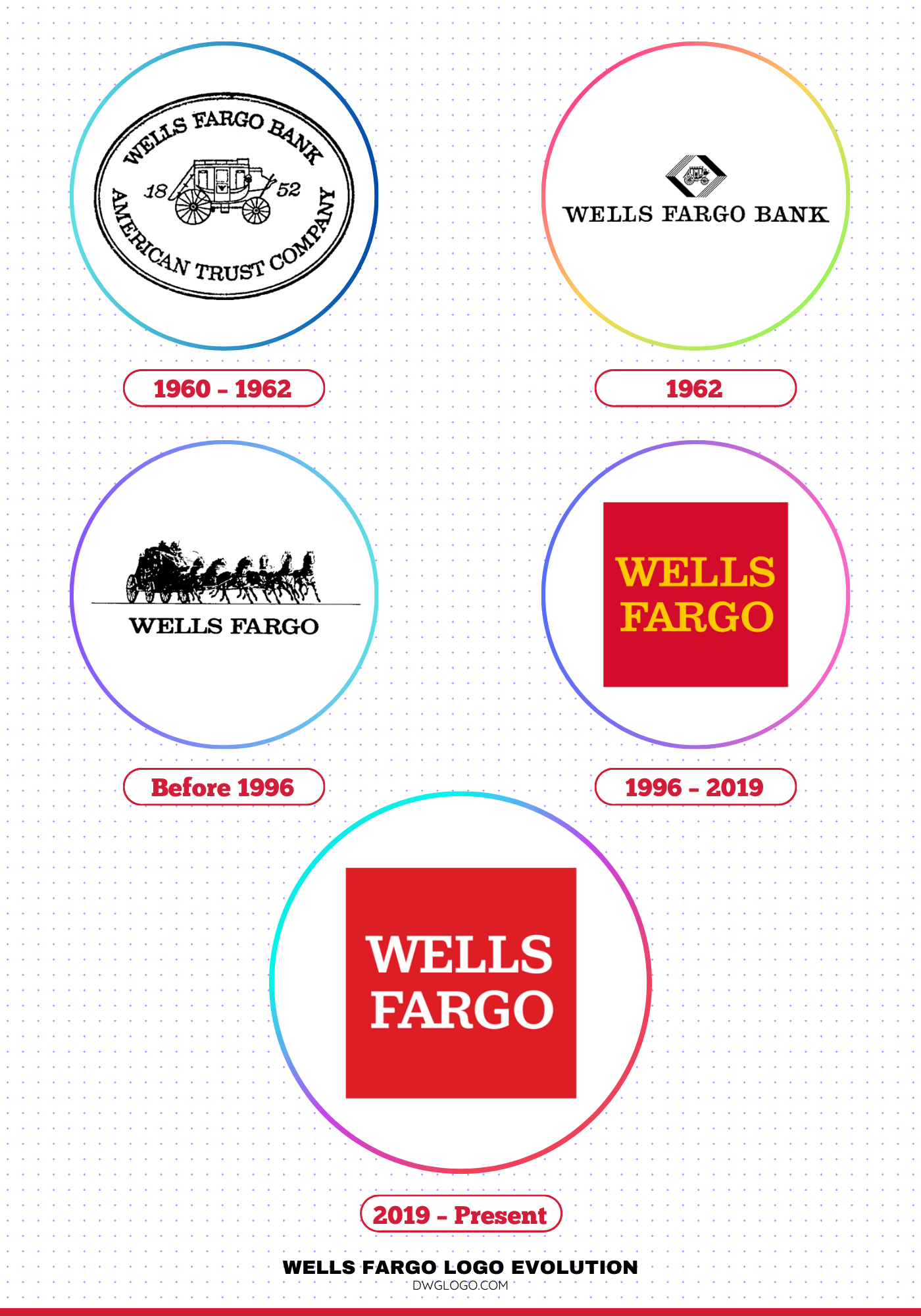
Throughout this development, Wells Fargo’s brand identity also evolved, often incorporating distinct design elements such as the iconic stagecoach and later experimenting with geometric forms like the ellipse to frame or balance its typography. This careful use of shapes and imagery helped the bank communicate trust, security, and modernity. Ultimately, the early history of the bank holding company is most vividly captured through its evolving logos, each one reflecting both tradition and innovation.
1962
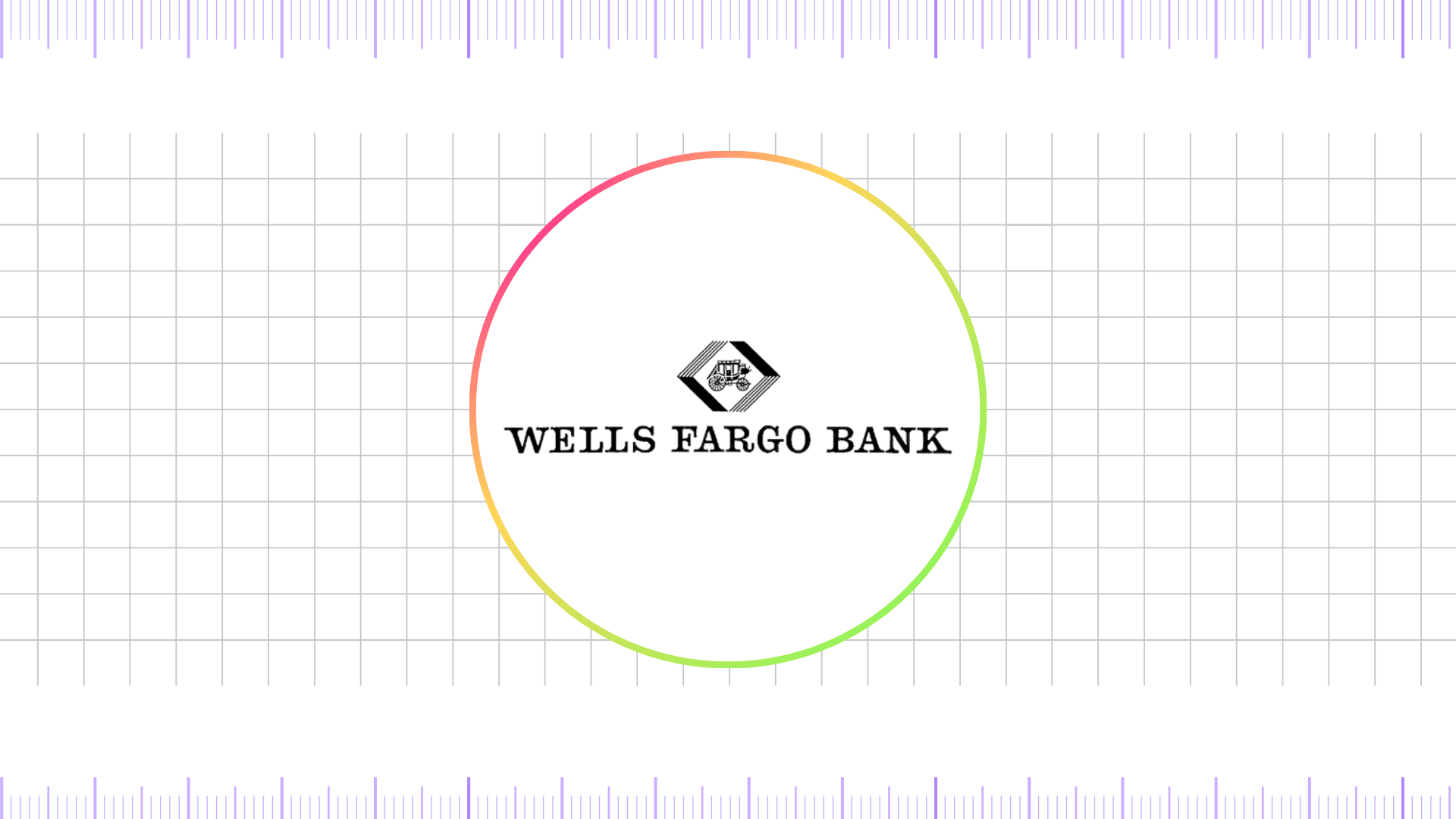
In 1962, the Wells Fargo logo underwent a notable transformation, as the stagecoach was rendered in black and reduced in size. All surrounding inscriptions were removed, shifting the focus toward a cleaner design. Instead of the previous oval, a white rotated square took center stage, framed by an unusual border featuring two solid black stripes combined with parallel line fragments that created a distinctive visual effect.
Beneath this emblem, the company’s name was placed on a long, flat baseline, written in bold, capital serif letters that emphasized authority and professionalism.
Before 1996
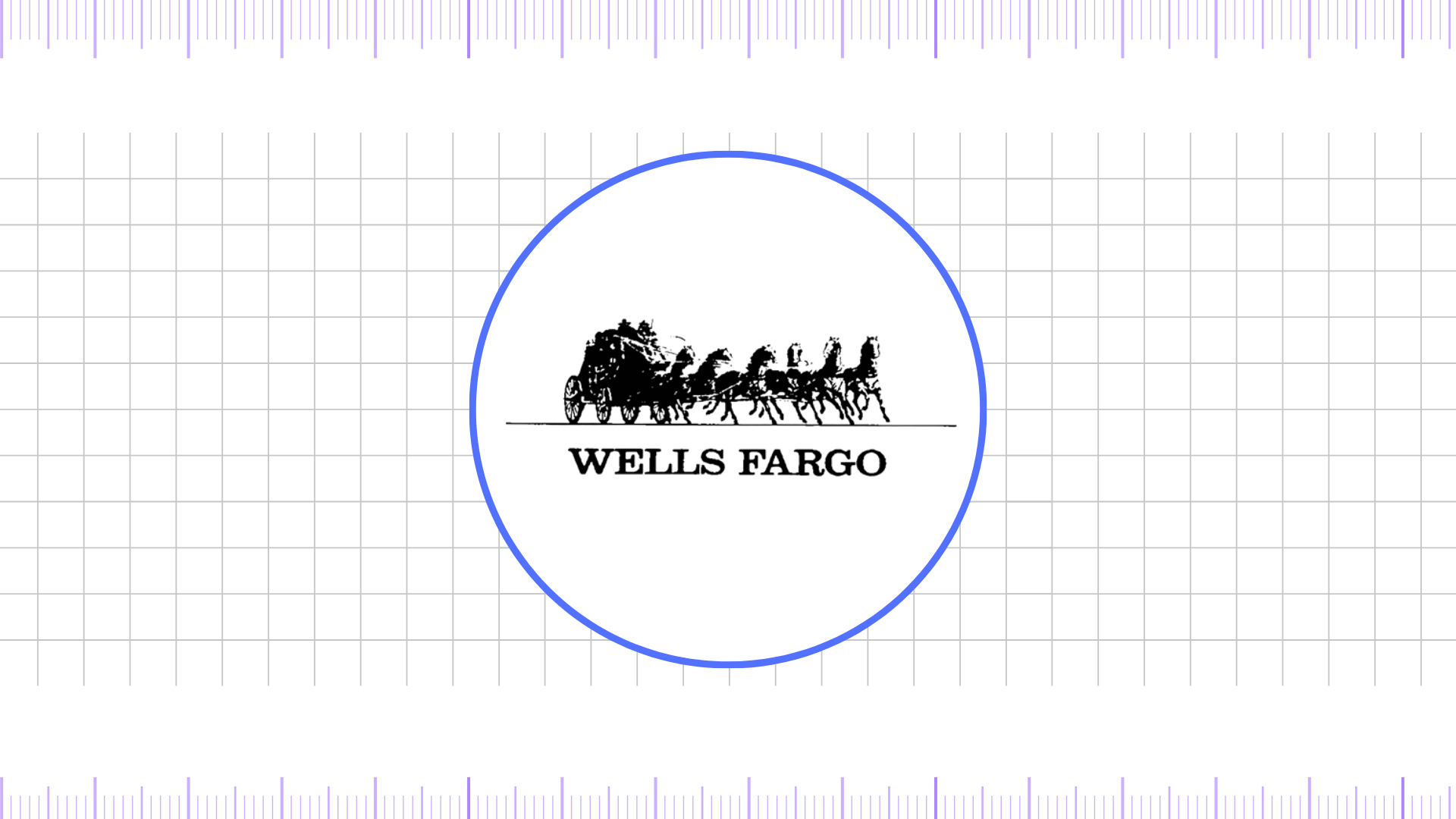
The first emblem of the holding company showcased a Concord Coach stagecoach, a vehicle specifically built to endure the challenges of rugged terrain. With its damask-lined leather interior, gracefully curved frame, and well-balanced wheels, the coach represented both durability and sophistication. The logo itself was highly detailed, capturing even the silhouettes of passengers. These riders were depicted transporting valuable cargo such as checks, documents, gold, and money, all under the protection of armed guards who symbolized security and trust.
Despite their vigilance, Wells Fargo’s stagecoach was famously targeted by one persistent outlaw who successfully robbed it twenty-seven times. Stagecoaches played a vital role in the company’s operations, especially in areas where railroads had yet to reach. They crossed deserts, climbed steep mountain passes, and pushed through quicksand, enduring the harshest conditions to prove the dependability of Wells Fargo’s express delivery service.
1996 – 2019
In 2008, following its merger with Wachovia, Wells Fargo introduced a refreshed logo that reflected both strength and heritage. The design adopted a square shape with a bold #d40c2c dark, deep red background, reinforcing a sense of trust, authority, and tradition. At the center, the wordmark appeared in #ffc800 vibrant, saturated yellow, with capitalized letters and extended serifs that gave the inscription a refined, almost regal charm. This striking contrast of red and yellow created a powerful visual identity that stood out across signage, advertising, and digital platforms.
The iconic stagecoach, already an enduring emblem of Wells Fargo’s legacy, was enhanced with greater realism and artistic detail. Its intricate lines and colors emphasized the company’s historical roots and pioneering spirit. Complementing the design, the bank’s motto “Together we’ll go far” was placed in the upper right corner, symbolizing unity, resilience, and forward progress.
2019 – Present
Wells Fargo has faced multiple scandals, accusations of fraud, and heavy fines for regulatory violations, which severely impacted its reputation. In response, the company’s leadership launched a large-scale rebranding campaign under the slogan “This is Wells Fargo” to rebuild trust and reshape its public image. A key part of this rehabilitation effort was the modernization of its logo and badge.
The creative direction was handled by BBDO-San Francisco, an advertising agency tasked with developing a concept that symbolized progress while staying true to the bank’s heritage. The design changes were intentionally subtle, yet meaningful. The iconic stagecoach illustration was retained but refined in a classic black and white style, while the lettering adopted a sharper, more contemporary look.
Most importantly, the wordmark was placed against a bold red color background with white text, ensuring strong visibility and emotional impact. This combination not only emphasized clarity and strength but also reinforced Wells Fargo’s recognizable identity across both print and digital platforms. The stagecoach itself was simplified with fewer horses, reducing visual clutter while maintaining its symbolic link to the bank’s historic roots. Through these updates, Wells Fargo aimed to balance modern branding trends with the reassurance of tradition, presenting a cleaner, more confident image to customers and stakeholders.
FAQ’s
Why does the Wells Fargo logo feature a stagecoach?
The stagecoach is a historical symbol of Wells Fargo’s origins. The company was founded in 1852 to provide banking and express services, and its stagecoach lines were essential for connecting the American West. The stagecoach represents a legacy of reliable service and pioneering spirit.
What role did branding agency Siegel+Gale play in the redesign of the Wells Fargo logo?
Siegel+Gale, a well-known branding and design agency, played a pivotal role in the 2019 brand refresh for Wells Fargo. Their involvement went beyond a simple logo update; they developed a comprehensive brand strategy to guide the company’s visual and verbal transformation.
Final Thoughts,
The Wells Fargo logo evolution is a clear reflection of how a brand can balance heritage with modernization. From the detailed stagecoach illustrations of the 1960s to the bold 1996 redesign with its red color background and white text, and finally to the cleaner, more minimalistic update in 2019, every transformation has served a purpose in aligning the company’s image with the expectations of its era.
The enduring presence of red as the dominant color symbolizes passion, trust, and resilience, while the evolving typography—from serif fonts to sleek sans-serif styles—demonstrates a move toward clarity and digital adaptability.


