The Volkswagen logo is instantly recognizable worldwide, a simple yet powerful symbol representing over 80 years of automotive history. Its journey from a complex, stylized swastika-adorned emblem to the clean, modern design we know today mirrors the company’s own tumultuous and transformative past.
The Evolution of the Volkswagen Logo
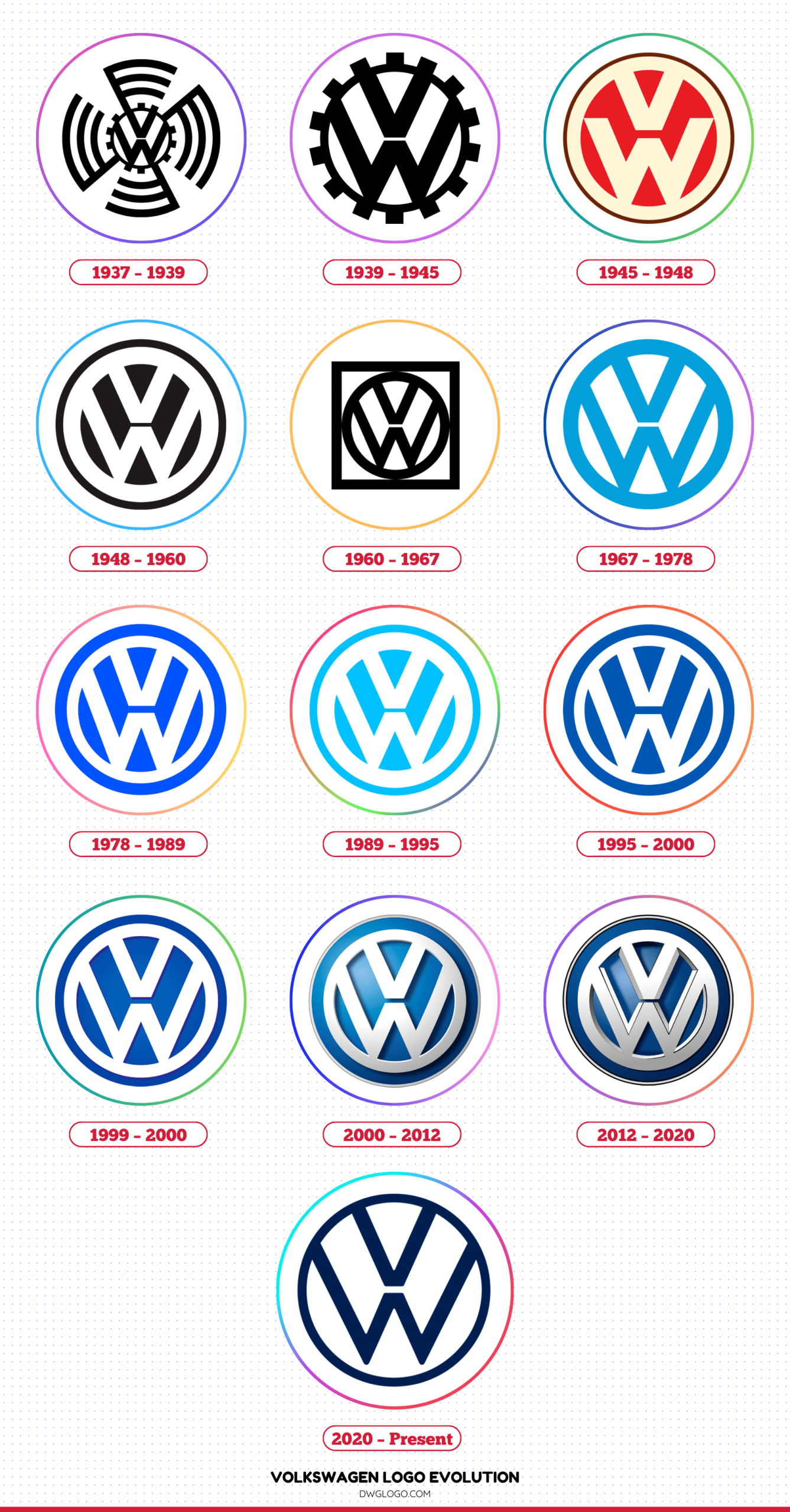
1937 – 1939
Inside the gear sat the bold letters “V” and “W,” stacked vertically in a stylized manner. The “V” rested above the “W,” both perfectly centered, reflecting simplicity and functionality. This early emblem carried strong mechanical symbolism, aligning with Germany’s industrial ambitions at the time. The gear-toothed design was elaborate, yet it served its purpose of presenting Volkswagen as a powerful, technology-driven manufacturer.
1939 – 1945
In 1939, Volkswagen refined its logo to better suit its identity during World War II. The gear-like edges were streamlined into a round circular emblem, reducing visual clutter. The “V” and “W” lettering became sharper and more geometric, positioned firmly within the circle.
This design reflected wartime minimalism, with a bolder emphasis on clarity. The emblem looked industrial, rigid, and authoritative, matching the serious tone of the era. Despite its associations with the time, the fundamental structure—the “VW” monogram inside a circle—was cemented here and remains the backbone of Volkswagen’s identity to this day.
1945 – 1948
Following the war, Volkswagen was restructured under Allied supervision. To distance itself from its wartime past, the logo was again redesigned in 1945. The militaristic gear edges were eliminated, replaced with a simple, modern circle enclosing the “VW” letters.
This refined emblem, now in a vivid red color, symbolized a fresh start, emphasizing neutrality, simplicity, and accessibility. These new values were mirrored in Volkswagen’s shift toward civilian car production, particularly with the iconic Beetle, and the new logo became a visual representation of the brand’s rebirth.
1948 – 1960
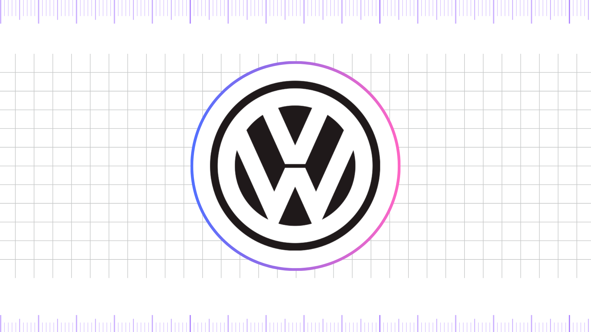
Between 1948 and 1960, Volkswagen made its logo more refined and recognizable for global expansion. The “VW” letters inside the circle were adjusted for better legibility and proportion. The outer circle was given cleaner edges, while the spacing between the letters and border was carefully balanced.
This version projected stability and harmony, reflecting Volkswagen’s growing success internationally. During this period, the logo became a trusted symbol of durability and affordability, carried by the Beetle as it gained massive popularity worldwide.
1960 – 1967
In the 1960s, Volkswagen’s logo evolved into a sharper, more geometric design. The rectangle was a key influence in this era, as the “V” and “W” letters became more angular and modern, encased in a cleaner, thinner circle.
This refinement highlighted precision and engineering excellence, reinforcing Volkswagen’s image of modernity as it positioned itself as a global automotive leader. This updated emblem was instantly recognizable on vehicles like the Type 2 (Transporter), further cementing Volkswagen’s reputation across Europe, America, and beyond.
1967 – 1978
By 1967, Volkswagen shifted toward a bold, solid logo, adopting a new color scheme of white on a vibrant, dark washed azure background. The circle was thickened, and the letters “VW” were made more prominent, with heavier lines and better contrast.
This update gave the emblem a stronger visual presence, ensuring visibility at a glance. As car design evolved in the late 1960s and 1970s, the bold emblem complemented the modern look of Volkswagen vehicles. This was also the era when Volkswagen transitioned into new markets and introduced models beyond the Beetle, requiring a logo that projected reliability and strength.
1978 – 1989
The late 1970s saw Volkswagen embrace a new era of minimalist design. In 1978, the logo was streamlined, shedding its three-dimensional look for a flatter, lighter appearance. The letters “VW” were simplified, and the surrounding circle was made thinner, ensuring maximum clarity for both print and early digital applications.
This new version, often rendered in a vivid navy blue, marked a significant shift toward timeless branding. The design’s clean lines perfectly complemented the company’s expanding range of hatchbacks, sedans, and family vehicles, and it became an iconic symbol during the global boom of models like the Golf and the Passat in the 1980s.
1989 – 1995
As Volkswagen set its sights on the global market, particularly North America, the logo underwent a subtle but important change. The cogwheel was now gone for good, and the design became a cleaner, two-dimensional emblem. This era saw the introduction of a new, distinctive color scheme.
The emblem featured a circle with a blue frame and a wide white stripe inside, which connected the intertwined “V” and “W” letters on a light blue-green color background. This new, friendly hue was a deliberate departure from the more formal black-and-white logos of the past, signaling a more modern and accessible brand for a worldwide audience.
1995 – 2000
In the 1995 logo redesign, Volkswagen refined its iconic roundel badge with a polished, modern touch. The letters “V” and “W” appeared seamlessly integrated within the circular frame in crisp white, set against a bright blue color background. This new shade of blue was deeper and more vibrant than the previous version, giving the emblem a stronger visual presence.
The contrast between the bright blue and white created a look that was both professional and contemporary, reinforcing Volkswagen’s image as a forward-thinking and reliable automotive brand.
1999 – 2000
The 1999 redesign gave the Volkswagen badge a sense of depth and refinement. The roundel adopted a deep rich blue gradient, transitioning into a strong dark blue at the edges, which added dimension and elegance to the emblem.
The white “VW” characters were enhanced with subtle shading and a delicate shadow, creating a soft 3D effect that emphasized clarity and precision. This version served as a transitional design, bridging the earlier flat interpretation with the fully three-dimensional logo that Volkswagen would introduce in 2000.
2000 – 2012
Designers updated the emblem by adding volume and a polished 3D effect to reflect contemporary design trends. The logo features a double circular edging, created from two thin dark lines with a subtle gray stripe between them, giving the symbol greater depth.
The shade of blue was intensified with a rich dark blue hue and gradient, making the background more dynamic. Meanwhile, the “VW” letters were refined with a sleek silvery finish on a white base, enhancing contrast and ensuring a modern, premium look.
2012 – 2020
In 2012, Volkswagen refined its logo once again, maintaining the 3D chrome style but simplifying gradients and shadows. The design appeared sleeker and cleaner, ensuring versatility across different platforms. It retained the deep blue background, symbolizing tradition and trust. However, the reduced detailing made the emblem more adaptable for digital and print use. This update reflected Volkswagen’s efforts to modernize its identity while retaining the familiar visual strength of its 2000s logo.
2020 – Present
In 2020, Volkswagen introduced a radically simplified flat logo to align with digital-first branding strategies. The emblem returned to a minimalistic two-dimensional design, featuring a thin white “VW” monogram inside a simple circle. Instead of relying on heavy gradients or metallic effects, the new design embraced flexible background options, most notably Oxford Blue along with black and white variations.
This modern shade of blue added depth while maintaining Volkswagen’s traditional association with trust and reliability. The shift to flat design ensured perfect scalability across apps, websites, and digital platforms, reflecting Volkswagen’s transition into electric mobility and sustainable innovation. Overall, the Oxford Blue flat logo is sleek, future-oriented, and adaptable, symbolizing clarity, openness, and progress.
FAQ’s
Who designed the original Volkswagen logo?
The original Volkswagen logo was designed in 1937 by Franz Xaver Reimspiess, an engineer who also worked on the development of the iconic Beetle.
Why does the Volkswagen logo feature “V” and “W”?
The logo features the initials of the brand’s name: “V” for “Volks” (people) and “W” for “Wagen” (car), symbolizing the “people’s car.”
Why did the logo have a swastika?
The swastika was part of the original design due to Volkswagen’s origins as a state-owned company under Nazi Germany. The emblem was quickly modified after the war to remove the controversial symbol and distance the brand from its past.
Final thoughts,
The Volkswagen logo evolution is a testament to the brand’s resilience, adaptability, and vision. From the industrial roots of the 1930s to the sleek, digital-first identity of today, each version of the emblem tells a story about Volkswagen’s journey through history, design, and innovation. The consistent use of the “VW” monogram within a circle underscores the company’s dedication to clarity and trust, while the refinements in font, color, and style highlight its responsiveness to changing times.
Today, Volkswagen’s flat, minimalist emblem reflects its future-oriented mission, embracing sustainability, electric mobility, and digital innovation.
