The National Aeronautics and Space Administration (NASA) is the United States government agency responsible for civilian space exploration, aeronautics research, and scientific discovery. Founded in 1958, NASA has led some of the most significant advancements in space travel, including the Apollo moon missions, the Space Shuttle program, and the ongoing Mars exploration initiatives. Over the decades, NASA’s logo has undergone several transformations, each representing a unique era in space exploration history.
NASA Logo Evolution
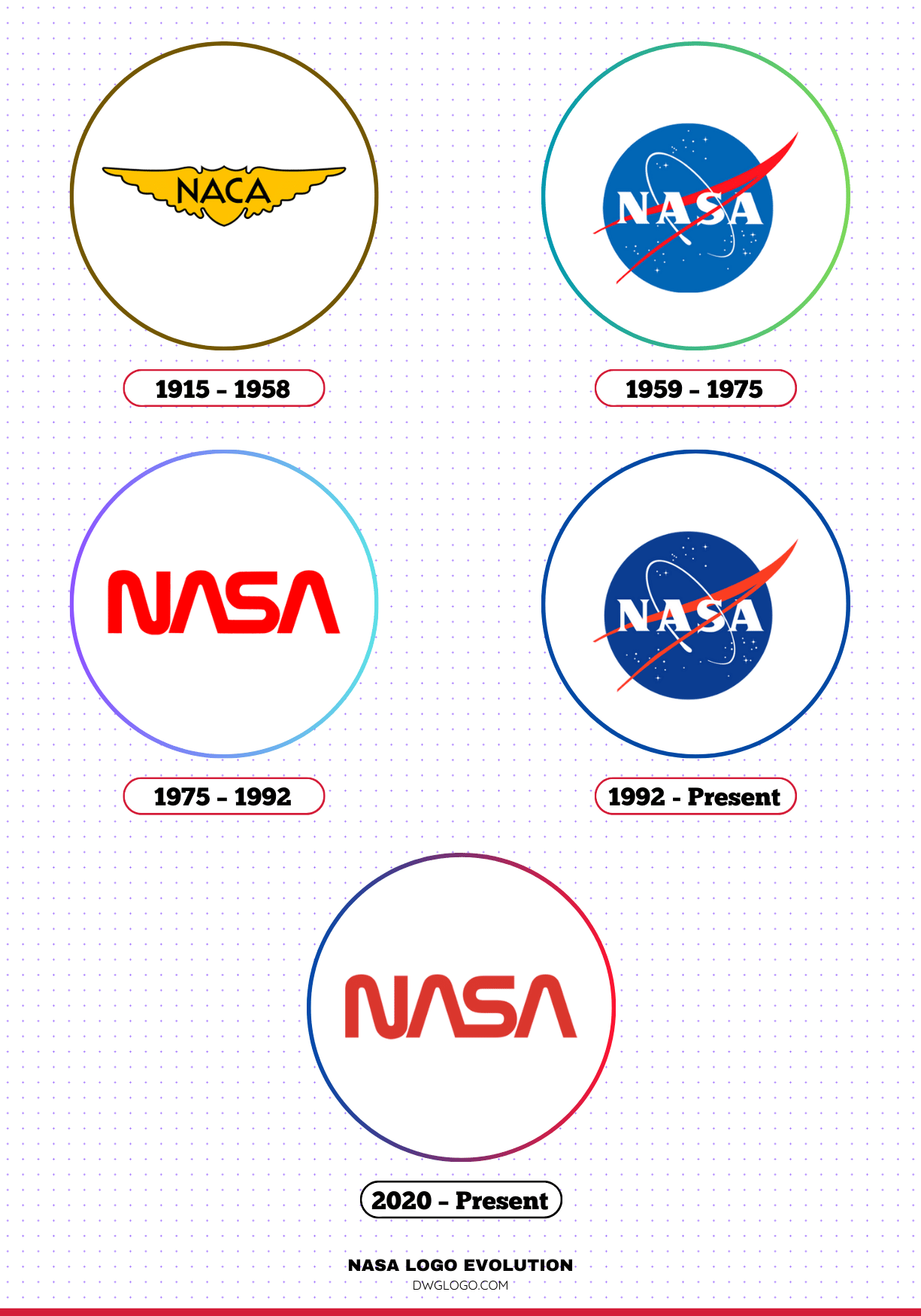
NASA has had three primary logos throughout its history, each reflecting a different phase of the organization’s journey in aeronautics and space exploration.
Let’s delve into the evolution of NASA’s branding from its earliest days to the present.
1915 – 1958
Before NASA existed, the National Advisory Committee for Aeronautics (NACA) functioned as its predecessor. Established in 1915, NACA focused on aeronautical research and had a simplistic emblem.
This era did not feature an official space-related logo since space exploration was not yet a core focus.
1959 – 1975
When NASA was founded in 1958, a new identity was needed. The first official NASA logo, commonly referred to as the “meatball,” was introduced in 1959.
This design was created by James Modarelli, a NASA employee, and remains one of the most recognizable logos in the world.
Design Elements:
- A blue circular background representing space.
- A red vector swoosh symbolizing aerodynamics and innovation.
- White orbiting stars illustrating the vastness of the universe.
- The bold “NASA” lettering in white, exuding modernity and authority.
The meatball logo was used prominently during NASA’s golden age, covering the Apollo missions, Gemini program, and early space shuttle developments.
1975 – 1992
In 1975, NASA introduced a more modern and minimalist logo known as the “worm.” Designed by Richard Danne and Bruce Blackburn, this logo reflected a contemporary design philosophy with a sleek, futuristic aesthetic.
Key Features:
- The NASA acronym was presented in a custom, continuous red typeface.
- The letters were streamlined and lacked the traditional crossbars in the “A.”
- The design exuded simplicity, dynamism, and forward momentum.
Despite its popularity in design circles, the worm logo was phased out in 1992 in favor of the original meatball emblem.
1992 – Present
In 1992, NASA decided to reinstate the original meatball logo due to its strong association with the agency’s achievements and historical significance. While the worm logo remained beloved by designers, the public and many within NASA felt the meatball better represented the agency’s mission and legacy.
Over the years, the meatball has been slightly refined for modern digital applications, but its core elements remain intact. In 2020, NASA reintroduced the worm logo for select missions, including the SpaceX Crew Dragon launch, as a nod to its historical significance.
2020 – Present
In 2020, NASA surprised the public by bringing back the Worm logo alongside the Meatball for specific missions. The SpaceX Crew Dragon mission was among the first to feature the revived Worm design. This dual-logo strategy allows NASA to celebrate its heritage while embracing modern aesthetics in spaceflight branding.
Symbolism of NASA’s Logos
NASA’s logos have consistently embodied the agency’s commitment to exploration, technology, and progress. Each element within the logos has been carefully chosen to represent specific themes:
- The blue sphere: Represents space and the unknown frontiers.
- The red vector: Symbolizes aerodynamics, speed, and future aspirations.
- White stars: Depict the infinite possibilities of the cosmos.
- Typography: Each font choice over the years has communicated the evolving identity of NASA, from bold authority to futuristic minimalism.
NASA Font and Colors
NASA’s branding extends beyond just its logo. The typography and color choices play a crucial role in maintaining its visual identity.
Font
NASA has used various fonts over the years, with its most recognizable being:
- The Worm Font (1975-1992): A custom-designed sans-serif font that was futuristic and streamlined.
- Helvetica and Helvetica Neue: Commonly used in NASA’s official documents and branding materials for clarity and modernity.
- Boeing Condensed: Used for NASA’s insignia and communication assets in some applications.
Color Palette
NASA’s primary colors include:
- Blue (#0B3D91): Representing the sky and space.
- Red (#FC3D21): Symbolizing energy, power, and passion.
- White (#FFFFFF): Signifying purity, innovation, and futuristic aspirations.
These colors contribute to NASA’s distinct branding, ensuring consistency across all visual communications.
FAQ’s
1. Why did NASA change its logo in 1975?
NASA adopted the worm logo in 1975 as part of a broader modernization effort to make its branding more contemporary and aligned with futuristic design trends.
2. Why was the meatball logo reinstated in 1992?
The meatball logo was brought back due to its historical significance and strong public association with NASA’s most iconic missions.
3. Is the worm logo still used today?
While the meatball remains NASA’s official insignia, the worm logo was reintroduced in 2020 for special missions and limited branding applications.
4. Who designed the original NASA logo?
The meatball logo was designed by James Modarelli, a NASA employee, in 1959.
5. What is the meaning of the red vector in the NASA logo?
The red vector represents aerodynamics, propulsion, and innovation, key themes in NASA’s mission.
Why does NASA have 2 logos?
NASA retains both logos to honor its history while embracing modern design. The Meatball represents tradition and legacy, while the Worm signifies progress and innovation, making both essential symbols of space exploration.
Final thoughts,
NASA’s logos serve as more than just symbols; they represent the agency’s mission, evolution, and technological aspirations. From the early days of the NACA emblem to the sleek worm and the iconic meatball, each logo tells a story of space exploration and human ingenuity.
As NASA continues to push the boundaries of space travel, its visual identity remains a testament to its legacy and vision for the future.
Reference: [1] [2]


