The Kit Kat logo evolution is a fascinating journey through nearly nine decades of branding, design refinement, and marketing strategy that has made the chocolate-covered wafer one of the world’s most recognizable and beloved confectionery products. Launched in 1935 by Rowntree’s of York, England, and later acquired by Nestlé in most countries (with The Hershey Company holding rights in the U.S.),
Kit Kat has not only become a household name but also a branding case study in simplicity, consistency, and consumer trust. The logo has undergone several redesigns across the decades—each reflecting cultural shifts, printing technology improvements, and global marketing strategies—yet it has always maintained a core identity that ensured instant recognition. In this article, we will explore the evolution of the Kit Kat logo from its beginnings in 1935 through its modern digital-age adaptation, while also analyzing its font choices, color schemes, and visual consistency.
The Timeless Evolution of the Kit Kat Logo
1935 – 1937
When Kit Kat first entered the market in 1935, it was not even called “Kit Kat.” The product was introduced as “Rowntree’s Chocolate Crisp”, and its early branding reflected a straightforward, descriptive style typical of pre-war confectionery packaging. The logo used a bold serif font, emphasizing clarity and readability.
The design was functional rather than stylish, reflecting the fact that this was an entirely new product aimed at factory workers and students seeking an affordable snack. The logo appeared in dark shades—often brown or muted red, symbolizing chocolate and indulgence. While simple, it laid the groundwork for the Kit Kat identity.
1937 – 1945
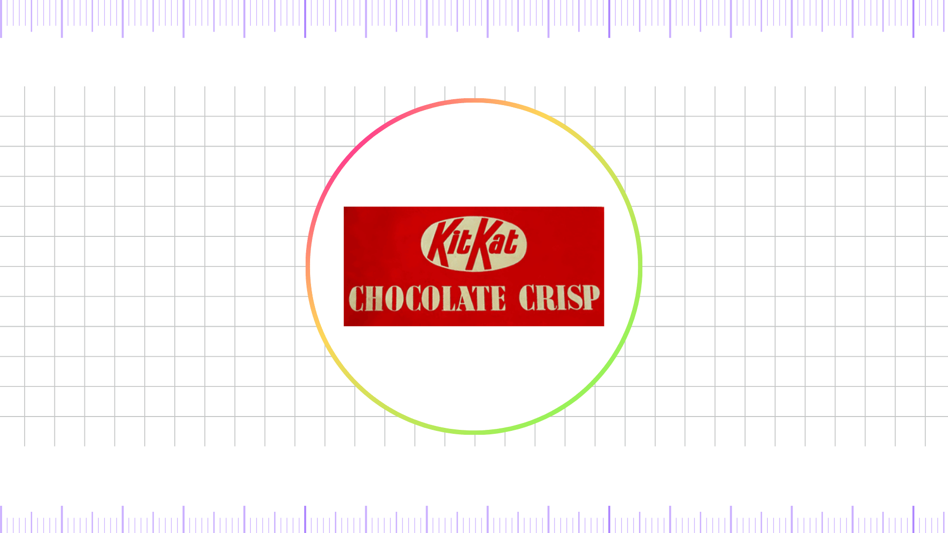
In 1937, the product was officially renamed “Kit Kat Chocolate Crisp,” marking the birth of the Kit Kat brand identity. This era introduced the first recognizable Kit Kat logo, which used a script-style typeface enclosed within an oval shape. The wordmark had a slightly playful character, differentiating it from competitors by combining elegance with accessibility.
The oval frame suggested a seal of quality, while the use of red and white began to appear more prominently, a color combination that would become a defining characteristic of Kit Kat branding. This was the logo that carried Kit Kat through the pre-World War II years, establishing its name and identity firmly in the public consciousness.
1945 – 1947
The immediate post-war period brought resource shortages, including printing and packaging materials. As a result, Kit Kat simplified its branding. The 1945–1947 logo removed decorative details and relied on block lettering with minimal embellishments.
The design emphasized functionality and legibility, making it easy to reproduce under wartime restrictions. The red background with white text became more standardized during this period, reinforcing a bold and distinctive presence on shelves. Although short-lived, this version of the logo was important in consolidating Kit Kat’s identity at a time when rationing and austerity influenced consumer behavior.
1947 – 1988
After the war, Kit Kat reintroduced a more refined version of its oval-shaped logo. This period, lasting more than four decades, represents one of the most iconic and recognizable stages of Kit Kat branding. The logo featured “Kit Kat” in bold sans-serif lettering inside a white oval, set against a vibrant red background. This combination proved timeless, creating strong brand recognition worldwide. The typography was straightforward, modern, and highly legible, while the oval encapsulation gave the brand a seal-like authority.
During these decades, Kit Kat became a truly international brand, expanding beyond the UK into numerous markets, including Canada, Japan, and Australia. The long consistency of this logo allowed it to become deeply ingrained in consumer culture, ensuring that Kit Kat was instantly identifiable no matter where it appeared.
1988 – 1995
In 1988, Nestlé acquired Rowntree’s, marking a new era for Kit Kat. The logo was modernized to reflect the brand’s global ambitions. While it retained the red and white oval design, the typography was slightly refined, with more dynamic proportions and improved spacing to enhance visual balance. The wordmark appeared bolder and cleaner, reflecting Nestlé’s desire to project strength and reliability. Additionally, the Nestlé wordmark was introduced above the oval, signaling corporate ownership and reinforcing trust.
This era was crucial for global marketing campaigns such as the famous slogan “Have a Break, Have a Kit Kat”, which was tightly associated with the logo’s visibility in advertisements.
1995 – 2004
In 1996, the Kit Kat logo underwent a refined update, with smoother contours and sharper lines that gave the main wordmark a bolder, more sophisticated appearance. The red background was intensified to a brighter, more striking shade, adding confidence and professionalism to the emblem. The Nestlé logotype was introduced in lowercase letters, positioned to the left of the oval and accentuated with a subtle curved underline for balance.
2004 – 2017
As branding entered the digital age in the 2004s, many companies experimented with three-dimensional effects and gradients. The Kit Kat logo followed this trend, with designers introducing a more polished, glossy, and three-dimensional look to the oval logo. The red background became more vibrant, while highlights and shading created a sense of depth and modernity. The font remained sans-serif but appeared sleeker and slightly italicized, giving the logo an energetic appeal.
This era aligned with major global advertising campaigns that positioned Kit Kat as both a snack and a cultural icon. The 3D-style logo reflected the design aesthetics of the time while maintaining brand consistency.
2017 – 2022
As branding shifted toward minimalism and flat design in the 2010s, Kit Kat updated its logo once again. The 2017 redesign flattened the oval, removed excessive gradients, and emphasized simplicity. The flat red background with clean white lettering aligned with contemporary design trends and improved adaptability for digital platforms such as mobile apps, social media, and online advertising.
This move reflected a global industry trend toward minimalist logos that could scale seamlessly in the digital environment while maintaining core brand identity.
2022 – Present
The most recent redesign in 2022 retains the classic red-and-white oval motif but with a modern, polished twist. The typography was subtly adjusted for better legibility, while the oval frame was refined to balance heritage with modernity. The Nestlé logo, while still associated, has been deemphasized in many markets, allowing Kit Kat to stand more independently as a global icon. The overall design remains minimalist yet powerful, reinforcing Kit Kat’s position as a timeless brand that bridges tradition and modern appeal.
Font Analysis
Throughout its history, the Kit Kat logo has primarily used bold, sans-serif fonts, with occasional experimentation in the earlier decades. The modern font is clean, rounded, and slightly italicized, giving it a friendly yet dynamic appearance. The typography reflects accessibility and trust, making it universally appealing.
Color Analysis
The defining colors of the Kit Kat logo are red and white. Red symbolizes energy, excitement, and appetite stimulation—qualities directly associated with confectionery products. White conveys simplicity, trust, and cleanliness, balancing the intensity of the red. Over the decades, shades of red have been standardized to a bold, vibrant tone that ensures visibility across diverse mediums.
FAQ’s
What does the oval shape of the Kit Kat logo represent?
The oval shape has historically symbolized a seal of quality and consistency, reinforcing the brand’s reputation as a trustworthy chocolate bar.
Why is red the dominant color in the Kit Kat logo?
Red is associated with energy, appetite, and excitement. It makes the logo eye-catching and instantly recognizable on store shelves.
Final thoughts,
he evolution of the Kit Kat logo from its humble beginnings in 1935 as “Rowntree’s Chocolate Crisp” to the sleek and modern design of today reflects the brand’s ability to balance tradition with innovation. Each redesign—whether driven by wartime necessity, corporate ownership changes, or digital-age demands—has built upon the core identity of red-and-white simplicity, bold typography, and oval framing.
This consistency has allowed Kit Kat to remain one of the most instantly recognizable confectionery logos in the world. By retaining its essence while adapting to cultural and technological shifts, Kit Kat has proven the power of thoughtful branding. Whether enjoyed as a quick snack, a social symbol, or even as part of Japan’s flavor experiments, Kit Kat continues to represent more than just a chocolate bar—it represents timeless design, global appeal, and the universal joy of a sweet break.
Reference: [1]
