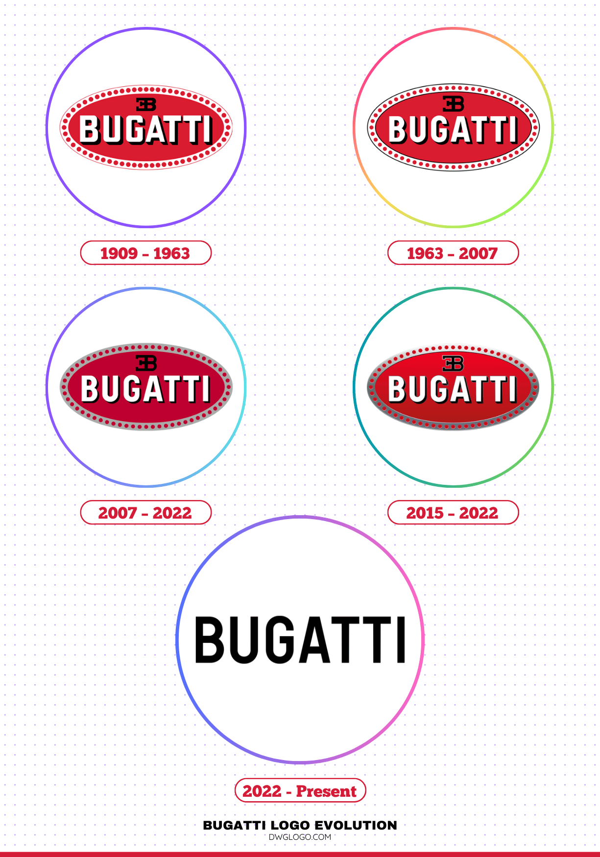
Since its founding in 1909, Bugatti has stood as a symbol of automotive excellence, engineering precision, and timeless luxury. Central to this identity is its logo—a visual emblem that has evolved alongside the brand’s technological and stylistic transformations. From Carlo Bugatti’s meticulously designed oval badge adorned with jewel-like details, to the sleek minimalist wordmark of today, each redesign reflects a careful balance between honoring heritage and embracing innovation.
Bugatti Logo Evolution: 1909–Present
Over more than a century, the Bugatti logo has transitioned through subtle refinements and bold reimaginings, mirroring the brand’s journey from early racing legends to cutting-edge hypercars. This evolution not only charts changes in typography, color, and form but also tells the story of a marque that has successfully blended tradition with modernity while maintaining its unmistakable prestige.
1909 – 1963

The debut logo, designed by Carlo Bugatti—father of founder Ettore—introduced the now-iconic oval badge. Featuring a rich red background, a light-gray frame with 60 red dots, a bold white sans-serif “BUGATTI” wordmark with black shading, and the “EB” monogram perched atop, it encapsulated both luxury and craftsmanship. The dots are often interpreted as either jewelry-like gems or functional safety wires—reflecting Carlo’s background as a jeweler and the engineering spirit of the brand.
1963 – 2007

While retaining the primary layout, this redesign softened letter contours and slightly increased spacing between the 60 perimeter dots. The dots themselves became smaller, and the font shifted to a more traditional sans-serif style. Overall, it exuded a cleaner, more graceful aesthetic.
2007 – 2022

The original Bugatti emblem achieved a perfect balance between graphic artistry and typographic precision. Its foundation was a horizontally oriented oval, outlined by a gray-violet border adorned with prominent dark crimson dots—sixty in total—symbolizing both craftsmanship and exclusivity. Within this frame sat a solid dark crimson interior, serving as the backdrop for the brand’s signature elements.
At the center, the “BUGATTI” name appeared in large, uppercase white letters with subtle right-side shadows. This shading created a slight three-dimensional effect, giving the text the appearance of lifting from the surface. The font featured clean, elongated sans-serif characters, projecting strength and clarity. Above the wordmark rested the distinctive EB monogram, representing the initials of founder Ettore Bugatti. The two capital letters were mirrored “back-to-back” and connected by a single horizontal stroke, forming a symmetrical, geometric design that has become an iconic symbol of the brand.
The typeface used, Uniform Cond Bold, is a modern, sans-serif design created by Richard Miller and released by Miller Type Foundry. Its slightly shadowed right edge adds depth while preserving a minimalist, high-end feel.
Bugatti’s historic color palette consisted of four key tones: a rich, deep burgundy (#bf002c) for the main background; a refined gray-violet (#aaacac) for the border; classic black for the monogram and shadows; and crisp white for the lettering. Together, these colors conveyed luxury, precision, and timeless elegance—perfectly reflecting the Bugatti ethos.
2015 – 2022

In 2015, Bugatti introduced a refreshed three-dimensional version of its iconic logo, bringing a more dynamic and modern look. The design team achieved the 3D effect through the use of subtle gradients, enhancing depth and realism. The oval frame was rendered in a sleek silver tone, giving it a polished metallic sheen that emphasized luxury. The central red background was brightened to a vivid scarlet, replacing the darker crimson used in the previous version.
Around the border, the small circular details appeared more refined, resembling precise perforations within the silver frame. The signature “EB” monogram and all key design elements were accentuated with thin silver outlines, while the bold “BUGATTI” wordmark featured black shadows bordered in light silver, adding a sense of depth and volume to the lettering. This update preserved the emblem’s heritage while giving it a sophisticated, high-end finish.
2022 – Present

In 2022, Bugatti underwent a major brand transformation, prioritizing a modern luxury image over its historical emblem designed by Carlo Bugatti. With no remaining family connection to the company, the owners saw little reason to retain the century-old badge as the primary brand symbol. Partnering with global branding agency Interbrand, they developed a new visual identity that emphasizes adaptability, elegance, and alignment with contemporary design trends.
The updated logo is a bold, minimalist black wordmark without the traditional oval, red background, or “EB” monogram—though the monogram remains as a separate icon. This design shift reflects Bugatti’s strategic move from focusing solely on extreme speed to highlighting refined luxury. While the streamlined wordmark is now used in marketing, dealerships, and official events, the classic emblem continues to adorn Bugatti cars, preserving a visual link to the brand’s heritage.
FAQ’s
Who is the most notable person credited with designing the original Bugatti logo?
Carlo Bugatti (1856–1940) was an acclaimed Italian artist, designer, and jeweler known for his intricate craftsmanship and Art Nouveau-inspired creations. When Ettore established the Bugatti automobile brand in 1909, he turned to his father to create a badge that would convey both luxury and precision engineering.
Carlo’s design—the iconic red oval with 60 dots, a bold white “BUGATTI” wordmark, and the elegant “EB” monogram—combined visual elegance with symbolic meaning. The dots, resembling small gemstones or mechanical rivets, were a direct reflection of Carlo’s dual passions for artistry and functionality.
What do the 60 dots mean?
Interpretations vary: they may represent jewelry gems, nodding to Carlo’s craftsman background, or safety wires linked to Bugatti’s attention to engineering detail.
Why did Bugatti change its logo to a typography-based design?
Bugatti changed its logo to a typography-based design in 2022 to align with modern luxury branding trends and create a cleaner, more versatile identity for digital and global use. The minimalist black wordmark reflects sophistication, exclusivity, and forward-thinking design, while removing intricate elements like the red oval, 60 dots, and the “EB” monogram makes the logo easier to reproduce across various media formats. This shift also mirrors the visual direction of other high-end brands, emphasizing elegance through simplicity.
While the typography-based logo is now used in corporate and marketing contexts, the classic oval badge still appears on the cars themselves—preserving the brand’s heritage while projecting a contemporary image to the world.
Final thoughts,
The evolution of the Bugatti logo is a masterclass in balancing tradition with modernity. From the jewel-like 1909 oval to the sleek 2022 wordmark, each iteration reflects the brand’s enduring luxury ethos and its adaptation to contemporary design trends. The color palette, typography, and iconic EB monogram continue to carry deep symbolic meaning, connecting past craftsmanship with future elegance.
