Founded October 17, 1904. Bank of America Corporation accepts deposits and offers banking, investing, asset management, and other financial and risk-management products and services. The Company has a mortgage lending subsidiary, and an investment banking and securities brokerage subsidiary.
The bank’s first logos featured its corporate symbol: a monogram of the letters ‘B’ and ‘A’. But this is not about Bank of America itself, but about its eponymous predecessor. The operating company has a completely different graphic sign: it contains a stylized American flag of six stripes of different lengths.
Bank of America Logo Evolution
1930 – 1969
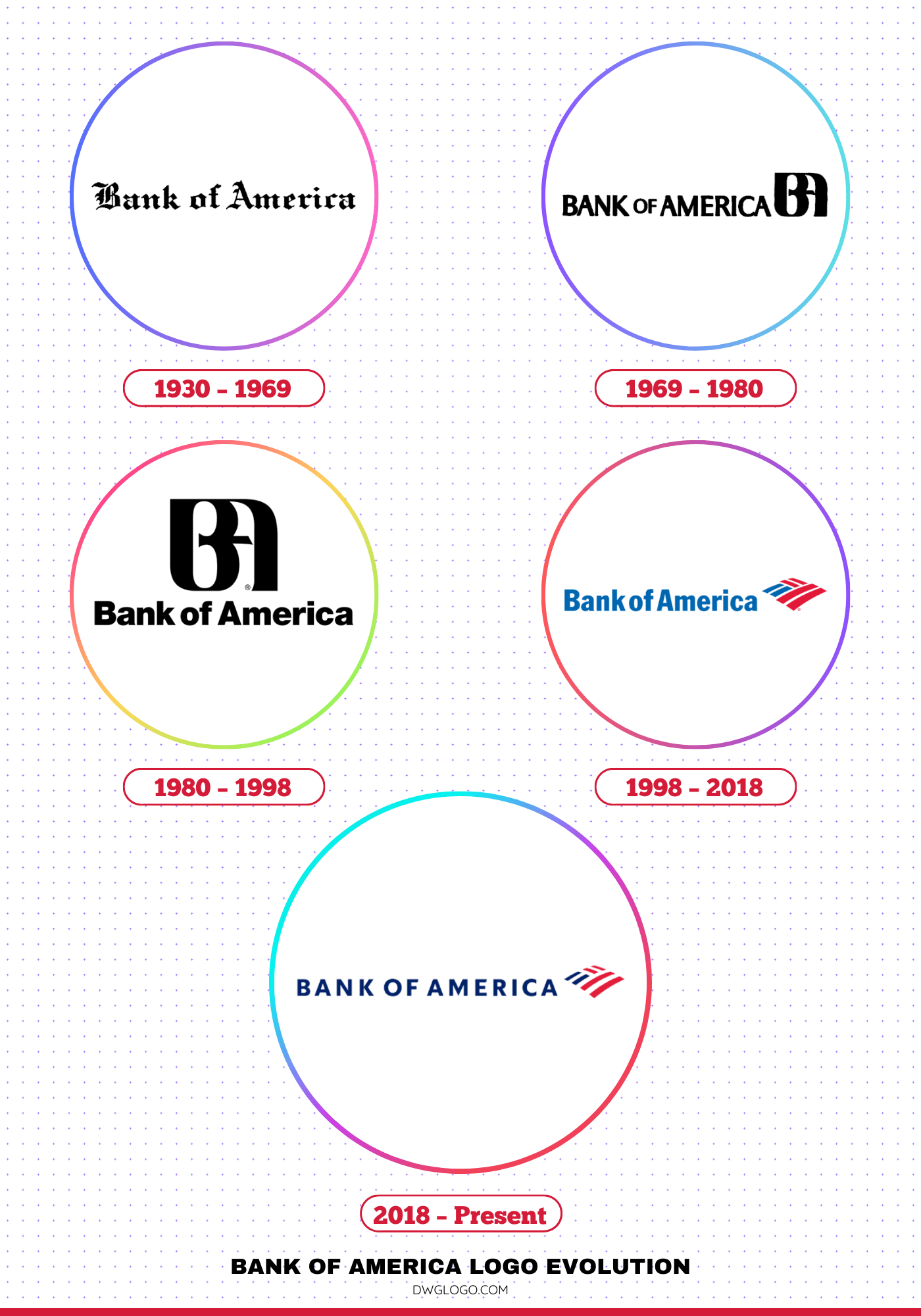
During this period, Bank of America, which had evolved from the Bank of Italy founded by Amadeo Giannini, used a logo that was a testament to its heritage and strength. The logo from this era was often text-based, featuring a classic, serif font that exuded a sense of tradition and stability. The name “Bank of America” was typically presented in a dignified, almost formal manner. The color palette was straightforward, often featuring a deep blue or black on a white background, symbolizing trust and reliability. There was no distinct, universal symbol like the modern flag, but rather a focus on the gravitas of the bank’s name itself. This minimalist approach was common for financial institutions of the time, emphasizing their role as pillars of the community.
1969 – 1980
1969 saw the introduction of an emblem designed by Walter Landor. The graphic designer insisted on doing it and managed to convince the board of directors. He offered many options until the General Counsel stated that the appearance of the logo did not matter as long as it had the letters ‘B’ and ‘A’. This is how the monogram appeared, which, according to the idea, was supposed to mimic the name stamp. To the left was the inscription “BANK OF AMERICA.”
1980 – 1998
Over time, the name began to be written at the bottom of the monogram. “B” and “A” were in uppercase and the rest of the letters were in lowercase. The Helvetica Black font gave them a modern look.
1998 – 2018
A landmark shift occurred in 1998 when Bank of America introduced its most iconic logo design to date, which remained in use until 2018. This version combined the wordmark with a symbolic graphic: a stylized flag that represented both the American identity of the brand and its commitment to progress. The flag was abstractly designed with geometric shapes in red and blue, forming a pattern that was not only patriotic but also distinctive.
The typography was modernized into a clean, sans-serif typeface that paired perfectly with the vibrant emblem. This design quickly became synonymous with Bank of America’s brand, appearing across branches, credit cards, and advertisements worldwide. The use of red and blue emphasized patriotism, trust, and energy, aligning with the bank’s reputation as a cornerstone of American finance.
2018 – Present
In 2018, consulting firm Lippincott made fine lines, changed colors, changed the letter box, and increased letter spacing.
Symbol font and color
Designers have transformed Bank of America’s sense of identity into a graphic sign that appears on every credit card and at every branch. On the stylized flag, the letters are encrypted: “B” – two blue stripes and “A” – four red.
The newer logo uses a new sans-serif font – the name is now displayed in capital letters. The colors are darker than before 2018, although the palette remains the same: blue-red elements on a white background.
The Bank of America Logo’s Typography and Color
Font
Throughout its history, Bank of America’s logo typography has evolved from traditional serif fonts to modern sans-serif styles. The early logos used a classic serif font that conveyed stability and tradition. The 1969 redesign saw a move to a more contemporary sans-serif, and this preference for sans-serif fonts has continued ever since. The 1980s and 1990s logos used custom sans-serif fonts that were proprietary to the brand. This choice of a sans-serif typeface aligns with the banking industry’s desire to appear approachable, modern, and trustworthy.
Color
The logo consistently uses red and blue, colors that convey energy, trust, and reliability while aligning with the bank’s American identity.
