AT&T Inc. is one of the world’s largest telecommunications companies, providing mobile and broadband services, digital entertainment, and business solutions. Headquartered in Dallas, Texas, AT&T has played a pivotal role in shaping global communications since its inception in 1885.
The company was initially part of the Bell Telephone Company, founded by Alexander Graham Bell, and evolved into the American Telephone and Telegraph Company (AT&T), pioneering telecommunications advancements.
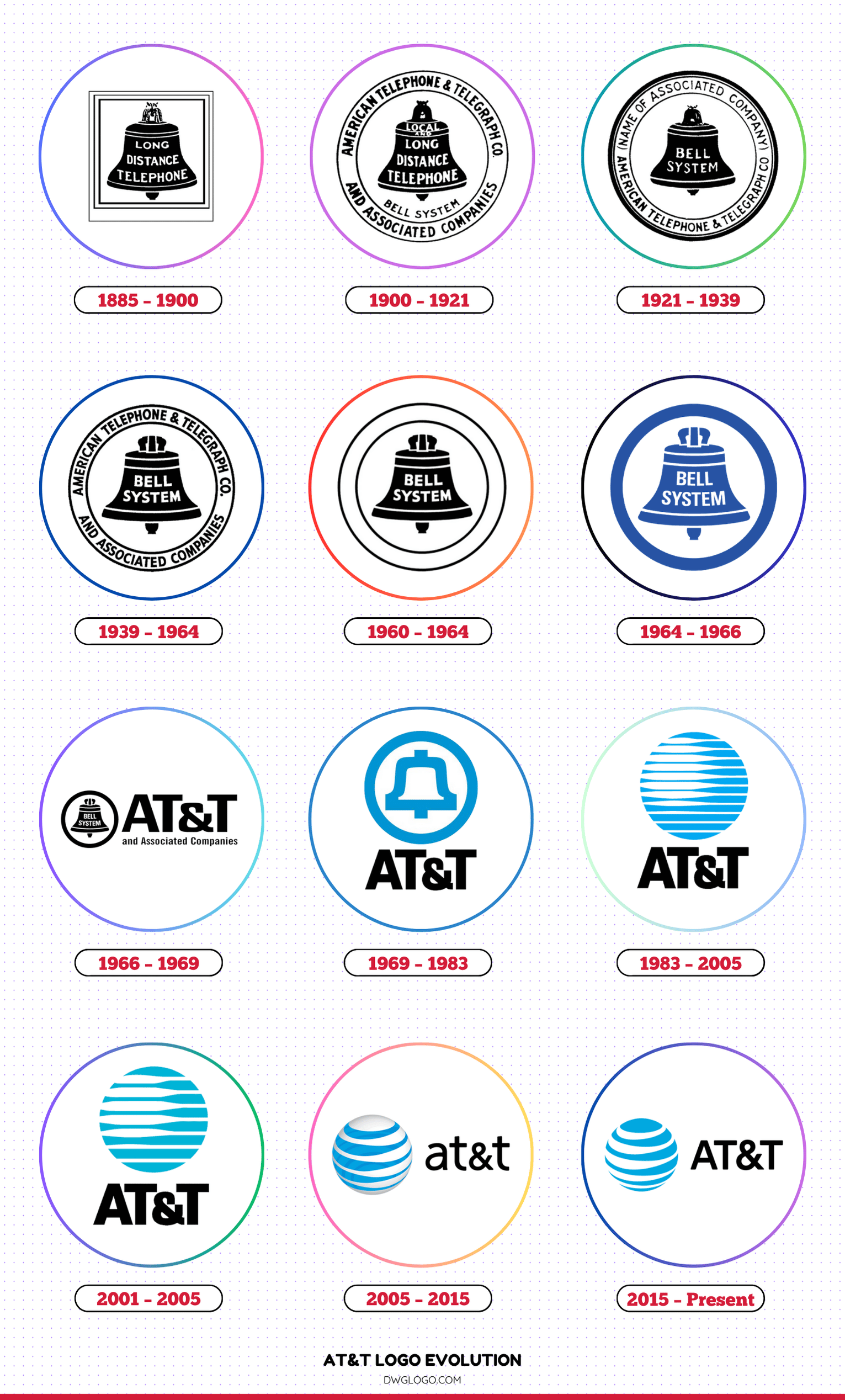
Over the years, AT&T has undergone several structural and branding changes, including mergers, acquisitions, and logo redesigns to reflect its corporate evolution and technological advancements.
AT&T Logo Evolution
1885 – 1900
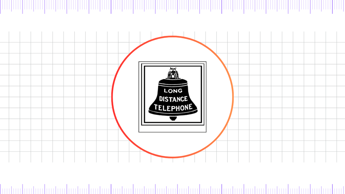
AT&T’s original logo featured a bell inside a double-circle frame with the text “Bell Telephone Company” and “Long Distance Telephone.”
This emblem symbolized the company’s connection to the Bell System and emphasized the telephone industry’s expansion.
1900 – 1921
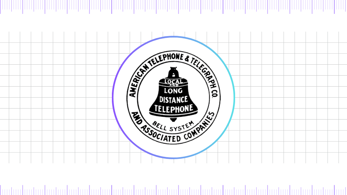
In 1900, the logo underwent a minor update, keeping the bell but simplifying the design. The text was rearranged to enhance readability, reinforcing the company’s reputation in telecommunications.
1921 – 1939
During this period, AT&T’s logo remained consistent with previous designs but introduced a bolder, well-defined bell. The typography became sharper, and the double-circle frame was retained, strengthening brand recognition.
1939 – 1964
As AT&T grew into a leading telecommunication provider, the logo saw significant refinements. The bell image became more stylized with smoother edges and a uniform stroke. The text placement remained consistent, ensuring brand familiarity.
1960 – 1964
A more streamlined version of the bell was introduced, featuring clearer contours. This marked the beginning of a shift toward a modern and minimalistic branding approach.
1964 – 1966

AT&T continued making subtle refinements, making the bell icon even sleeker. The typography used for the text became more contemporary, reflecting the corporate identity’s modernization.
1966 – 1969
The logo retained the bell motif but introduced a more pronounced, well-defined outline, enhancing visual clarity. This era saw a branding shift that aligned with AT&T’s growing presence in the telecommunications sector.
1969 – 1983
In 1969, the bell logo was enclosed within a thick, circular border. This design became one of AT&T’s most iconic emblems, reinforcing the company’s identity before a major transformation occurred in 1983.
1983 – 2005
In 1983, AT&T introduced a revolutionary logo shift by replacing the traditional bell with a globe design. This new look, created by graphic designer Saul Bass, symbolized AT&T’s global expansion and innovation in telecommunications.
The iconic blue striped globe represented interconnectedness and modernization.
2001 – 2005
The globe logo received a refined look in 2001, featuring lighter blue tones and a more polished gradient effect. The changes enhanced the company’s digital and global appeal, reinforcing its role as a modern telecom leader.
2005 – 2015
AT&T underwent another significant transformation in 2005, adopting a more three-dimensional globe. The iconic blue stripes became more fluid, giving the logo a contemporary and dynamic appearance.
This period marked AT&T’s expansion into mobile and digital communications.
2015 – Present
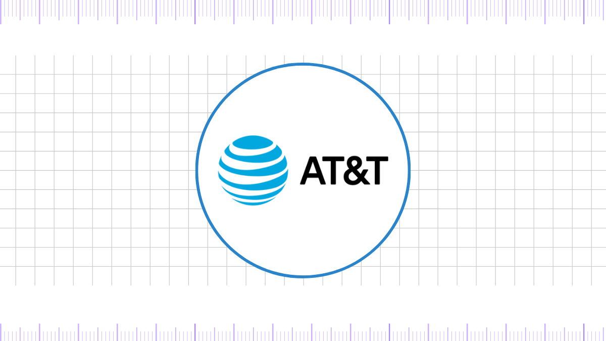
In 2015, AT&T introduced its current logo, refining the globe by making it flatter and more minimalistic. The company’s name now appears in bold, sans-serif typography, reinforcing a sleek, modern identity.
This evolution aligns with AT&T’s digital-first strategy and commitment to innovation.
Font and Color of AT&T’s Logo
Font
AT&T’s current logo uses a clean, modern sans-serif typeface. The typography is bold, simple, and highly legible, reflecting the brand’s futuristic and professional image. It conveys trust, innovation, and technological leadership.
Color
AT&T predominantly uses blue in its logo, signifying trust, reliability, and innovation. The shades of blue have evolved over time, with the latest version featuring a lighter, more vibrant hue, reinforcing a digital-forward and customer-centric brand identity.
FAQ’s
1. What does the AT&T logo symbolize?
The AT&T logo, particularly the globe design, symbolizes global connectivity, innovation, and communication. It represents AT&T’s role in shaping modern telecommunications worldwide.
2. Why did AT&T change its logo from the bell to the globe?
AT&T transitioned from the bell logo to the globe in 1983 to reflect its transformation from a traditional telephone service provider to a global telecommunications giant. The new design highlighted its expansion into digital and wireless communications.
3. Who designed AT&T’s iconic globe logo?
Renowned graphic designer Saul Bass created AT&T’s first globe logo in 1983, marking a significant rebranding moment for the company.
4. Has AT&T always used blue in its logo?
Yes, AT&T has consistently used blue as its primary brand color, symbolizing trust, reliability, and innovation in telecommunications.
5. What is the difference between the 2005 and 2015 AT&T logos?
The 2005 logo had a three-dimensional globe with gradients, while the 2015 version adopted a flatter and more minimalistic approach to align with digital trends.
6. What font does AT&T use in its logo?
AT&T’s current logo uses a bold, modern sans-serif font that enhances readability and professionalism.
Final thoughts,
AT&T’s logo evolution reflects its journey from a telephone service provider to a global telecommunications leader. With each redesign, the company has embraced modernity while maintaining brand recognition. The transition from the bell to the globe showcases its commitment to innovation and connectivity.
As AT&T continues to lead in the digital era, its logo remains a powerful symbol of its heritage and future aspirations.
Reference: [1]
