Android is an open-source operating system developed by Google, primarily designed for touchscreen mobile devices such as smartphones and tablets. The platform is based on the Linux kernel and has evolved significantly since its inception in 2008. Today, Android is the most widely used mobile operating system, powering billions of devices worldwide. Its flexibility, customization options, and vast app ecosystem contribute to its immense popularity among users and developers.
The development of Android began with Android Inc., a company founded in 2003 and later acquired by Google in 2005. The first commercial Android device, the HTC Dream (also known as the T-Mobile G1), was released in 2008. Over the years, Android has undergone continuous improvements, bringing enhanced security, user experience, and new features to its ecosystem.
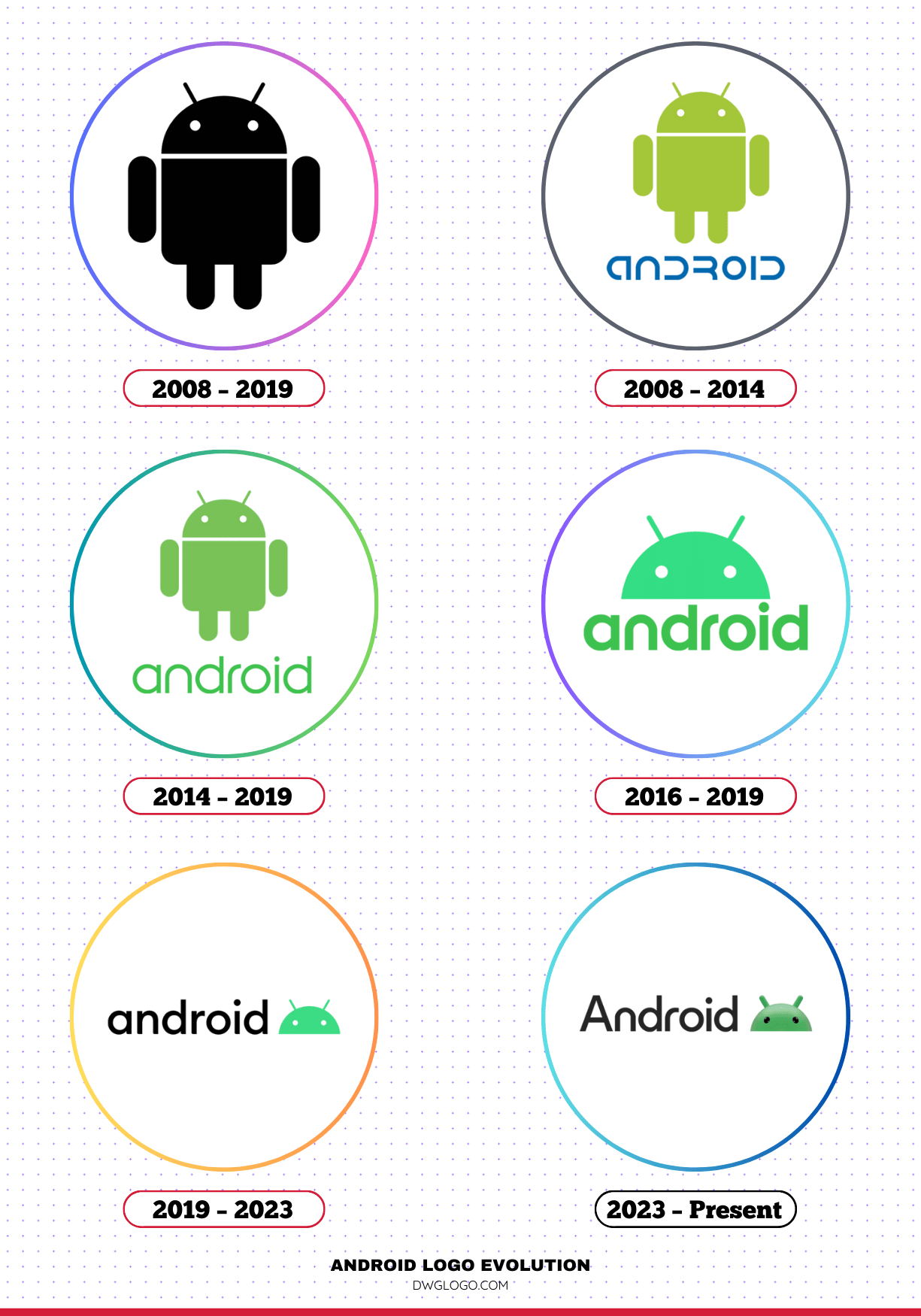
Android Logo Evolution
The Android logo has changed multiple times since its initial introduction in 2008. Each redesign aimed to modernize the brand identity while maintaining its recognition.
2008 – 2019
The original Android logo, introduced in 2008, featured the now-iconic green robot known as “Bugdroid.” The mascot, designed by Irina Blok, was a simple, friendly, and easily recognizable character. Alongside the robot, the word “Android” was displayed in a futuristic, sans-serif typeface.
This logo remained largely unchanged for over a decade.
2008 – 2014
During this period, the Android logo utilized a custom typeface with a futuristic and somewhat robotic appearance. The wordmark was lowercase, reflecting a modern, tech-driven look.
The green color of the Android mascot became strongly associated with the brand.
2014 – 2019
In 2014, Google introduced a refined version of the Android wordmark. The font was changed to a more modern and readable design while still maintaining the lowercase styling.
The Android mascot remained an integral part of the branding, emphasizing approachability and innovation.
2016 – 2019
During this period, minor refinements were made to the Android branding. Google focused on improving consistency across its product lines. The font and colors were subtly adjusted to align with Google’s Material Design principles.
2019 – 2023
In 2019, Android underwent a major brand refresh. The most noticeable change was the introduction of a new wordmark with a bolder and more rounded typeface. The traditional green color was modified to a darker shade to enhance contrast and accessibility. Additionally, the Android robot was integrated into the branding in a more subtle way, often appearing as part of the wordmark.
2023 – Present
In 2023, Android unveiled another logo update, refining its design further. The new logo features a more three-dimensional and visually appealing Android robot. The font remains similar to the 2019 version but has been slightly refined to ensure better readability. This update reinforces Android’s modern and user-friendly brand identity.
Android Font
Throughout its evolution, the Android brand has used various typefaces. Initially, it featured a unique, futuristic font that matched its tech-driven image. However, as the brand matured, Google introduced more refined and modern typefaces:
- 2008 – 2014: Custom, futuristic sans-serif font.
- 2014 – 2019: Updated sans-serif font, improving readability.
- 2019 – Present: A bold, rounded sans-serif typeface, aligning with Google’s design standards.
The current font prioritizes clarity and accessibility, ensuring that the branding remains strong across digital and physical platforms.
Android Color Palette
Color has played a crucial role in Android’s branding. The green hue associated with the Android robot has been a defining characteristic of the brand. However, over time, Google has made adjustments to the shades used in Android’s identity.
- 2008 – 2019: A bright green (#A4C639) associated with innovation and freshness.
- 2019 – Present: A darker green for better contrast and accessibility.
- Complementary Colors: Android branding has occasionally incorporated black, white, and blue tones to create a more cohesive and modern aesthetic.
FAQ’s
1. Who designed the original Android logo?
The original Android logo, featuring the famous green robot, was designed by Irina Blok, a graphic designer at Google, in 2007.
2. Why is Android’s color green?
Green was chosen as the primary color for Android because it represents growth, innovation, and a futuristic appeal. The specific shade has evolved over time to improve contrast and accessibility.
3. What does the Android robot represent?
The Android robot, also known as “Bugdroid,” symbolizes the open-source nature of the Android platform, its friendly and accessible nature, and its adaptability to various devices.
4. Why did Google change the Android logo in 2019?
The 2019 redesign aimed to modernize Android’s branding, improve readability, and enhance accessibility. The changes included a bolder font, a darker green color, and a refined presentation of the Android robot.
5. What font is used in the current Android logo?
The current Android logo uses a custom, rounded sans-serif typeface that aligns with Google’s design language.
6. Has the Android logo always included the robot?
While the Android robot has always been associated with the brand, earlier versions of the logo primarily featured the wordmark. In recent years, Google has incorporated the robot more seamlessly into the branding.
7. What is the significance of the 2023 Android logo update?
The 2023 update introduced a more three-dimensional and visually refined Android robot, reinforcing a more modern and dynamic brand identity.
8. How often does Android update its branding?
Android’s branding has been updated several times since 2008, usually every few years, to reflect design trends and Google’s evolving visual identity.
Final thoughts,
The Android logo and branding have undergone significant transformations over the years, reflecting the platform’s growth and innovation. From the original 2008 design featuring the iconic green robot to the latest 2023 update with a more modern and refined look, each change has aimed to enhance readability, accessibility, and user appeal. As Android continues to evolve, its branding will likely continue adapting to new trends while maintaining its recognizable identity.
Android’s commitment to innovation is evident in its consistent visual evolution, ensuring that the brand remains fresh, accessible, and forward-thinking for years to come.


