Amazon is one of the most influential companies in the world, with a brand identity recognized globally. The Amazon logo has undergone multiple transformations since its inception in 1995, reflecting the company’s growth from an online bookstore to a global e-commerce and technology powerhouse. This article explores the history and evolution of the Amazon logo, highlighting key changes from 1995 to the present.
Amazon Logo History and Evolution: From 1995 to Present
1995-1997

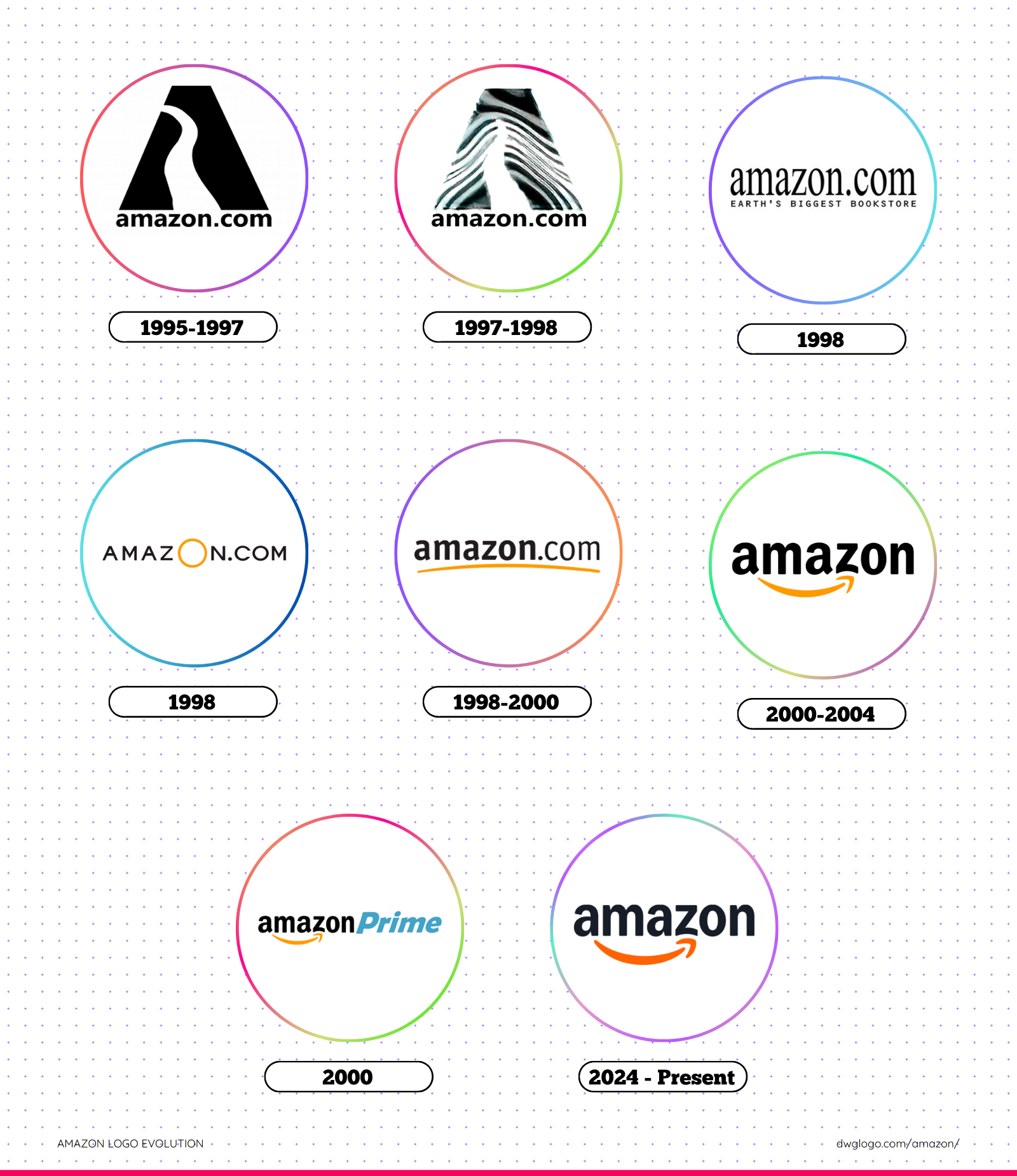
Amazon was founded by Jeff Bezos in 1994, and its first logo appeared in 1995. The logo featured a simple, text-based design with “Amazon.com” written in black capital letters, accompanied by the tagline “Earth’s biggest bookstore.” The font was simple and professional, reflecting the company’s primary focus on selling books online. This initial logo represented the company’s ambition to become the largest online book retailer.
1997-1998

In 1997, Amazon redesigned its logo to a more minimalistic style. The company dropped the tagline and opted for a sleeker, bolder font. This change aligned with Amazon’s expansion beyond books, as it began offering a wider range of products. The logo was still monochrome, maintaining a professional yet straightforward appearance.
1998
By 1998, Amazon had solidified its position as the leading online book retailer. To emphasize this achievement, the company introduced a new logo that prominently featured the text “Amazon.com” with the tagline “Earth’s biggest bookstore.” The font was bold, making the brand more recognizable. The color scheme remained black and white, maintaining a formal and professional aesthetic.
1998
Later in 1998, Amazon unveiled a significant update to its logo. The company introduced a curved line below the text, resembling a smile, which would later evolve into the iconic arrow. This design choice symbolized customer satisfaction and a positive shopping experience. The color scheme was adjusted to a more modern and inviting look, moving away from the earlier monochrome design.
1998-2000
Amazon continued refining its logo in 1998 by adding an arrow connecting the letters “A” and “Z” in “Amazon.com.” This change subtly conveyed the company’s mission to provide everything from “A to Z.” The arrow also reinforced the idea of swift delivery and a seamless shopping experience. This version of the logo set the foundation for Amazon’s long-term branding strategy.
2000-2004

In 2000, Amazon launched a refined version of its logo, which remains largely unchanged to this day. The company kept the lowercase “amazon.com” typography but emphasized the smile-like arrow in yellow. This arrow stretched from “A” to “Z,” reinforcing the company’s broad selection of products. The color scheme now included a deep black for the text and a warm yellow for the arrow, enhancing the logo’s friendliness and approachability.
The decision to keep “amazon.com” in lowercase letters made the brand appear more approachable and customer-friendly. This was also the year Amazon introduced Amazon Prime, a game-changing subscription service that offered faster shipping and exclusive content. The new branding reflected the company’s commitment to innovation and customer satisfaction.
2024 – Present
As of 2024, the Amazon logo remains one of the most recognizable symbols in the world. While the company has introduced slight refinements to enhance digital readability and branding consistency, the core elements remain unchanged. The iconic black font and yellow smile-arrow continue to represent Amazon’s commitment to delivering convenience and innovation.
With Amazon constantly evolving, future changes to its branding may be subtle but impactful, ensuring the logo remains fresh while retaining its core identity.
What Color is the Amazon Logo?
Amazon as a brand has a number of color combinations based on different usage. For the purpose of this article, we would consider the brand’s logo color. The logo design with the codes HEX and RGB has two major colors which are the Gamboge (#FF9900) and Black (#000000).

The above-mentioned code color mix was discovered by user Keshav Naidu. If you are wondering if gamboge is a color. Affirmatively it is. Gamboge is a sunny yellow color. It could also be referred to as yellow-orange (i.e. yellow with a tone of orange resulting in a warm yellow color).
Another fascinating fact about the Amazon logo color is its uniqueness to the brand. Often times when you see this color combination, the brand name ‘’Amazon’’ comes to mind, playing a great role in marketing and brand promotion.
Final thoughts,
The Amazon logo has evolved significantly since 1995, reflecting the company’s journey from a humble online bookstore to a global technology giant. Each transformation has marked a key milestone in Amazon’s expansion, reinforcing its values of customer satisfaction, innovation, and reliability.
Today, the Amazon logo stands as a symbol of global commerce, technological advancement, and an unparalleled shopping experience.
