A visual history of a brand’s identity is more than just a succession of images; it is a mirror reflecting its journey, purpose, and evolution in the marketplace. The logos of Twitter, and now X, provide a perfect case study in this phenomenon. From its humble, experimental beginnings to its recent dramatic and polarizing transformation, the platform’s logos have told a story of growth, professionalization, and radical change. This article explores the chronological progression of the company’s logos, examining the design choices, fonts, colors, and the broader context that influenced each iteration.
The Evolution of the Twitter Logo
2005 – 2006
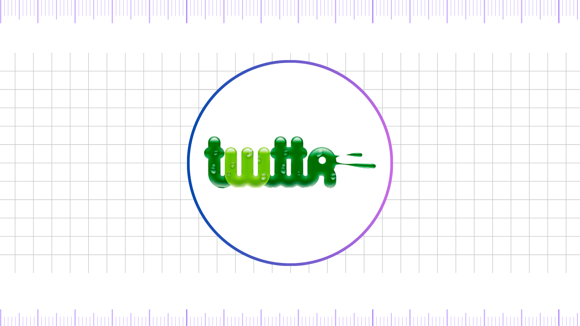
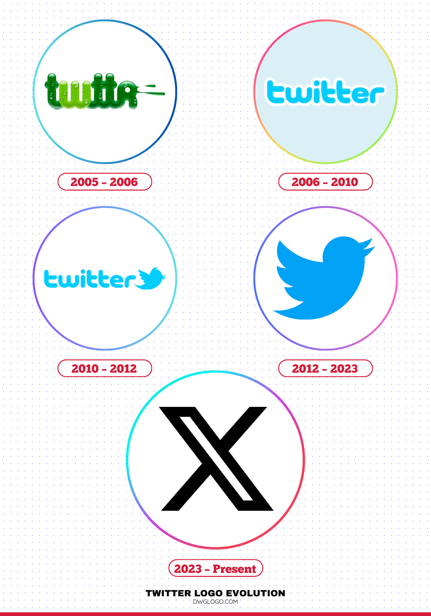
The very first logo, which was primarily for internal use, was a playful and experimental wordmark that spelled out “twttr.” This initial design, featuring a bubbly, somewhat slimy green typeface, was a nod to the SMS character limit constraints of the time. The sans-serif font, though simple, gave the company a modern and approachable feel, a stark contrast to the more traditional and corporate logos of the era. The choice to omit vowels highlighted its origin as a text-message-based service and positioned it as a quirky, tech-savvy startup.
The green color, which would soon be replaced, symbolized new beginnings and vitality. This early logo, designed before the platform’s public debut, perfectly captured the raw, unrefined energy of a project in its nascent stages.
2006 – 2010
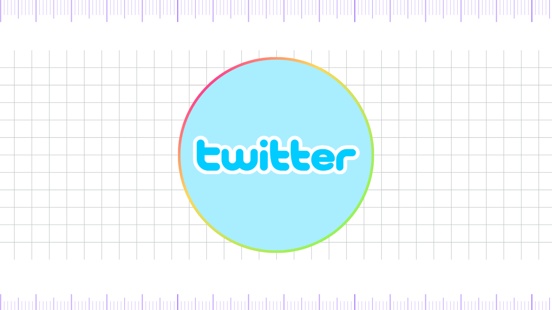
When the platform officially launched in 2006, the logo underwent its first major transformation. The name was changed to “Twitter”, complete with vowels, and the color palette shifted from green to a light, iconic sky blue. This color choice was deliberate, as blue is widely associated with trust, calmness, and stability, qualities that the new social media company wanted to convey.
The wordmark, designed by Linda Gavin, featured a rounded, sans-serif font that was both clean and professional, retaining a hint of the previous bubbly aesthetic but in a much more polished form. This era also saw the unofficial introduction of a simple bird icon, reportedly purchased for a mere $15 from iStock. While not yet part of the main logo, this bird began to appear on the platform, subtly laying the groundwork for what would become one of the most recognizable brand symbols in the world.
2010 – 2012
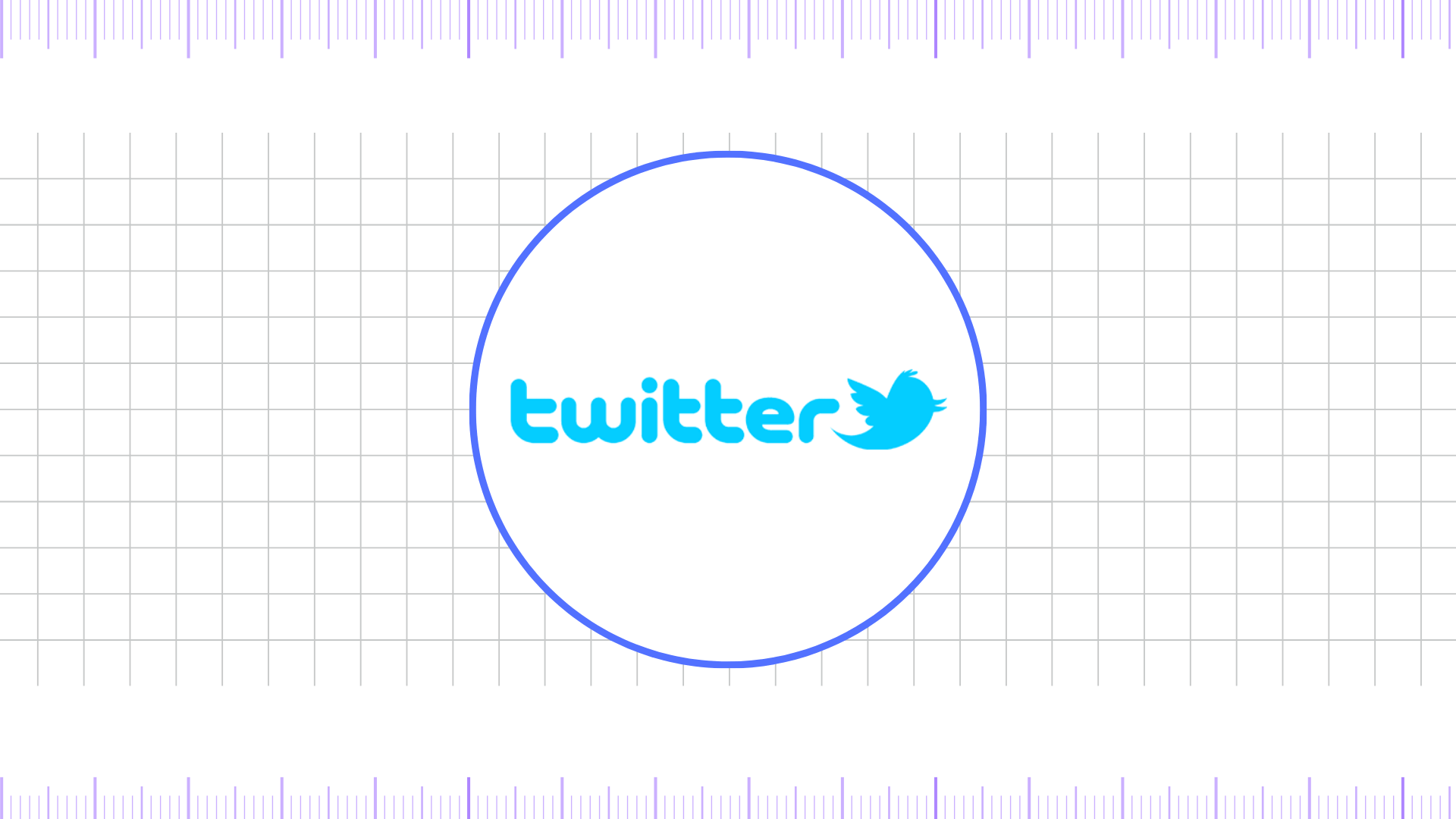
The blue bird, which had been a secondary element, officially took center stage in 2010 when it was integrated into the main logo. This iteration featured both the “Twitter” wordmark and the blue bird icon side-by-side. The bird itself, affectionately named “Larry” after basketball player Larry Bird, was more detailed than its predecessor, with a tuft of feathers and a more dynamic, “leaping” posture. This design marked a significant shift, as the brand began to lean on a visual mascot to represent its core concept.
The symbolism of a bird, and the action of tweeting, was a natural fit. The font used for the wordmark was a slightly modified sans-serif, believed to be a variation of Pico Alphabet. The integration of the bird made the logo more universally identifiable and less reliant on the English wordmark, a crucial step for a company with global ambitions.
2012 – 2023
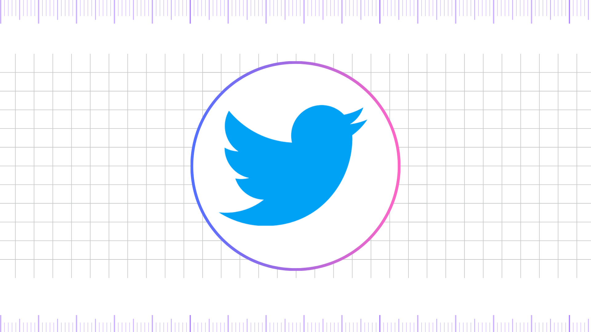
In 2012, Twitter streamlined its logo to what would become its most enduring and globally recognized form. The wordmark was completely removed, leaving only the bird. This bold move was a testament to the brand’s immense growth and a strategic decision to make its identity as simple as possible. The bird itself was redesigned to be more minimalist, with its head and wings pointing upward at a specific angle, a design said to be based on a series of overlapping circles to create a “perfect” shape.
This iteration of the logo, with its clean lines and confident upward trajectory, symbolized simplicity, freedom, and the democratization of information. The color was also slightly adjusted to a darker, more vibrant blue, which provided better contrast on white backgrounds. This logo served the company for over a decade, becoming a powerful symbol of real-time communication, news, and public discourse.
2023 – Present
The most recent and dramatic change came in 2023 under the ownership of Elon Musk. The iconic blue bird and the Twitter name were retired in favor of a single letter, “X,” and a new color palette centered around black and white. The new logo is a stylized, bold, and stark ‘X’ that conveys a radical shift in the company’s direction. While the design is simple, it is also generic, drawing comparisons to various other logos and even the mathematical symbol for an unknown variable. The rebrand from Twitter to X, and the subsequent logo change, represents a move away from a “bird app” and toward an “everything app.”
This new logo is less about what the platform does now and more about a speculative future vision, which has been met with mixed public reactions. The bold, black color scheme signifies power, seriousness, and a departure from the platform’s previously cheerful and communicative identity.
FAQ’s
Why was the Twitter bird named “Larry”?
The bird was named Larry after the legendary basketball player Larry Bird of the Boston Celtics, a nod to a Twitter employee’s love for the sport.
Why did Twitter change its logo to X?
The change to the “X” logo was part of a broader rebrand under Elon Musk’s leadership, who envisions the platform as an “everything app” similar to China’s WeChat. The name change to X and the new logo were meant to signal a complete departure from the old platform’s identity and a new direction for the company.
What role did Biz Stone play in the creation of the Twitter logo?
Biz Stone, one of Twitter’s co-founders, played a key role in shaping the early visual identity of Twitter, including its first logos. With a background in graphic design and creative direction, Stone personally created the initial Twitter wordmark and branding elements during the platform’s formative years. He is often credited with helping define the friendly, approachable, and minimalist style that set Twitter apart from other tech startups at the time.
While the famous “Larry the Bird” mascot was originally purchased from iStock by designer Simon Oxley, Biz Stone guided how the bird was integrated into Twitter’s branding and refined over time. In essence, Stone’s contribution was not just about designing graphics but about giving Twitter an identity that matched its mission—simple, playful, and centered around communication.
How much did Elon Musk buy Twitter for?
Elon Musk acquired Twitter (now known as X) for approximately US $44 billion, closing the deal in October 2022. The acquisition was finalized at a price of $54.20 per share.
How the X Logo Came to Be?
When Elon Musk announced the rebrand from Twitter to X, he posted a tweet asking for a “good enough X logo,” stating that if someone submitted a suitable design in time, he would roll it out globally the next day.
A Twitter user named Sawyer Merritt, co-founder of the apparel brand Twin Birch, submitted a design that Musk liked. That version was originally created by Alex Tourville, who had designed it for a now-defunct podcast called “X Pod” focused on Musk’s ventures. Merritt adapted the logo—adding a glow and subtle imperfections—to make it suitable for Twitter’s branding.
This simple, minimalist “X” had an Art Deco vibe that resonated with Musk. It was made live almost immediately across the platform and even projected onto Twitter’s headquarters.
Final Thoughts,
The journey from the playful, sky-blue Twitter bird to the stark black-and-white “X” marks one of the most dramatic shifts in modern branding. For more than a decade, the bird symbolized communication, freedom, and global conversation, becoming one of the most recognizable icons in digital culture. Its simplicity and optimism reflected Twitter’s original mission: to connect people through short, real-time messages. However, the 2023 rebrand to “X” represents a radical departure from that legacy.
The minimalist and geometric X is not just a new logo, but a statement of ambition under Elon Musk’s ownership, signaling a transformation from a social networking site into a multifaceted “everything app.” While the new identity has sparked debate—some praising its boldness and others mourning the loss of the bird—it underscores the evolving nature of technology brands and their need to adapt to broader visions.
Ultimately, the transition from bird to X tells a larger story about reinvention, cultural impact, and the power of logos to capture both nostalgia and future aspirations.
