Nescafé is a globally recognized coffee brand owned by Nestlé. Introduced in 1938, it has become synonymous with instant coffee, revolutionizing the way people consume this beloved beverage. The brand name “Nescafé” is a combination of “Nestlé” and “café,” representing its deep roots in the coffee industry.
Over the decades, Nescafé has continuously evolved to meet the changing preferences of coffee lovers worldwide, offering a wide range of products, including classic instant coffee, premium blends, and ready-to-drink options.
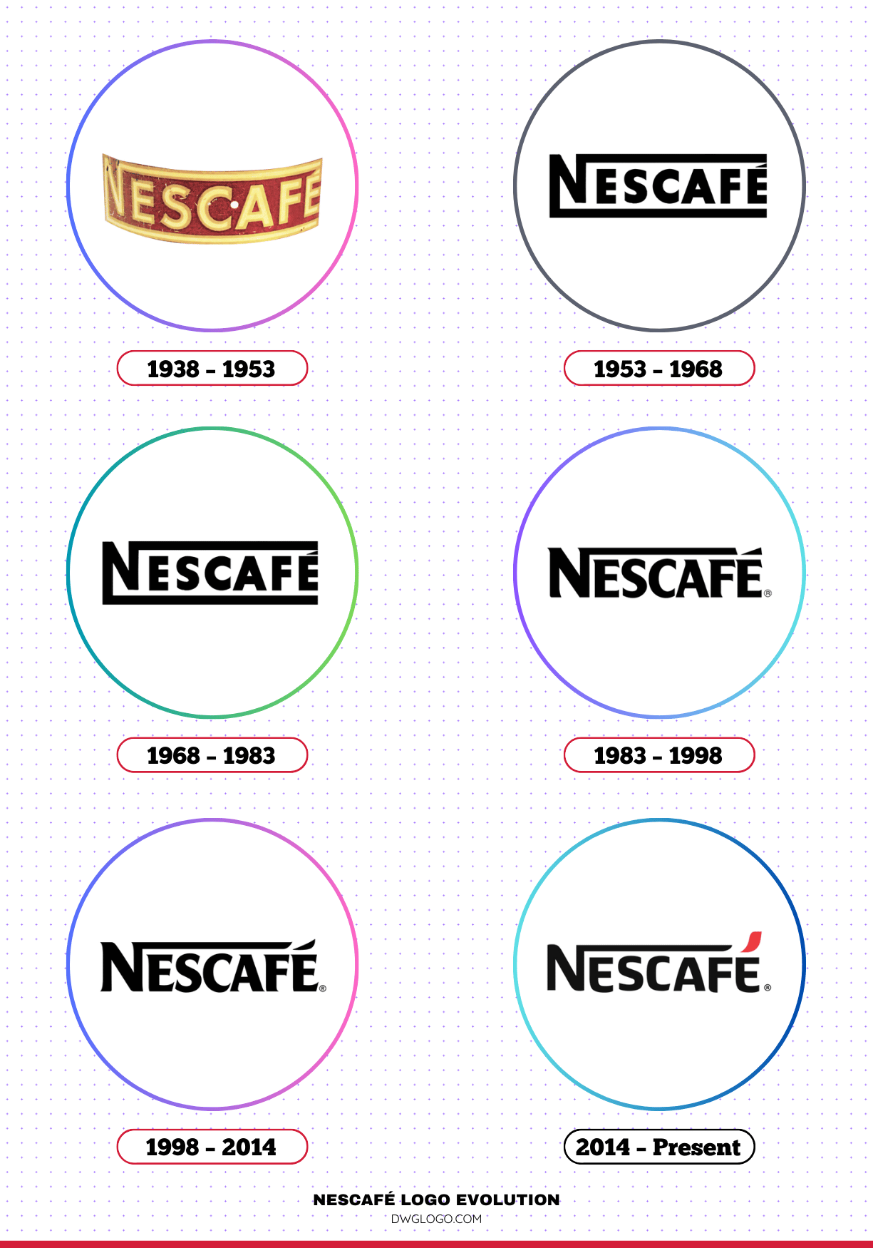
Nescafé Logo Evolution
Nescafé’s logo has undergone multiple redesigns over the years, reflecting changes in branding strategies, design trends, and consumer preferences. Below is an in-depth look at the evolution of the Nescafé logo.
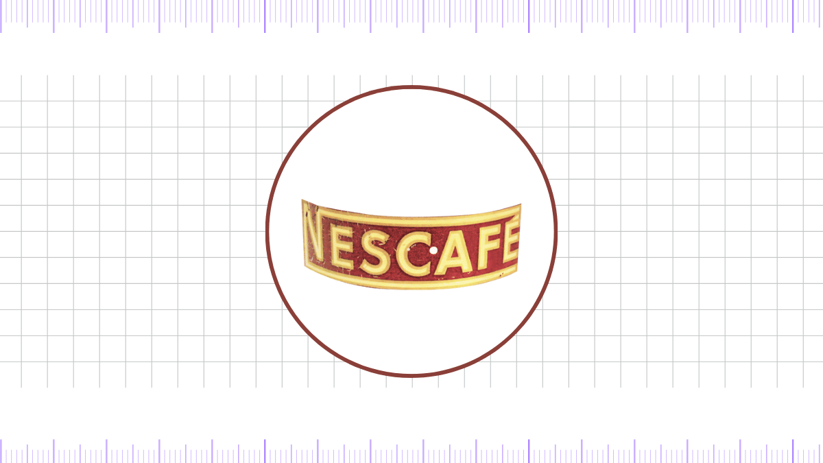
1938 – 1953
The first Nescafé logo was simple yet elegant, featuring a bold, sans-serif typeface. The black and white color scheme represented a strong, no-nonsense branding approach.
The design was straightforward, emphasizing the brand’s commitment to providing high-quality instant coffee.
1953 – 1968
During this period, the logo underwent slight modifications, incorporating a more stylized font. The design retained a monochrome appearance but featured slightly refined letterforms, making it more modern and sophisticated.
This change aimed to enhance brand recognition as Nescafé expanded into new markets.
1968 – 1983
The logo saw a significant transformation in the late 1960s. The letters became more refined and evenly spaced, and the “E” in “Nescafé” was extended slightly, a feature that would become a signature element in future designs.
The black color remained dominant, reinforcing the brand’s bold and classic image.
1983 – 1998
The 1983 redesign introduced a more contemporary look, featuring bolder typography and the characteristic extended stroke on the letter “E.” The logo also became more compact, making it versatile for various packaging and marketing materials.
The refined aesthetic reflected Nescafé’s growing global presence and brand maturity.
1998 – 2014
A major rebranding effort took place in 1998, bringing a more modernized and sophisticated feel to the Nescafé logo. The color scheme was updated to a deep brown and red combination, symbolizing coffee’s warmth and richness.
The font was further stylized, with a more pronounced curve in the “E,” giving the logo a distinctive and dynamic look.
2014 – Present (Today)
The latest iteration of the Nescafé logo, introduced in 2014, features a sleeker and more minimalistic design. The iconic red accent above the “E” was refined, making it a signature design element. The typography remains bold and modern, emphasizing Nescafé’s legacy while maintaining a contemporary appeal.
The color palette predominantly includes deep brown and red hues, reinforcing the brand’s association with high-quality coffee.
Nescafé Font
Nescafé has consistently used custom typography throughout its logo’s evolution. The current font is a sleek, modern sans-serif typeface that balances boldness with elegance. The extended “E” remains a distinctive element, symbolizing dynamism and innovation. While the exact font is proprietary, it closely resembles typefaces like Futura or Helvetica with customized modifications.
Nescafé Logo Colors
The color palette of the Nescafé logo has evolved over the years, but it has always maintained a strong connection to coffee’s rich and inviting hues. The primary colors associated with Nescafé include:
- Black: Represents elegance, sophistication, and timeless quality.
- Deep Brown: Symbolizes the warmth and richness of coffee.
- Red: Evokes passion, energy, and a strong brand identity.
These colors work together to create a visually appealing and instantly recognizable brand image.
FAQ’s
1. When was Nescafé founded?
Nescafé was officially introduced in 1938 by Nestlé as a convenient and high-quality instant coffee solution.
2. What does the name “Nescafé” mean?
The name “Nescafé” is derived from “Nestlé” and “café,” signifying the brand’s connection to coffee and its parent company.
3. Why did Nescafé change its logo multiple times?
Logo updates reflect branding trends, consumer preferences, and marketing strategies. Each redesign aimed to modernize the brand while maintaining its strong identity.
4. What is the meaning behind the red accent in the Nescafé logo?
The red accent symbolizes energy, passion, and warmth, all qualities associated with a great cup of coffee.
5. What font does Nescafé use in its logo?
While Nescafé uses a proprietary typeface, it closely resembles modern sans-serif fonts like Futura or Helvetica, with unique customizations.
6. What are the primary colors of the Nescafé logo?
The primary colors include deep brown, black, and red, representing coffee’s richness, sophistication, and energy.
7. How has Nescafé maintained its brand relevance over the years?
Nescafé has continuously innovated its products, marketing strategies, and branding, ensuring it remains a household name in the global coffee industry.
Final thoughts,
Nescafé’s journey from its inception in 1938 to its modern branding showcases its adaptability and enduring appeal. The logo’s evolution reflects the brand’s commitment to innovation and excellence, while the font and colors strengthen its visual identity.
Whether you’re a casual coffee drinker or a devoted enthusiast, Nescafé continues to be a trusted name in the world of instant coffee, delivering quality and convenience in every cup.
Reference:] [1]
