The National Basketball Association (NBA) is one of the most renowned professional basketball leagues in the world. Established in 1946 as the Basketball Association of America (BAA), it later merged with the National Basketball League (NBL) in 1949 to form what we now recognize as the NBA.
Over the years, the NBA has evolved significantly, not just in terms of gameplay and global influence but also in its branding, including its logo. The NBA logo has undergone multiple redesigns, each reflecting the era’s aesthetic and the league’s growth.
NBA Logo Evolution
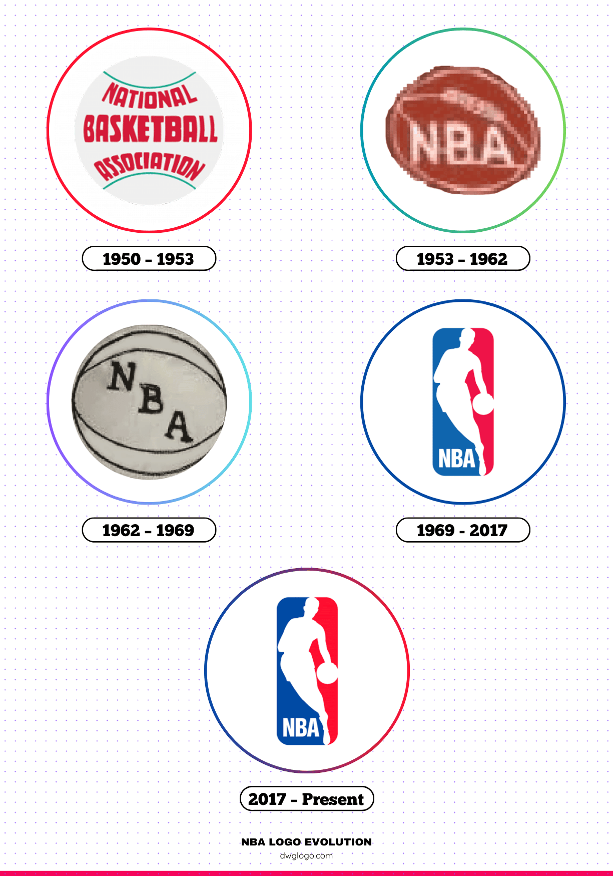
1950 — 1953
During the early years of the NBA, the logo was relatively simple and lacked the now-iconic silhouette. The design featured a circular emblem with a traditional basketball in the center and the league’s name inscribed around it. The logo reflected a modest approach, aligning with the sport’s growing presence rather than an established global brand.
1953 — 1962
In 1953, the NBA introduced a more refined logo. This design incorporated a traditional basketball symbol with bold typography.
The elements were more structured, and the emphasis on a clean, professional look made it stand out. This era marked a transition where branding became essential to the league’s recognition.
1962 — 1969
During the 1960s, the NBA’s popularity soared, necessitating a more dynamic logo. The new design featured a rectangular shape with “NBA” inscribed in bold letters. The typography became stronger, and the overall layout was modernized.
This version set the foundation for future logos, emphasizing minimalism and clarity.
1969 — 2017
One of the most iconic changes in NBA logo history came in 1969 when the league introduced the famous silhouette logo. Created by designer Alan Siegel, the logo featured the legendary figure of Jerry West dribbling a basketball. The combination of red, white, and blue reflected a patriotic theme, aligning with American sports traditions.
This version remained the official logo for nearly five decades and became a globally recognized symbol of basketball excellence.
2017 — Present
In 2017, the NBA made slight refinements to its classic logo. While the silhouette of Jerry West remained, the typography and overall aesthetics were modernized. The colors became more vibrant, and the lettering style was updated to keep up with contemporary design trends. This subtle yet effective rebranding ensured the logo remained relevant in an era of digital media and high-definition broadcasting.
Colors of the NBA Logo
The NBA logo predominantly features three colors: red, white, and blue. These colors symbolize unity, strength, and excellence. Here is a breakdown of the color codes used in the NBA logo:
- Red: HEX: #C8102E | RGB: 200, 16, 46 | CMYK: 2, 100, 85, 6
- Blue: HEX: #1D428A | RGB: 29, 66, 138 | CMYK: 98, 85, 10, 1
- White: HEX: #FFFFFF | RGB: 255, 255, 255 | CMYK: 0, 0, 0, 0
These colors have remained consistent over the years, reinforcing brand identity and maintaining a strong connection with fans worldwide.
FAQ’s
1. Who is featured in the NBA logo?
The NBA logo features the silhouette of former Los Angeles Lakers player Jerry West. Although the NBA has never officially confirmed it, the design is widely recognized as being inspired by West’s playing posture.
2. Why does the NBA use red, white, and blue in its logo?
The color scheme was chosen to reflect patriotism, as the NBA is an American-founded league. These colors also create a visually striking contrast, making the logo easily recognizable.
3. Has the NBA ever considered changing its logo?
There have been discussions about updating the logo to feature a modern player, such as Kobe Bryant. However, the NBA has not made any official decisions regarding a major redesign.
4. Who designed the NBA logo?
The NBA logo was designed by Alan Siegel in 1969. His work has remained one of the most iconic sports logos in history.
5. What makes the NBA logo unique?
Unlike many other sports logos, the NBA logo features a player silhouette instead of a team-related symbol. This universal representation of basketball makes it timeless and applicable to all franchises.
6. What is the significance of the silhouette in the logo?
The silhouette represents movement, skill, and the essence of basketball. It embodies the spirit of the game and acts as a symbol of excellence and professionalism in the sport.
Final thoughts,
The NBA’s logo evolution mirrors the league’s growth and global appeal. From its early simplistic designs to the iconic Jerry West silhouette, each change has reinforced the brand’s identity.
Today, the NBA logo remains a powerful symbol of basketball, recognized by millions of fans worldwide. Its red, white, and blue colors stand as a testament to the league’s American heritage and its lasting influence on the sport.
Reference: [1]
