The National Football League (NFL) is one of the most recognized sports organizations worldwide. Founded in 1920 as the American Professional Football Association (APFA), it was later renamed the NFL in 1922. Over the decades, the league has grown exponentially, gaining global popularity with millions of fans.
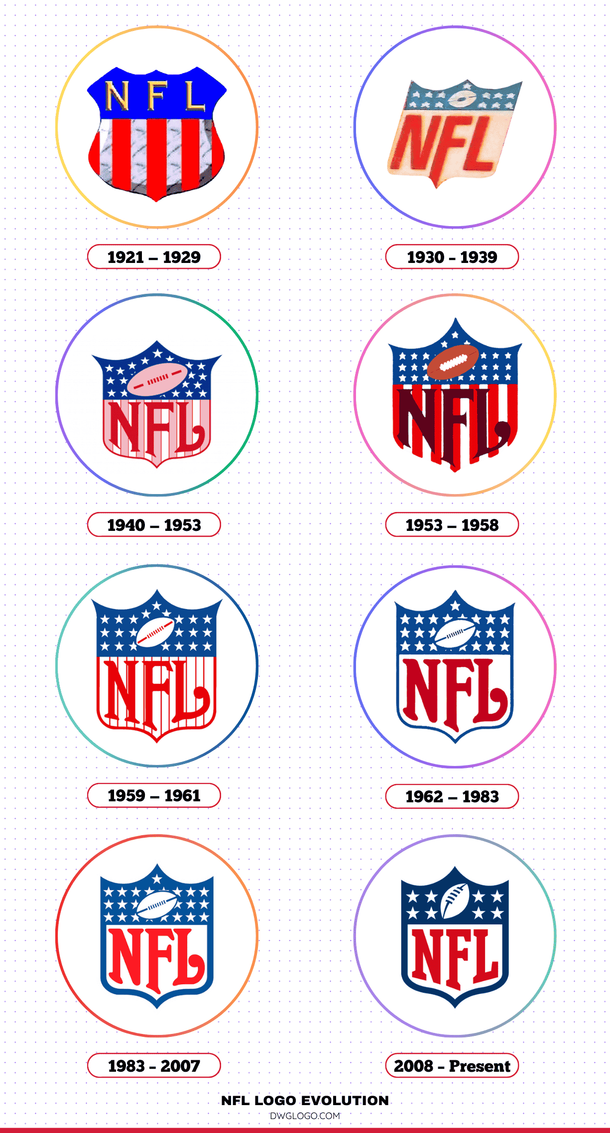
Alongside its growth, the NFL logo has also evolved, reflecting the league’s commitment to modernization while preserving its heritage.
Founded:
The NFL was established in 1920 as the American Professional Football Association (APFA) and officially adopted its current name in 1922.
Teams:
The NFL consists of 32 teams, evenly split between the American Football Conference (AFC) and the National Football Conference (NFC).
NFL Logo Evolution
1921 — 1929
The earliest representation of the NFL logo was simple and unrefined. The design featured a rudimentary shield outline with text, aligning with the minimalistic branding trends of the era.
It lacked the sophistication and detail seen in later versions but served as an essential foundation for the league’s branding.
1930 — 1939
During the 1930s, the NFL sought to establish a more distinct identity. The logo underwent minor refinements, incorporating stronger lettering and more defined lines.
The shield shape remained, symbolizing strength and resilience, traits integral to American football.
1940 — 1953
By the 1940s, the NFL logo started taking a more recognizable form. This period saw the inclusion of a football icon, reinforcing the sport’s identity within the branding.
The design also experimented with stars and stripes, reflecting American patriotism and the growing national appeal of the league.
1953 — 1958
The 1953 redesign introduced a bolder look. The shield was retained, but a more structured layout was implemented. The stars and football icon were refined, while the typography was enhanced to create a professional appearance.
This version laid the groundwork for the logo’s future iterations.
1959 — 1961
A brief but significant change occurred between 1959 and 1961. The league focused on modernizing its visual identity by streamlining the design and enhancing the clarity of the elements within the shield.
The colors became more pronounced, reinforcing brand recognition.
1962 — 1983
The 1962 redesign introduced a more familiar NFL logo, featuring a stronger blue shield with white stars and a red football. This version established a long-lasting identity, symbolizing the league’s national prominence.
It remained in use for over two decades with minor modifications.
1983 — 2007
During this period, the NFL made subtle adjustments to the logo. The colors became more vibrant, and the font was refined to enhance legibility. The football’s design was adjusted slightly to match the evolving aesthetics of the time.
2008 — Present
In 2008, the NFL introduced its current logo, which is a more polished and streamlined version of the previous iterations. The number of stars was reduced from 25 to 8, representing the league’s eight divisions.
The football was given a more dynamic, three-dimensional appearance, and the font was modernized to create a sleek and professional image.
NFL Logo Colors and Their Significance
The primary colors used in the NFL logo are red, white, and blue, symbolizing the league’s deep connection to the United States. Each color carries a distinct meaning:
- Red: Represents passion, energy, and determination.
- White: Signifies purity, fairness, and integrity in the game.
- Blue: Reflects strength, trust, and professionalism.
NFL Logo Color Codes
The official NFL logo features a distinctive color scheme that represents the league’s identity. Below are the exact color codes used in the logo:
- Blue: HEX #013369 | RGB (1, 51, 105) | CMYK (100, 65, 0, 60)
- Red: HEX #D50A0A | RGB (213, 10, 10) | CMYK (0, 95, 95, 15)
- White: HEX #FFFFFF | RGB (255, 255, 255) | CMYK (0, 0, 0, 0)
These colors are used across the NFL’s branding, including merchandise, digital media, and official documents.
These colors contribute to the league’s strong branding, making the NFL instantly recognizable on merchandise, digital platforms, and television broadcasts.
FAQ’s
1. Why did the NFL change its logo in 2008?
The 2008 logo update aimed to modernize the league’s branding while simplifying the design. Reducing the stars to 8 helped represent the league’s divisions, and the refined football symbol added a more contemporary touch.
2. What font is used in the NFL logo?
The NFL logo features a custom typeface that conveys strength and professionalism. It has evolved over the years but has always maintained bold, capitalized lettering.
3. Has the NFL ever used a different shape for its logo?
No, the NFL has consistently used a shield design since its inception. The shield represents strength and protection, aligning with the values of the sport.
4. What inspired the NFL logo colors?
The red, white, and blue colors were chosen to reflect the league’s American heritage and national identity.
5. Can teams modify the NFL logo for merchandise?
No, the official NFL logo remains standardized across all platforms. However, teams can incorporate the logo within their branding, as long as it adheres to league guidelines.
6. Where can I find official NFL merchandise with the current logo?
Official NFL merchandise is available on the league’s website, licensed retailers, and major sporting goods stores.
Final thoughts,
The NFL logo has undergone numerous changes, reflecting the league’s evolution while maintaining its core identity. From a simple emblem in the 1920s to the sleek and professional design used today, each iteration has played a role in shaping the league’s brand. The consistent use of patriotic colors and the shield motif reinforces the NFL’s position as an integral part of American sports culture.
As the NFL continues to grow, its logo will likely undergo further refinements, ensuring it remains a powerful symbol of the league’s legacy and future aspirations.
Reference: [1]
