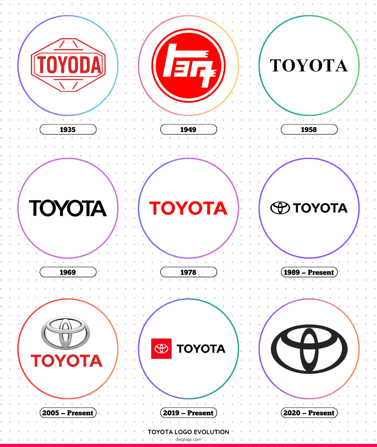
Toyota is one of the most recognized automobile brands worldwide, and its logo has undergone several changes since the company’s inception. Each modification in Toyota’s emblem represents a step forward in its branding, aligning with the company’s growth and global expansion.
The Evolution of the Toyota Logo
1935

Toyota’s first logo featured the brand name in a traditional Japanese kanji script, written as “Toyoda.” The company, originally named Toyoda Automatic Loom Works, focused on manufacturing automatic looms before venturing into automobiles.
This early logo emphasized the company’s heritage and Japanese roots.
1949

By 1949, Toyota introduced a new logo featuring the brand name in Latin script. This was a strategic move to make the brand more recognizable in international markets.
The transition from “Toyoda” to “Toyota” was made because the latter was phonetically simpler and required fewer strokes in the Japanese katakana script.
1958

As Toyota expanded globally, a new logo was introduced in 1958. It retained the bold “Toyota” wordmark but refined the font to appear more modern and sophisticated. This logo accompanied Toyota’s first exports to the United States and other international markets, marking the beginning of the brand’s worldwide expansion.
1969

To align with modern design trends, Toyota updated its logo in 1969 with a sleeker and more uniform typeface. The letters were slightly elongated, giving the logo a refined and futuristic look. This update reflected Toyota’s growing dominance in the automotive sector and its commitment to innovation.
1978
In 1978, Toyota made minor refinements to the typeface, making the letters bolder and more defined. The design emphasized strength and stability, aligning with Toyota’s increasing reputation for reliability and quality.
This version of the logo remained in use for over a decade, solidifying Toyota’s presence as a global automotive leader.
1989 – Present

One of Toyota’s most significant branding milestones came in 1989 with the introduction of the three-oval logo. This emblem featured three overlapping ovals, each with symbolic meaning:
- The two inner ovals form a “T,” representing Toyota.
- The outer oval signifies the brand’s global reach and expansion.
- The combination of ovals symbolizes the harmony between the company and its customers.
This design provided Toyota with a distinct and timeless visual identity, making it one of the most recognizable logos in the automotive industry.
2005 – Present

In 2005, Toyota refined the emblem by adopting a monochrome, silver-toned version. This change added a modern, premium feel to the logo, aligning with Toyota’s advancements in automotive technology and luxury vehicle offerings. This version remains widely used across Toyota’s branding materials.
2019 – Present

As minimalist design trends gained popularity, Toyota introduced a simplified version of its three-oval logo in 2019. This version removed the wordmark, leaving only the emblem.
The decision reflected a shift towards digital-first branding, ensuring clarity and recognition across online and mobile platforms.
2020 – Present

Following the global trend of flat and digital-friendly branding, Toyota unveiled a 2D, monochrome version of its logo in 2020. The flat design enhances legibility on digital screens, ensuring consistency across all marketing channels.
This update aligns with Toyota’s focus on digital transformation and the future of mobility.
FAQ’s
1. What does the Toyota logo symbolize?
The three-oval design represents the unity of customers and the company, as well as Toyota’s global presence. The inner ovals form a “T” for Toyota, while the outer oval symbolizes the world embracing Toyota.
2. Why did Toyota change its name from Toyoda to Toyota?
The change was made for linguistic and branding reasons. “Toyota” is easier to pronounce and write in Japanese and has a luckier number of strokes in Kanji, aligning with Japanese cultural beliefs.
3. When was the current Toyota logo introduced?
The three-oval logo was introduced in 1989 and has undergone refinements in 2005, 2019, and 2020.
4. Why did Toyota adopt a flat logo in 2020?
The shift to a flat logo was influenced by digital branding trends, ensuring better visibility across digital platforms such as websites and mobile apps.
5. How does Toyota’s logo compare to other car brands?
Toyota’s logo is one of the most recognizable in the industry, similar to brands like Mercedes-Benz, BMW, and Honda. The three-oval design distinguishes Toyota as a brand that values tradition, innovation, and global reach.
Final thoughts,
The evolution of Toyota’s logo showcases the brand’s journey from a local textile manufacturer to a global automotive powerhouse. Each logo change reflects Toyota’s commitment to innovation, quality, and customer satisfaction.
As Toyota continues to lead in automotive technology, sustainability, and mobility solutions, its iconic logo remains a symbol of reliability and excellence.
Reference: [1]

