The Toronto Blue Jays franchise, established in 1977, possesses one of the most recognizable and, at times, polarizing visual identities in Major League Baseball. Over nearly five decades, the team’s emblem has undergone six distinct iterations, each reflecting a shift in design trends, team ownership, or an intentional return to tradition.
Tracing the trajectory of the Blue Jays logo is a study in Canadian sports branding, from its classic, patriotic origins to its modern, simplified forms and its eventual, celebrated homecoming. The logo’s evolution is defined by consistency in its core subject—the blue jay bird—but significant variation in its color palettes, fonts, and overall graphical style.
The Evolution of the Blue Jay: A Deep Dive into Toronto Blue Jays Logo History
![]()
1977 – 1996
The original Toronto Blue Jays logo, unveiled for the team’s inaugural season in 1977, remains a touchstone of Canadian baseball history, indelibly linked to the franchise’s first World Series championships. This emblem was a masterful combination of classic baseball aesthetics and national symbolism.
It featured a stylized blue jay head set against a circular baseball background. The bird’s head, rendered primarily in royal blue, was detailed with a white outline and an eye detail. The most crucial element was the lettering: the words “TORONTO BLUE JAYS” were positioned around the baseball in a bold, sans-serif, slightly rounded font, all colored red with a white outline.
The core color palette of Royal Blue, White, and Red firmly cemented the team’s Canadian identity, a direct homage to the national flag. The font choice was assertive, mirroring the era’s design, prioritizing clear, readable lettering over elaborate flourishes. This logo’s enduring appeal lies in its clean lines, patriotic color scheme, and immediate recognition as the symbol of the expansion team that grew into a dynasty.
1997 – 2002
Following the back-to-back World Series victories, the team’s visual identity underwent a dramatic and often controversial transformation. The 1997 logo shift saw the team abandon the classic circular, patriotic design for a more aggressive, stylized, and contemporary approach. The new logo featured a fierce, abstract blue jay head depicted in a profile view.
The palette was overhauled, moving away from royal blue and red towards a darker, deeper shade of navy blue accented by black, silver, and a diminished presence of red. The bird itself was more angular, almost metallic in appearance, fitting the late-90s trend toward edgy, often darker sports branding.
The accompanying wordmark, now simply “JAYS” on the primary cap and jersey, used a thick, angular, custom-designed serif font that conveyed a sense of strength, distinct from the rounded openness of the classic font. This era is a significant marker for its bold abandonment of the core Royal Blue and Red, a decision that would later be corrected.
2003
![]()
In 2003, the Toronto Blue Jays introduced a distinct secondary logo that centered on their current mascot, Ace. This emblem, which was used for only one season, featured an illustrated, cartoon-style depiction of the blue jay mascot. The design showed Ace dynamically wrapped around a large, simplified letter “T” (representing Toronto), while holding a white baseball accented with red stitching and a yellow bat.
Notably, the illustration included a small maple leaf tattoo on the mascot’s bicep, a clear and overt nod to the team’s Canadian identity and heritage. This specific logo iteration served as a brief, animated departure from the team’s primary, more aggressive branding of that era.
2004 – 2011
![]()
During this era, the team embraced a fierce and aggressive visual identity often referred to as the “angry bird” phase. In 2004, Toronto-based firm Brandid introduced a new Toronto Blue Jays logo featuring a three-dimensional, intense-looking Blue Jay placed to the left of the word “Jays.”
This redesign marked a major departure from tradition, eliminating both the maple leaf and the signature red accents. Instead, the logo adopted a metallic color palette of blue, gray, and white for a sleek, modern appearance. Additionally, the word “Blue” was dropped from the team’s official name, further emphasizing the bold transformation in branding.
2012 – 2019
Perhaps the most celebrated redesign occurred in 2012, marking a powerful return to the franchise’s roots. This overhaul was a clear, intentional tribute to the 1977-1996 logo, acknowledging the fan base’s desire for a classic look associated with the World Series years. The design returned to the circular baseball motif and the stylized, classic blue jay head.
Crucially, the Royal Blue, Red, and White color palette was fully reinstated, restoring the team’s patriotic connection to Canada. The font was also a deliberate throwback—a bold, rounded, classic sans-serif font, though subtly modernized in its execution.
The wordmark “TORONTO BLUE JAYS” was once again prominently displayed around the bird and baseball. This logo successfully merged the cherished elements of the past with a clean, contemporary execution, proving that classic design elements can be timeless.
2019 – Present
The current logo, adopted in 2019, represents a minor but important refinement of the successful 2012 design. While the overall look, structure, and color palette (Royal Blue, Red, and White) remain the same, the details were subtly sharpened. The bird’s design became slightly cleaner, and the font was updated.
The new typeface, while retaining the classic sans-serif style, is slightly more condensed and geometrically precise, offering a more contemporary feel. The primary change was often seen in the separate ‘Jays’ wordmark used on some secondary logos and jerseys, which adopted a cleaner, slightly streamlined version of the traditional font.
This logo solidifies the team’s visual identity as a modernized classic, confirming that the Royal Blue and Red is their permanent, enduring color scheme.
Toronto Blue Jays Color Codes: A Modern Palette
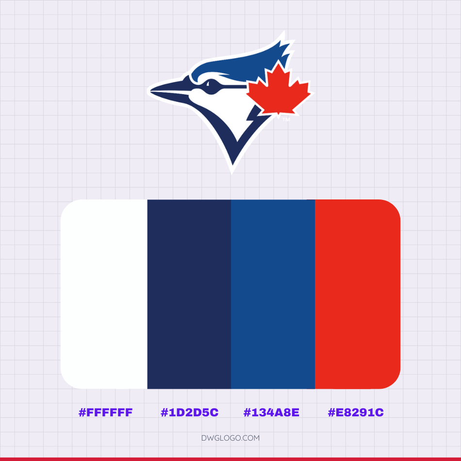
The Toronto Blue Jays’ current brand identity, rooted in the franchise’s classic, patriotic color scheme, is officially defined by four primary colors. The specific hexadecimal codes you provided—#ffffff, #1d2d5c, #134a8e, and #e8291c—represent the meticulously chosen palette that appears across the team’s modern logo, uniforms, and official merchandise.
This four-color palette successfully balances tradition (Royal Blue, Red, and White from the original 1977 look) with a modern depth (the use of Navy Blue), creating one of the most cohesive and geographically symbolic brand identities in Major League Baseball.
Toronto Blue Jays Cap insignia

FAQ’s
Which logo era is associated with the Blue Jays’ World Series wins?
The classic 1977–1996 logo is the one associated with the Blue Jays’ back-to-back World Series victories in 1992 and 1993.
Why did the Blue Jays initially drop the Royal Blue and Red?
The shift in 1997 was largely a reaction to sports design trends of the late 1990s, which favored darker, more aggressive, and often less colorful branding, leading to the adoption of Navy Blue, Black, and Silver/Teal.
What year did the Blue Jays begin playing?
The Toronto Blue Jays began playing in Major League Baseball (MLB) as an expansion team in 1977.
Why are they called the Blue Jays?
The name “Blue Jays” was chosen from over 4,000 fan suggestions in a “Name the Team” contest. The name is a nod to the bird of the same name and reflects Toronto’s long tradition of professional sports teams using the color blue (e.g., Maple Leafs, Argonauts).