The Starbucks logo, featuring the iconic Siren, has undergone a fascinating evolution, reflecting the company’s journey from a small Seattle coffee bean retailer to a global coffeehouse giant. Each redesign wasn’t just a simple facelift; it was a strategic move to align the brand’s visual identity with its expanding vision and market presence. The logo’s transformation from a rustic, detailed woodcut to a clean, minimalist emblem tells a compelling story of branding, growth, and adaptability.
The Siren’s Evolution: A Visual History
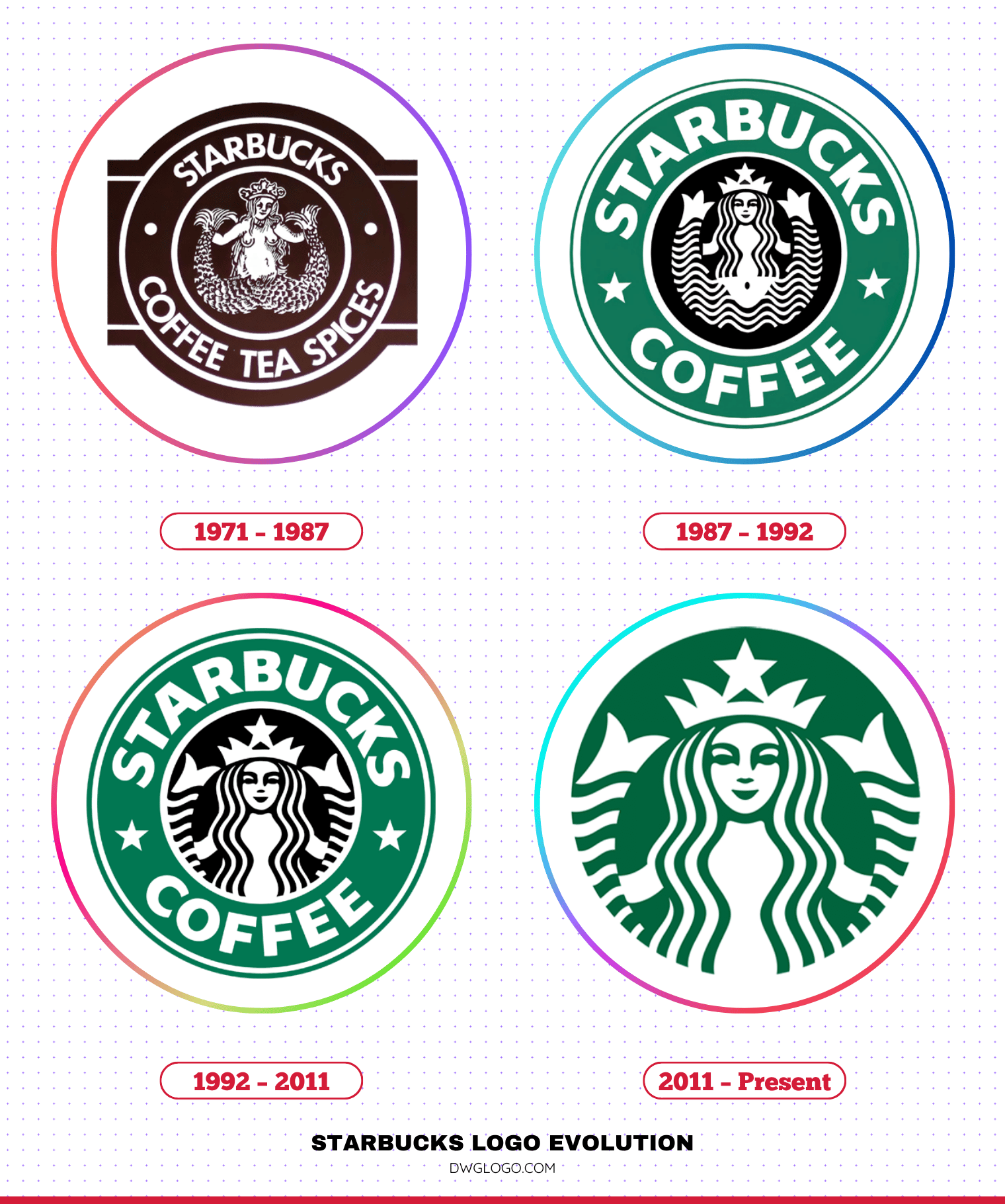
The Starbucks logo’s history is best understood by looking at its four major iterations. Each version builds upon the last, simplifying and modernizing the Siren to increase brand recognition and appeal to a broader audience.
1971 – 1987
The very first logo, designed by Terry Heckler, was a two-tailed Siren inspired by a 16th-century Norse woodcut. The design, in a rich brown color reminiscent of coffee beans, depicted a bare-breasted Siren with her two tails spread apart. The full name, “Starbucks Coffee, Tea, and Spices,” encircled her in a rustic, sans-serif font. This logo captured the brand’s nautical roots and its focus on the exotic nature of coffee, tea, and spices, evoking the allure of the sea.
1987 – 1992
A major shift occurred in 1987 when Howard Schultz acquired the company. The logo was redesigned to reflect the brand’s new direction as a coffeehouse. The most notable change was the color: the brown was replaced with a vibrant green, symbolizing freshness, growth, and prosperity.
The Siren was also made more modest, with her long, flowing hair covering her chest. The words “Tea and Spices” were removed, and the name was simplified to “Starbucks Coffee,” flanked by two stars. The font became a bolder, more corporate sans-serif typeface, reflecting the company’s ambition for wider appeal.
1992 – 2011

As Starbucks experienced rapid global expansion, the logo was refined to be more recognizable and scalable. The 1992 version was a subtle but important change, cropping in on the Siren’s face and upper body. Her navel, visible in the previous design, was removed, and her twin tails were stylized to be a part of the circular design.
The green and white color scheme remained, but the black accents were simplified. This version’s focus on the Siren’s face made her the clear centerpiece of the brand, cementing her status as a global icon. The typography also became slightly wider and more refined.
2011 – Present
For its 40th anniversary, Starbucks unveiled the current, minimalist logo. The most significant change was the removal of the text entirely. The iconic Siren, now in a simplified, all-green design, stands on her own.
This bold move signaled the company’s confidence in its brand’s global recognition. The Siren’s face was also made slightly asymmetrical to give her a more human, less-perfect look. This iteration reflects Starbucks’ evolution beyond a coffee-only brand to a more encompassing lifestyle brand. The streamlined, clean design is highly adaptable for digital platforms, merchandise, and a variety of products.
Font and Color
Font
While the wordmark has been removed from the primary logo, Starbucks uses a custom sans-serif font family in its branding called Sodo Sans. It’s a clean, modern, and versatile font that aligns with the brand’s current aesthetic.
Color
The current primary colors are Starbucks Green (#00643c) and white. The green symbolizes growth, nature, and freshness, while the white provides a clean, modern contrast. The green is a powerful brand identifier, instantly recognizable even without the Siren herself.
FAQ’s
Who designed the Starbucks logo?
The original 1971 logo was designed by artist and designer Terry Heckler. The subsequent redesigns were a collaborative effort, often involving Heckler and the company’s in-house design team, along with brand consultancy firms like Lippincott for the 2011 version.
What is the meaning behind the Starbucks logo?
The Siren, a mythical creature from Greek mythology, was chosen to represent the allure and mystique of coffee. Her siren song, in this context, is the irresistible aroma and experience of Starbucks coffee that draws people in.
What is the history and meaning behind the Siren on the Starbucks logo?
The story of the Siren goes back to the very beginning of Starbucks. In 1971, the company’s founders were looking for a name and a logo that would capture the seafaring history of coffee and the strong port city roots of their hometown, Seattle. They were inspired by Herman Melville’s classic novel, Moby-Dick, and the name “Starbuck,” the first mate on the ship Pequod.
To accompany this nautical theme, they sought a logo that would evoke the allure of the sea. They commissioned artist Terry Heckler, who, while scouring old marine books, stumbled upon a 16th-century Norse woodcut of a twin-tailed mermaid, or “Siren.” In Greek mythology, Sirens were mythical creatures known for their enchanting songs that would lure sailors to their doom.
Final thoughts,
The Starbucks logo evolution is a remarkable example of how a brand can modernize while staying true to its roots. From the intricate brown Siren of 1971 to the minimalist green emblem used today, each redesign reflects the company’s growth, confidence, and global influence. The Siren has always remained at the heart of the logo, symbolizing allure, mystery, and the irresistible draw of coffee, while the shift from brown to green established a signature color now instantly recognized worldwide.
The removal of text in 2011 marked a bold statement, proving that Starbucks had become iconic enough to be identified solely by its imagery. By carefully balancing tradition with innovation, Starbucks has built a timeless identity that resonates across cultures and generations. The Starbucks logo is more than just a symbol—it’s a representation of quality, community, and the enduring power of brand storytelling.


