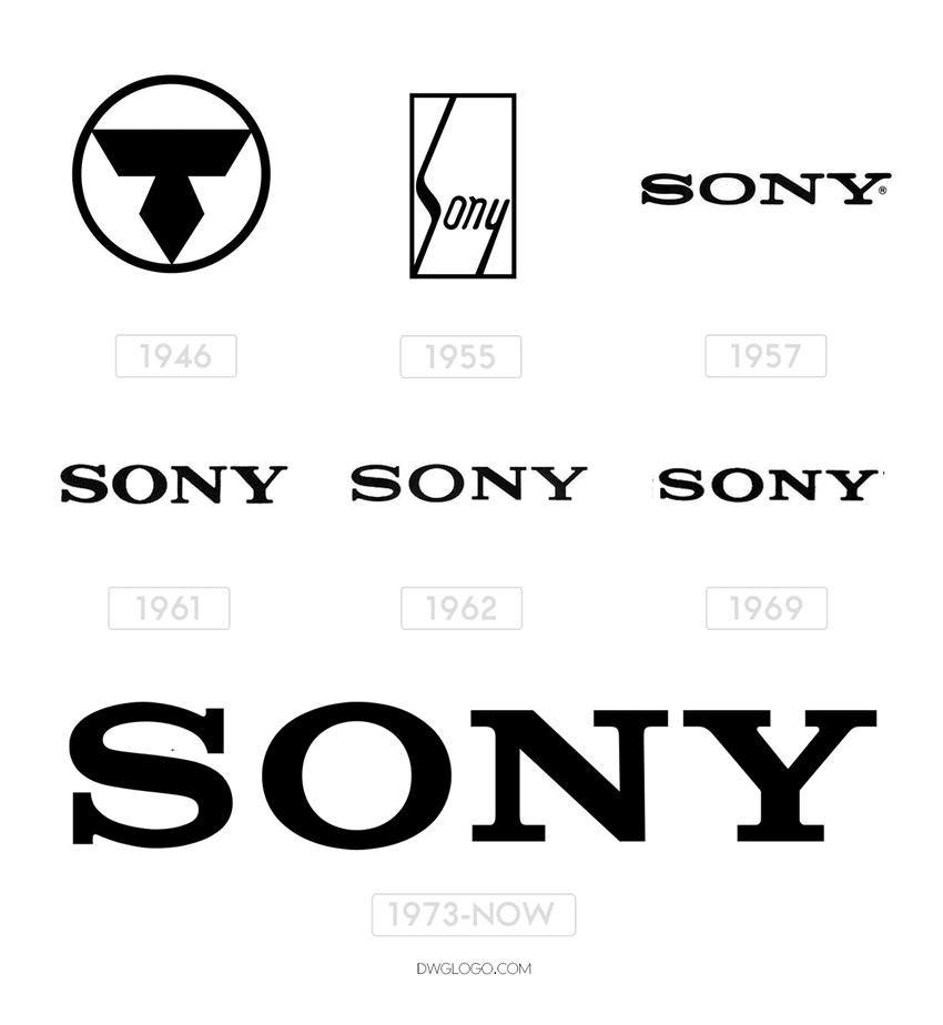
Sony is a Japanese technology conglomerate created in 1946 by Akio Morita and Masaru Ibuka. It is one of the largest manufacturers of electronics and multimedia. Provides financial services, records, manufactures digital devices and household appliances.
The Company’s other businesses include music, pictures, computer entertainment, and online businesses. Sony Corporation ticker symbol traded as TYO: 6758 and NYSE: SNE.
The group consists of Sony Corporation, Sony Pictures, Sony Mobile, Sony Interactive Entertainment, Sony Music, Sony/ATV Music Publishing, Sony Financial Holdings, and others.
Meaning and history
The Sony logo is one of the most recognizable. It represents the name of the company, formed from the Latin “sonus” (“sound”). There is also a connection to the word “son”, which is used in Japanese culture to refer to young people with an innovative vision of things.
1946 – 1955

The company was not always called Sony. In 1946, it was known as Tokyo Tsushin Kogyo, so the letter “T” took center stage on its emblem. The symbol consisted of an inverted isosceles trapezoid and a rhombus, and was located within the black ring.
1955 – 1957
In 1955, the Sony brand appeared. His brand was different from the main logo. It was the cursive inscription ‘Sony’, placed in a rectangular frame. The elongated “S” and “y” gave it a special touch.
1957 – 1961
In 1958, the Tokyo Tsushin Kogyo group of companies was renamed Sony Corporation. Part of the rebrand was the logo change. The new version was invented by designer Yasuo Kuroki, who worked on the company’s permanent staff. He removed the quadrangle and left only the inscription “Sony.” To emphasize its importance, I chose a strict bold font with large serifs.
1961 – 1973
Norio Ohga, the former president of the company, criticized the existing logo and suggested improving it. The head of Akio Morita’s design office agreed and appointed Ohga for his position. Under his leadership, Yasuo Kuroki revised the trademark and made the letter “S” slightly larger than “O”, “N” and “Y” so that it does not appear small due to the visual effect. Subsequently, the logo changed several more times until the final version appeared. All versions differed only in bold letters and the font changed slightly.
1973 – Present
In 1973, the designer created an emblem that suited the demanding Norio Ohga. The person in charge considered that it perfectly reflects the corporate image of the company. The use of black on a white background symbolizes integrity and elegance. The font resembles Clarendon with minor modifications.
The company tried several times to change the brand, even organizing a contest in honor of its 35th anniversary. It received nearly 30,000 applications, but none of the jobs had the honor of becoming the Sony logo.
Font
The closest typeface is called Clarendon. However the Sony insignia does not just copy it, the characters have been slightly modified.
Color
The simple combination of black and white featured in the Sony logo looks clean, elegant and never goes out of fashion.
Bonus


