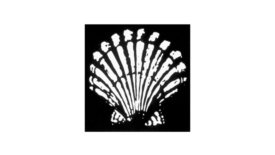
Both the word “Shell” and the pecten symbol may have been suggested to Marcus Samuel and Company (original founders) by another interested party. A certain Mr Graham (of apparent Scottish origins) imported Samuel’s kerosene into India and sold it as ‘Graham’s Oil’. He became a director of The Shell Transport and Trading Company, and there is some evidence that the Shell emblem was taken from his family coat of arms.
Meaning and history
For more than 100 years the word “Shell”, the shell of its emblem and its red and yellow badge have identified Shell as a brand, promoting its corporate reputation. These symbols are not only linked to the quality of their products and services, but have also become a visible representation of the value of their activities and of all their companies around the world.
The word “Shell” first appeared in 1891, as the brand of kerosene that Marcus Samuel and Company shipped to the Far East. This small London company was originally dedicated to antiques, curios and oriental seashells. These became so popular – the Victorians used them to decorate boxes – that their import soon formed a profitable base for the company that took advantage of its trade and export from the East.
The word was elevated to corporate status in 1897, when Samuel established the “Shell” Transport and Trading Company. The first logo (1901) was intended to represent a mussel shell, but since 1904 a scallop shell was introduced to offer a corporate visual manifestation.
1900–1904
1904–1909
The choice of a shell as an emblem was not a surprise because that is the company’s own name in English. In addition, each of Samuel’s cisterns that carried kerosene to the Far East received the name of a different seashell. But why was the scallop specifically chosen as the company’s symbol in 1904? It was certainly not the simplest way to reproduce in print.
Both the word “Shell” and the shell symbol could be suggested to Samuel and Company by another interested party. A certain Mr. Graham, who imported Samuel’s kerosene into India and sold it as “Graham’s Oil” invested capital and became director of The “Shell” Transport and Tranding Company. There is some evidence to show that the Shell emblem was taken from his family coat of arms.
1909–1930
The “Pilgrim’s Shell” was assumed by the Graham Family after their ancestors made the Pilgrimage to Santiago de Compostela, in Spain. Whatever its origins, the truth is that the original design was a reasonably faithful reproduction of the scallop.
In 1907 the Royal Dutch Petroleum Company and “Shell” Transport and Trading formed an alliance unifying the brand name that would be abbreviated to “Shell” and the emblem (the shell) of the new Royal Dutch / Shell Group. And so it has remained ever since.
1930–1948
1948–1955
1955–1971
The shape of the Shell emblem has been gradually changing over the years, in line with the evolution of graphic design trends. The current emblem, created by renowned designer Raymond Loewy, was introduced in 1971 and after more than thirty years endures the passage of time as one of the most recognized symbols in the world.
1971 – Present

Why red and yellow?
The exact origins of the red and yellow shell are not easy to define. It is true that the first kerosene tin containers that Samuel and Company sent to the Far East were painted red. But the link could once again be in Spain.
In 1915, when Shell Company of California built their first service stations, they had to compete with other companies. Bright colors were chosen as a solution, but you could only search among colors that did not offend Californians. Due to the important Spanish footprint in Californian lands, red and yellow would finally be the chosen colors.
Like the emblem, the authentic colors had to be changed over the years, especially in 1995, with the introduction of new bright, fresh colors: Shell’s red and yellow were introduced to launch the visual identity of the sale. Shell Retail.


