The Seattle Seahawks logo has undergone a fascinating evolution, reflecting the team’s identity and the aesthetic sensibilities of its era. From its inception rooted in Pacific Northwest Indigenous art to its current sleek and modern iteration, the emblem has consistently symbolized a ferocious predator.
The logo’s journey is a visual narrative of change, yet it has always maintained a connection to the team’s home region and its fierce, uncompromising spirit.
Seattle Seahawks Logo Evolution
1976 – 2001
![]()
The inaugural Seattle Seahawks logo, unveiled in 1976, was a stylized osprey head, deeply inspired by the art of the Kwakwakaʼwakw people of the Pacific Northwest. Local artist Marvin Oliver, a Quinault and Isleta-Pueblo artist, was instrumental in its design. This initial emblem was a departure from typical sports logos of the time, featuring bold lines, a distinctive profile, and an aggressive frown.
Its colors were a vibrant royal blue and emerald green, chosen to represent the Pacific Ocean and the lush forests of Washington State. This design, which would remain largely unchanged for 25 years, was a powerful visual nod to the region’s rich cultural heritage. The original wordmark, or team name lettering, used a classic serif font, simple and straightforward.
2002 – 2011
![]()
In 2002, coinciding with the team’s move to the NFC West and the opening of a new stadium, the Seahawks introduced a modernized logo. This significant redesign was a collaborative effort by the NFL Properties in-house design team. While maintaining the core concept of the Kwakwakaʼwakw-inspired osprey, the new logo presented a leaner, sharper, and more aggressive version. The beak was more pronounced, and the eye, now a vibrant lime green, faced forward with a focused scowl rather than directly at the viewer.
The color palette also shifted from bright to more subdued tones, introducing a darker navy blue and a lighter pale blue alongside the vibrant lime green. The accompanying wordmark evolved as well, featuring a more dynamic serif font with sharp, angular serifs that mirrored the intensity of the new logo.
2012 – Present
![]()
The most recent evolution of the Seahawks’ brand identity occurred in 2012 with Nike’s takeover as the NFL’s uniform supplier. The logo itself underwent only subtle modifications but was now complemented by a complete overhaul of the uniforms and color scheme.
The primary colors were refined to a deep College Navy, a striking Action Green, and a new accent color, Wolf Grey. The logo remained the same lean and aggressive hawk from 2002, but its new color scheme, especially the use of Wolf Grey in the feathered crest, gave it a more contemporary and intimidating feel.
The current font, a custom, aggressive sans-serif typeface, complements the logo’s sharp angles and dynamic energy, creating a cohesive and powerful brand identity that has become synonymous with the team’s recent on-field success. This design solidified the Seahawks’ position as a team with a visually distinct and modern aesthetic.
Seattle Seahawks Color Codes: A Modern Palette
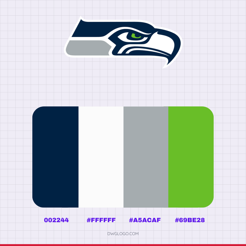
The Seattle Seahawks’ official color scheme is a modern and striking palette. The primary color, College Navy (#002244), forms the logo’s dark foundation, evoking the Pacific Ocean. This is brilliantly contrasted with Action Green (#69be28), which symbolizes the region’s lush forests and adds a vibrant energy.
The subtle accent of Wolf Grey (#a5acaf) provides a contemporary, metallic feel, while pure white (#ffffff) is used for crisp outlines and lettering. Together, these colors create a cohesive and powerful visual identity that connects the team to its Pacific Northwest roots while maintaining a sleek, modern aesthetic.
Final thoughts,
The Seattle Seahawks logo evolution is more than just a series of visual changes; it is a testament to the team’s ability to adapt while staying true to its core identity. From its culturally significant beginnings inspired by Pacific Northwest Indigenous art, the logo has transitioned through different eras, each iteration a reflection of a new chapter in the team’s history.
The 1976 design was a respectful homage, the 2002 version a sharp modernization, and the current logo a bold, aggressive statement of a winning franchise. Ultimately, the Seattle Seahawks logo, in all its forms, has consistently embodied a ferocious and distinctive predator, a powerful symbol for a team and its passionate fanbase.
The journey of the logo, from its cultural roots to its modern, high-tech aesthetic, perfectly encapsulates the spirit of a franchise that honors its heritage while always looking to the future.