The San Francisco 49ers franchise, named after the prospectors of the 1849 California Gold Rush, has a rich history that is reflected in the evolution of its logo. From its inception, the team’s visual identity has undergone several significant changes, each one a snapshot of a different era in football history. The logo’s transformation from a whimsical prospector to the iconic interlocking “SF” is a fascinating journey through time, design, and branding.
The Evolution of the San Francisco 49ers Logo
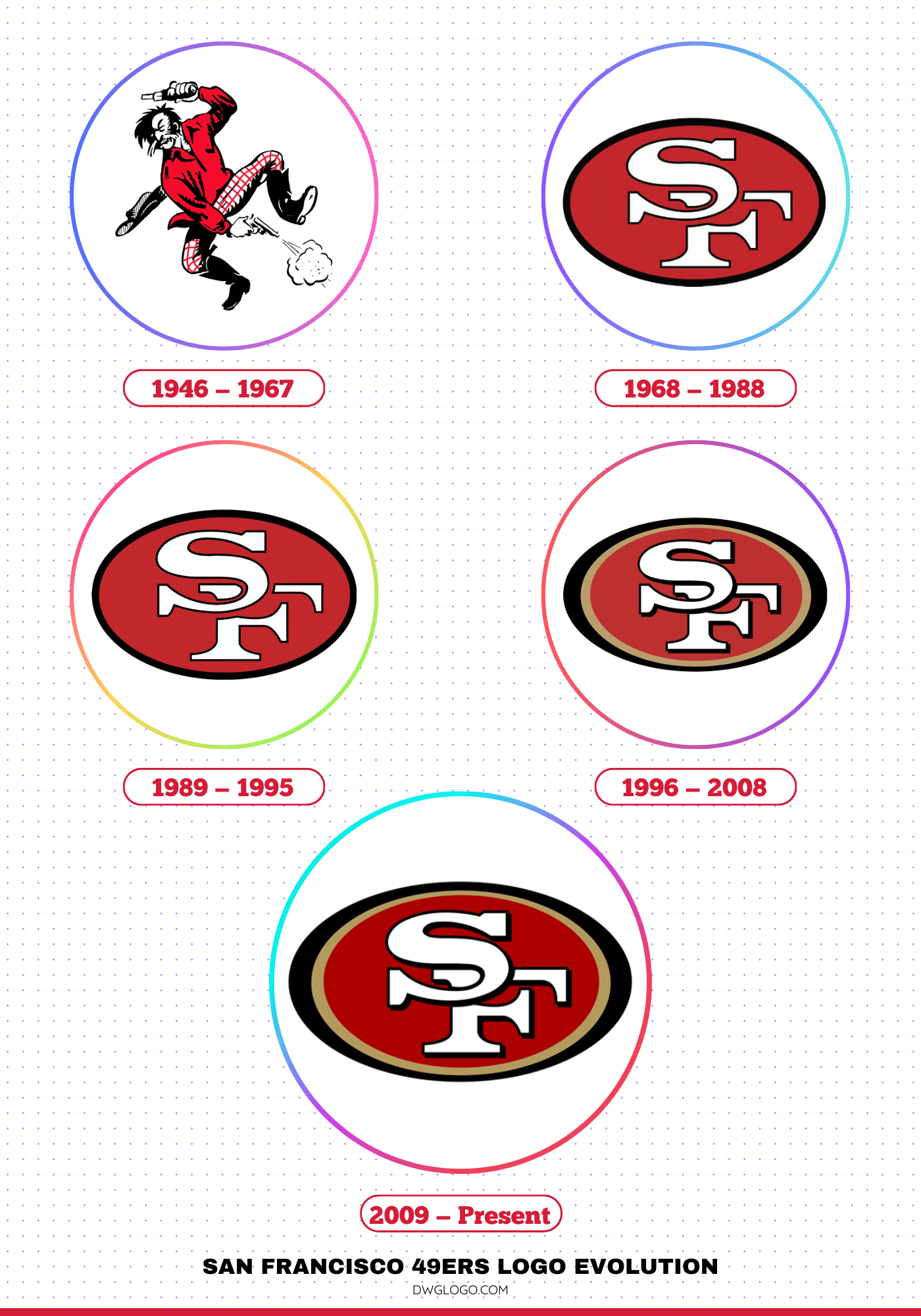
1946 – 1967
The inaugural 1946 logo was a tribute to the team’s namesake, featuring a cartoonish prospector with a red flannel shirt and a gold pan, joyfully firing two pistols. This original logo encapsulated the adventurous spirit of the Gold Rush, a period of immense ambition and fortune-seeking.
The design was more illustrative than a modern corporate logo, reflecting the common design aesthetics of the era’s sports teams. For over two decades, this prospector, a symbol of determination and the quest for gold, served as the primary visual representation of the team. This initial design was bold and expressive, setting a foundation that would be refined over the years while always maintaining a connection to the team’s roots.
1968 – 1988
In 1968, the 49ers adopted a more streamlined and modern logo, a change that coincided with the broader shift in sports branding toward more stylized, typographic emblems. The new logo featured a white oval with a red outer ring and the bold, iconic “SF” initials in the center. The “S” and “F” were in gold, with a black outline, and the “SF” was surrounded by a gold outline of a football, symbolizing the team’s sport.
This new emblem was a departure from the whimsical prospector, signaling a more professional and serious identity. This era saw the rise of the 49ers as a dynasty, and the logo became synonymous with the team’s legendary success, particularly their four Super Bowl victories in the 1980s. This design laid the groundwork for the future evolution of the team’s logo, establishing the interlocking “SF” as the central element of their identity.
1989 – 1995
The 1989 logo update was a subtle but significant refinement of the 1968 design. The color palette was adjusted to a deeper red and a richer gold, and the lettering was slightly tweaked. The “SF” remained the focal point, but the football outline was removed, and the oval was simplified.
This design was cleaner and more polished, reflecting the high-stakes, professional nature of the team’s ongoing dominance. This logo’s longevity, albeit for a shorter period, is a testament to the strength of the “SF” mark. It was worn by a team that continued its winning ways, capturing another Super Bowl title in 1994 and solidifying its status as a league powerhouse.
1996 – 2008
The 1996 logo change was a major one, representing a return to a more traditional, classic aesthetic while also introducing a new, brighter color scheme. The team brought back a version of the 1968 interlocking “SF”, but with a few key differences. The colors were brightened, featuring a vibrant red and a bold gold.
The “SF” was given a white outline, making it pop against the red oval background. This design was a modernization of the fan-favorite 1968 logo, successfully bridging the gap between the team’s celebrated past and its contemporary identity. The color adjustments were intended to provide a fresh, dynamic look for the franchise as it headed into the 21st century.
2009 – Present
The most recent logo change, implemented in 2009, was less of a redesign and more of a subtle refinement of the 1996 version. The core elements remained the same: the red oval with the interlocking “SF” inside. The most notable change was a slight darkening of the red and a more metallic, saturated gold.
The font of the “SF” was also minimally adjusted for better legibility and a more robust appearance. This current logo is a polished version of the classic design, maintaining a strong connection to the team’s history while feeling contemporary and sharp. It’s a testament to the timeless appeal of the interlocking “SF” that has become a symbol of the 49ers franchise.
San Francisco 49ers Color Codes
The team’s official colors are 49ers Red (#a90201) and 49ers Gold (#b2985c). These colors are deeply ingrained in the team’s identity. The red symbolizes passion, power, and courage, while the gold represents the team’s gold-rush heritage and the “gold standard” of success they’ve pursued.
Accompanying these primary colors are black (#000000) and white (#ffffff), used for accents, outlines, and detailing on the logos and uniforms. These specific color codes ensure consistency across all branding and merchandise, from jerseys to stadium banners.
FAQ’s
Why is the team called the “49ers”?
The team’s name, the San Francisco 49ers, is a tribute to the prospectors who came to Northern California during the 1849 Gold Rush. These pioneers, known as “forty-niners,” are a symbol of determination, adventure, and the pursuit of fortune, all of which are values the team aims to embody.
What does the “SF” in the logo stand for?
The “SF” stands for San Francisco, the city where the team is based. The interlocking design of the letters has become a strong and recognizable symbol for the franchise.
Final thoughts,
The San Francisco 49ers logo evolution is a compelling visual narrative of the franchise’s journey. From the whimsical prospector of its early days to the sleek, iconic interlocking “SF,” each iteration reflects a different era of the team’s history and branding.
This transformation from a charming caricature to a powerful, modern emblem mirrors the 49ers’ own rise from a fledgling franchise to a celebrated NFL dynasty. The current logo, a refined version of the classic, stands as a timeless symbol of tradition, success, and the enduring spirit of the Gold Rush, forever linking the team to its unique heritage.
