The Pfizer logo is more than just a symbol; it’s a visual chronicle of a company’s journey from a small chemical business in the mid-19th century to a global pharmaceutical powerhouse. Tracing its evolution from 1849 to the present day reveals a fascinating story of adaptation, strategic rebranding, and a consistent effort to project an image of trust, innovation, and scientific integrity. Each iteration of the logo reflects not only the changing design trends of its time but also Pfizer’s evolving corporate identity and its place in the world.
The Evolution of Pfizer’s Logo: A Visual Journey Through Time

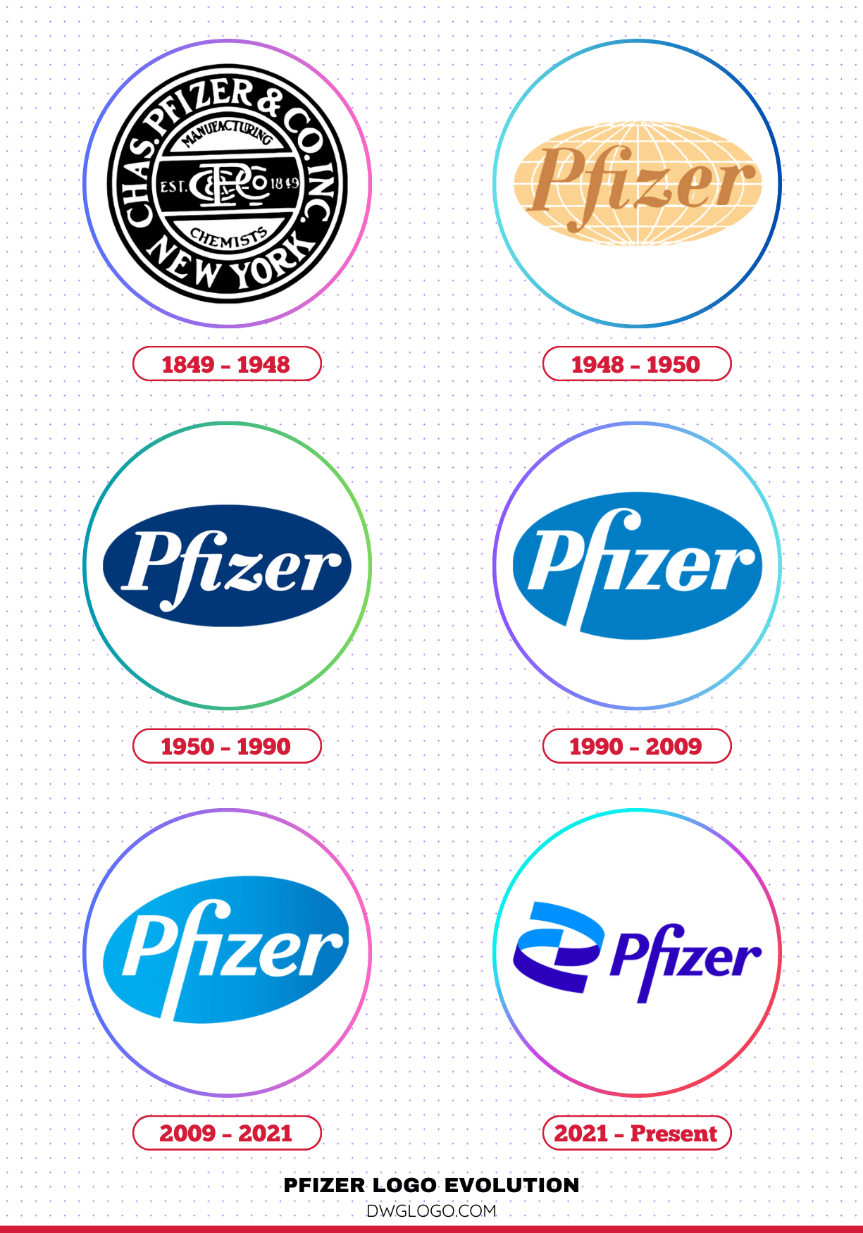
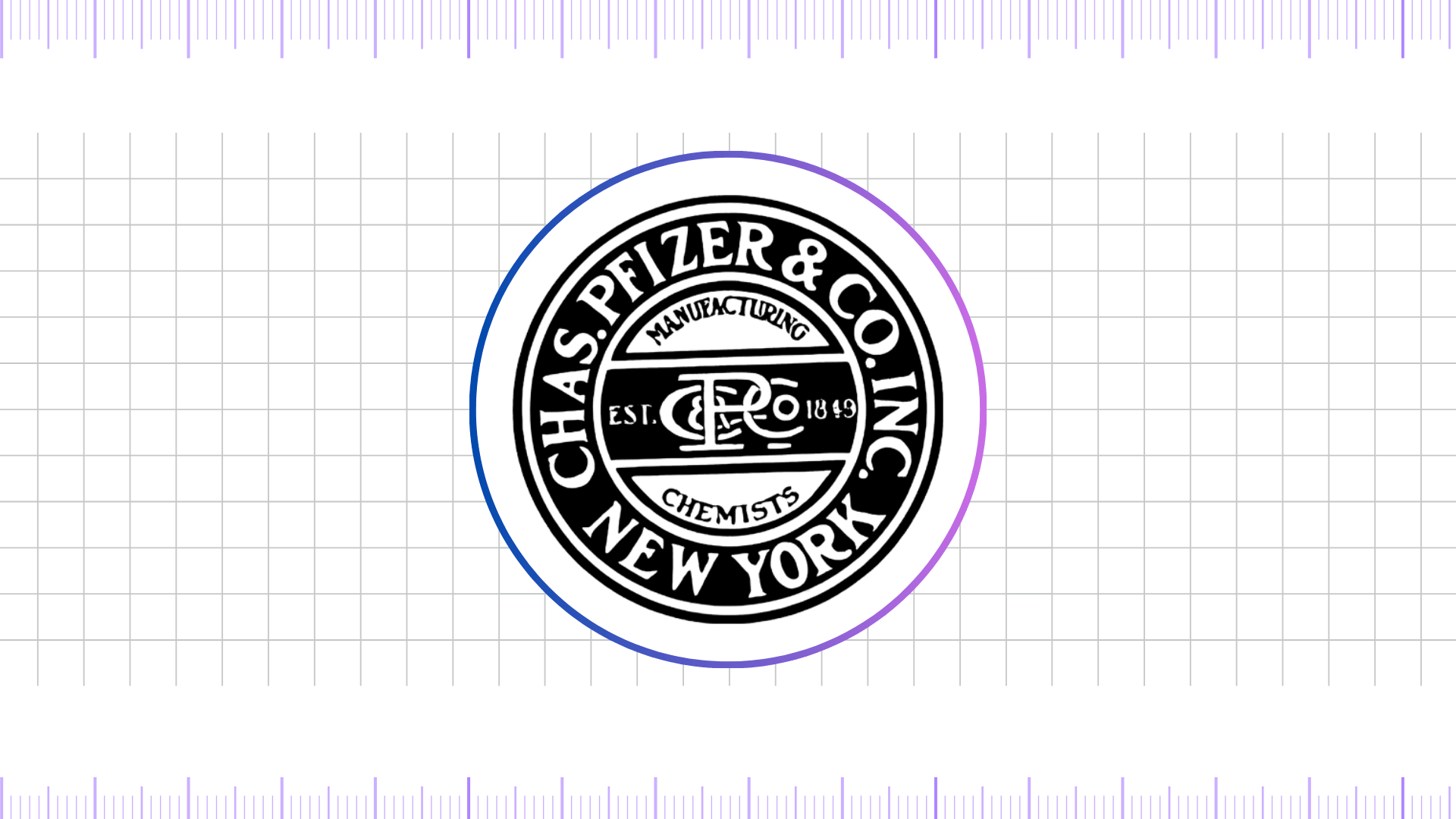
1849 – 1948
The earliest known Pfizer logo, used from its founding in 1849, was a testament to its origins as Charles Pfizer & Co., Inc. . This initial mark was primarily text-based, often featuring the company’s full name in a classic, ornate font. The design was typical of the era, emphasizing craftsmanship and tradition. The typography was often serif, giving it a formal, established feel.
The colors were simple, predominantly black or dark blue on a light background, which was standard for corporate documentation and product labeling at the time. This period’s logo was not a brand icon in the modern sense but a clear identifier of the company’s products. It conveyed a sense of reliability and a direct link to its founders, Charles Pfizer and Charles F. Erhart. The lack of a stylized symbol suggests a focus on the product’s quality and the company’s name rather than a conceptual brand identity.
1948 – 1950
The mid-20th century marked a period of significant growth for Pfizer, particularly with the mass production of penicillin. This era saw a subtle but important shift in the company’s visual identity. The logo from 1948 to 1950 was a transitional design, moving away from the purely ornate text of the past. While still featuring the company name prominently, it began to incorporate a slightly more modern aesthetic. The font became cleaner and less decorative, signaling a move towards a more streamlined, industrial look.
The use of a simple, sans-serif font in some applications hinted at a forward-looking company, no longer solely defined by its historical roots. This two-year period’s logo reflected Pfizer’s burgeoning role in modern medicine and its expansion beyond fine chemicals. The colors remained conservative, typically monochrome, but the design’s simplicity was a clear break from the 19th-century aesthetic.
1950 – 1990
The logo introduced in 1950 became one of Pfizer’s most enduring and recognizable symbols. This design, often referred to as the “shield logo,” featured the name “Pfizer” in a bold, sans-serif font enclosed within a stylized shield shape. . The shield was a powerful symbol, representing protection, strength, and security—qualities essential for a pharmaceutical company dedicated to health and safety. The use of the color blue became a defining characteristic during this period.
Blue is universally associated with trust, stability, and professionalism, making it an ideal choice for a healthcare brand. This logo was a cornerstone of Pfizer’s identity for four decades, seeing the company through monumental scientific breakthroughs, including the development of groundbreaking drugs. The clear, legible typography and the strong, iconic shield shape made it instantly recognizable on product packaging, corporate materials, and advertisements worldwide. It projected an image of a reliable, trusted, and scientifically advanced organization.
1990 – 2009
As the world entered a new era of globalization and digital communication, Pfizer’s logo underwent another significant refresh in 1990. The shield was streamlined and refined, and the font was updated to a more contemporary style. The shield’s lines became cleaner and more elegant, and the typography was a sleek, bold sans-serif, often a custom font. The use of a richer, more vibrant blue became standard. This version of the logo was a response to the need for a modern, global brand identity that would resonate in a competitive marketplace. It maintained the trust and heritage of the shield but presented it in a way that felt current and dynamic.
This period saw Pfizer’s rise to an even more prominent position in the pharmaceutical industry, and the logo reflected this status. It was a perfect blend of heritage and modernity, communicating the company’s long-standing credibility while signaling its forward-thinking approach. The font was specifically designed to be highly legible and impactful, suitable for a wide range of applications from small pill bottles to large corporate signage.
2009 – 2021
In 2009, Pfizer’s logo was slightly refined, representing a more polished and technologically advanced version of the previous design. The main change was a subtle gradient effect applied to the blue of the shield, giving it a more three-dimensional, glowing appearance. The font was also fine-tuned, becoming even more modern and minimalist. This logo was designed for the digital age, where a flat, clean design might not always be the most engaging.
The subtle gradient and sheen gave it a sense of depth and innovation, suggesting a company that was at the cutting edge of scientific discovery. . The core elements—the name “Pfizer” and the shield—remained unchanged, reinforcing the brand’s continuity and reliability. This version of the logo served the company well for over a decade, through periods of significant mergers and acquisitions, and as it faced new challenges and opportunities in the global healthcare landscape.
2021 – Present
The most radical and transformative change to the Pfizer logo occurred in 2021. The iconic shield was completely replaced by a new mark: a swirling helix shape, often depicted in a gradient of two shades of blue. The name “Pfizer” is written in a new, custom sans-serif font. . This dramatic redesign was a deliberate move to signal a fundamental shift in the company’s identity.
The new logo is meant to symbolize Pfizer’s evolution from a traditional pharmaceutical company to one focused on cutting-edge science and a more dynamic, digital-first approach. The helix represents a key building block of life and medicine, such as DNA and RNA, directly linking the brand to the core of biological science. The swirling motion of the helix suggests momentum, innovation, and the constant search for new breakthroughs.
The two shades of blue create a sense of depth and energy. This logo represents a new chapter for Pfizer, one defined by its commitment to bold scientific breakthroughs and its active role in shaping the future of medicine.
FAQ’s
What role did John Clark and Amy Globus, with Sabri Akin play in the creation of the modern Pfizer logo?
John Clark and Amy Globus, along with designer Sabri Akin, played a central role in shaping Pfizer’s most recent logo, unveiled in 2021. The redesign was executed in partnership with the branding agency Team, where Clark and Globus are creative directors. They worked closely with Akin, a New York–based designer, to move Pfizer away from the long-standing oval emblem and introduce a bold, modern identity.
Their contribution centered on reimagining Pfizer as not just a pharmaceutical manufacturer but a science-driven biotechnology leader. The team introduced the double-helix DNA symbol, reflecting Pfizer’s role in cutting-edge genetics and medical innovation. They also updated the typography to a modern sans-serif typeface and refined the dual shades of blue to symbolize trust, clarity, and forward-looking innovation.
In short, John Clark and Amy Globus directed the creative vision, while Sabri Akin crafted the visual execution, together producing a logo that emphasizes Pfizer’s future in science and biotechnology rather than only pharmaceuticals.
What colors are used in the Pfizer logo?
The primary color used throughout most of Pfizer’s modern history has been blue, a hue strongly tied to trust, stability, and professionalism. Over the years, the exact shades have varied, but the brand has consistently embraced blue as its core identity color.
In the current logo, Pfizer uses two distinct shades—#0190ff and #2b01be—to form a smooth gradient effect that conveys depth, innovation, and forward momentum. Supporting this palette, secondary colors such as white or lighter blues are often applied for accents, ensuring clarity and balance across branding and digital platforms.
Final thoughts,
The Pfizer logo has evolved significantly since the company’s founding in 1849, reflecting its growth from a small chemical business to a global pharmaceutical leader. The earliest logo featured ornate serif lettering, later replaced in 1948 by the iconic oval design that became Pfizer’s hallmark for over seven decades. Through the 1950s to 2000s, the logo underwent refinements in typography and color, with blue becoming the signature brand shade to symbolize trust and professionalism.


