The NVIDIA logo, a highly recognizable emblem within the technology sector, represents an evolving narrative of a company that transitioned from a specialized graphics chip manufacturer to a global leader in accelerated computing and artificial intelligence.
While the core visual theme of a stylized ‘eye’ and the color green have been constant, the logo’s two major iterations—the 1993-2006 version and the 2006-Present version—reflect significant shifts in brand identity, market positioning, and design sensibilities.
The Visual Evolution of NVIDIA: A Logo Analysis from 1993 to Today
![]()
1993 – 2006
![]()
The 1993–2006 logo established NVIDIA’s foundational visual identity. The symbol, often described as an “all-seeing eye” or an elliptical swirl, was immediately prominent. This icon, with its dual-tone structure of green and black/white, was designed to symbolize vision, foresight, and innovation—a direct connection to the company’s name, which is inspired by the Latin word videre meaning “to see or perceive,” and perhaps a nod to the concept of “Invidia,” or envy, with the choice of the color green.
The typeface used for the accompanying wordmark, “nVIDIA,” was a traditional serif font. This choice of a serif typeface generally suggests professionalism, heritage, and stability, aligning with the seriousness of a technology startup. The most distinctive feature of this wordmark was its unconventional capitalization: the “n” was lowercase and italicized, while the subsequent letters were uppercase.
This quirkiness injected a sense of creative individuality into the brand, signaling a company that did not conform entirely to corporate norms, yet the overall structure remained bold and legible. The original color palette featured a lighter shade of green alongside black and white, contributing to a graphic identity that was distinct but still rooted in the era’s design preferences.
2006 – Present
![]()
The 2006–Present logo introduced a sophisticated refinement, aligning the brand with a more modern, authoritative, and expansive identity. This revision coincided with NVIDIA’s growth beyond just gaming GPUs into areas like high-performance computing, CUDA architecture, and later, AI. The symbolic ‘eye’ retained its core shape but was significantly simplified and streamlined, adopting a more geometric and contemporary aesthetic.
Critically, the black element in the symbol was replaced with a darker shade of green, typically a rich Apple Green (Hex: #76b900, Pantone 376 C), alongside white. This consolidation of the color scheme made the logo cleaner, more impactful, and more versatile across different media. The wordmark underwent a complete overhaul in typography.
The traditional serif font was replaced by a bolder, customized, sans-serif typeface (related to typefaces like Handel Gothic or a custom NVIDIA Sans), often presented in black or a deep gray, though the primary logo uses the green and white scheme.
Sans-serif fonts are inherently modern, reflecting the technological precision and forward-thinking nature of the brand. Furthermore, the memorable, italicized, lowercase “n” was removed, resulting in a cleaner, all-uppercase “NVIDIA” wordmark in most applications. However, to maintain a touch of its unique heritage, some uses of the wordmark (especially its product names like “nForce”) retain a lowercase first letter for the product name following the uppercase “NVIDIA” corporate name.
The shift to a sans-serif, predominantly uppercase wordmark, paired with the refined green and white symbol, projected an image of a confident, established, and cutting-edge technology powerhouse ready to dominate future computational fields.
NVIDIA Color Codes: A Modern Palette
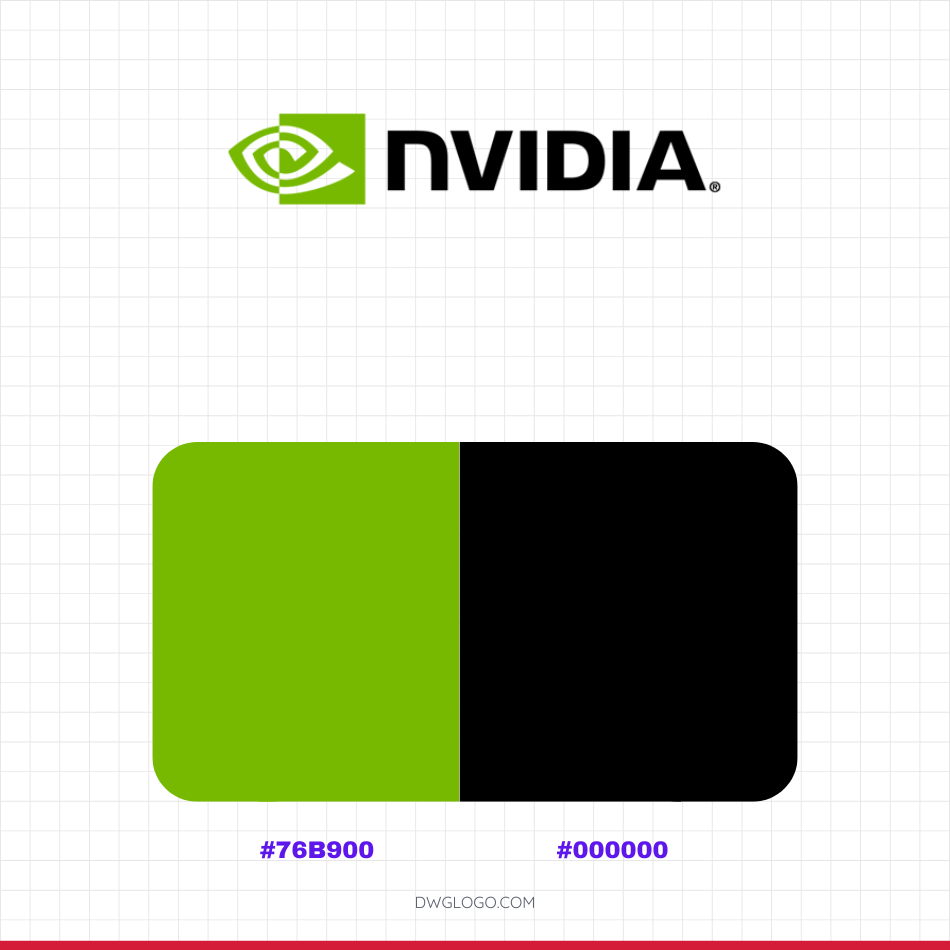
The official color codes most commonly associated with the current NVIDIA logo are #76B900 for the signature green and #000000 for black.
The green hue, often referred to as Apple Green or Limeade, is a cornerstone of the brand’s visual identity, symbolizing growth, innovation, and its origins which are linked to the concept of “envy” (Invidia). Black is used for the wordmark and as a strong contrasting element.
FAQ’s
What is the primary font used in the current NVIDIA logo (2006-Present)?
The current wordmark primarily uses a customized sans-serif typeface—a bold, clean style that communicates modernity and strength. While some sources link its origins to typefaces like Handel Gothic, the final version is a proprietary, customized logotype, sometimes referred to as NVIDIA Sans.
What do the colors in the NVIDIA logo represent?
The core color is green, which is chosen to symbolize growth, innovation, uniqueness, and vitality, and is historically linked to the concept of “envy” (Invidia) that inspired the name.
What is the meaning behind the ‘eye’ symbol?
The stylized, elliptical symbol, often called the “all-seeing eye,” represents vision, foresight, and the relentless pursuit of innovation. It also visually connects to the company’s name, which relates to the Latin word for ‘to see’.
Reference: [1]