The Knicks are one of only two original NBA teams still located in their founding city. They play at Madison Square Garden, an arena often dubbed “The Mecca of Basketball.” Over the decades, the team has seen highs—such as championship victories in 1970 and 1973—and lows, including playoff droughts and management changes. Despite fluctuations in success, the Knicks remain a beloved institution and one of the most valuable franchises in the NBA.
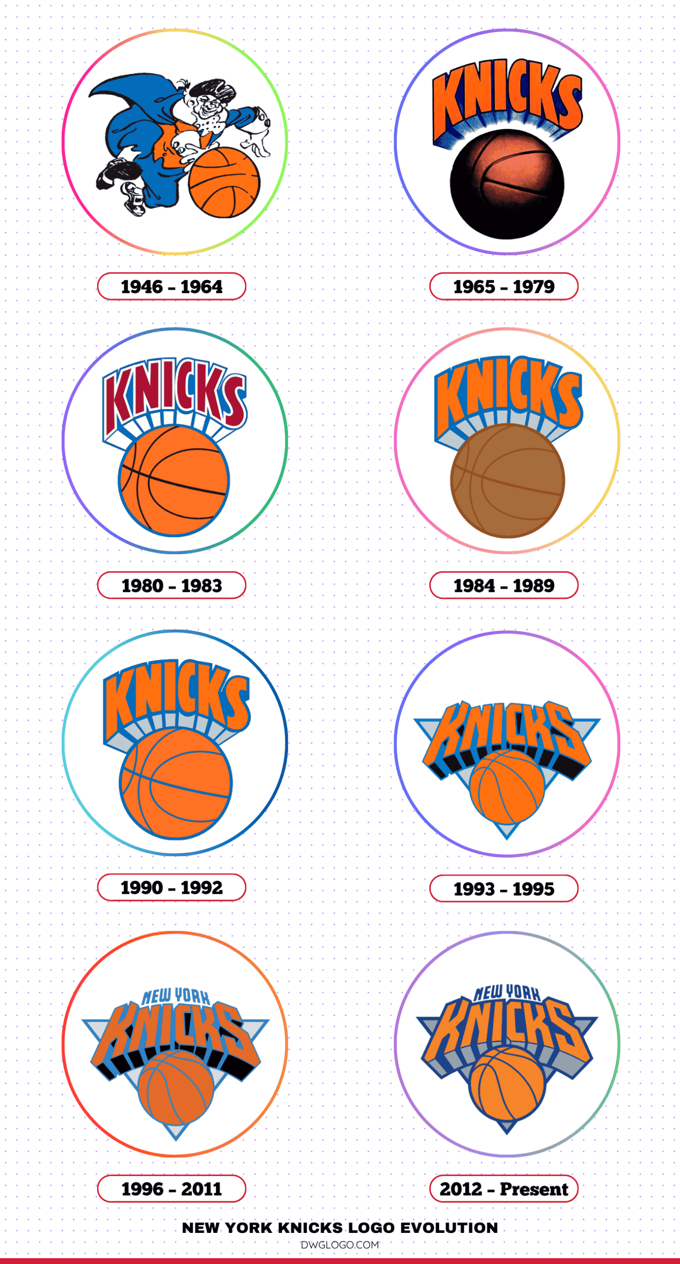
New York Knicks Logo Evolution
1946 – 1964
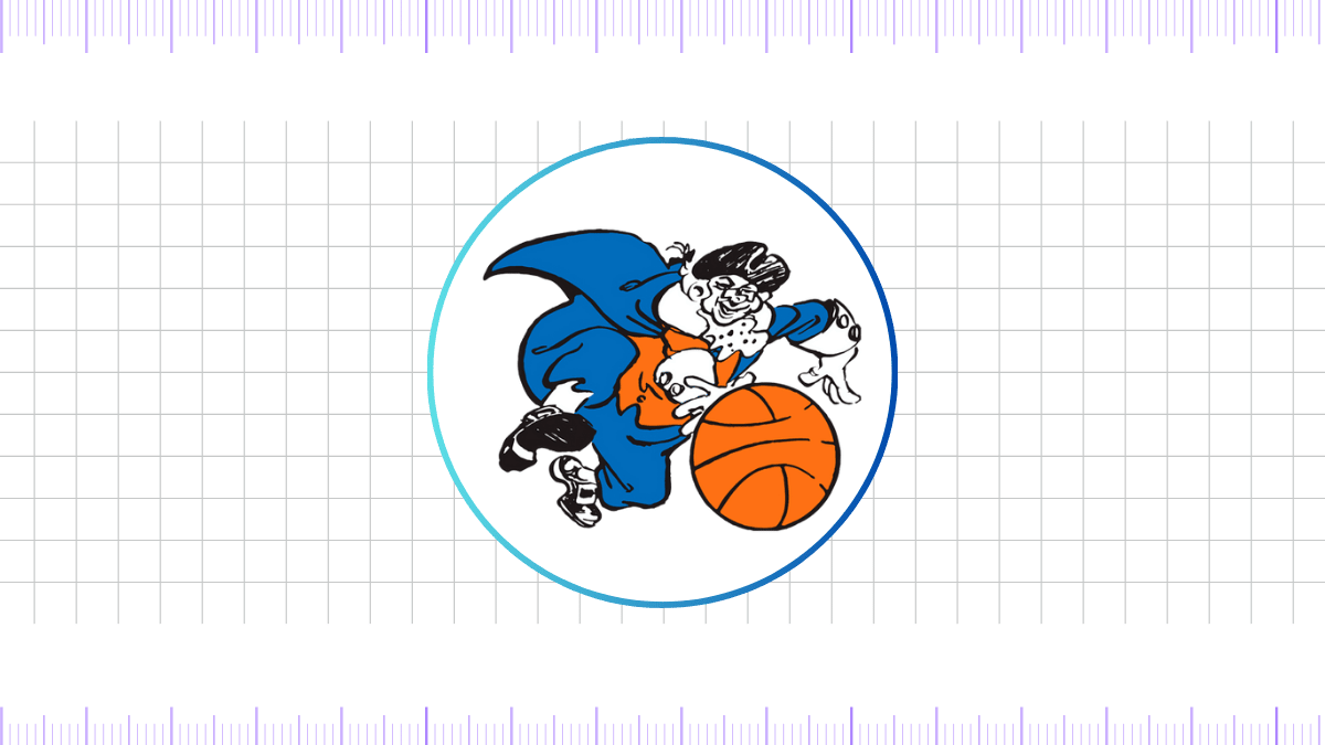
The first Knicks logo debuted in 1946 and featured a simple yet stylish cartoonish design of a man dribbling a basketball. Dressed in colonial garb—paying homage to the term “Knickerbockers,” a reference to 17th-century Dutch settlers of New York—the character emphasized the team’s historical roots.
The typography was minimal, and the color scheme revolved around blue, orange, and white, reflecting the flag of New York City.
1965 – 1979
In 1965, the Knicks moved toward a more contemporary design. The cartoon figure was dropped in favor of a clean, bold wordmark: “KNICKS” written in uppercase sans-serif font, angled upward. The letters were orange with blue outlines.
This minimalist and forward-looking design aligned with mid-century modern aesthetics and projected athleticism and strength.
1980 – 1983
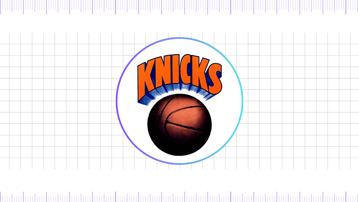
The 1980 redesign introduced the first iteration of the now-familiar basketball emblem. The word “KNICKS” was placed above an orange basketball, and the font was updated to a sleeker, more angular sans-serif typeface.
The logo aimed to fuse movement with identity, giving the impression of a rising ball and upward momentum.
1984 – 1989
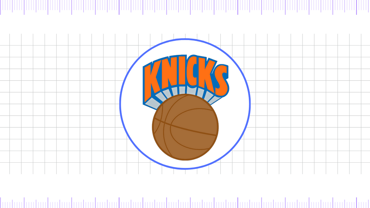
During this phase of the New York Knickerbockers’ visual identity, the team maintained the fundamental structure of its logo—preserving the shape, font, element positioning, and overall proportions. However, the color scheme underwent notable adjustments.
The updated palette adopted softer, pastel tones, giving the design a less aggressive and more refined appearance. Among the subtle modifications was the transformation of the basketball, which took on a brown hue with darker brown seams for a more classic look.
Additionally, the typography was enhanced with a blue gradient that suggested light reflecting from below. All components of the logo were outlined in blue, with the sole exception of the basketball, which featured a dark brown outline consistent with its seams.
1990 – 1992
In this iteration of the New York Knickerbockers logo, the design team introduced a noticeable shift in the color palette. The saturation levels were reduced, giving the overall emblem a softer, more subdued appearance, while a foggy visual effect was enhanced to add depth.
The basketball graphic was recolored to match the vibrant orange hue of the “KNICKS” wordmark, creating a unified visual identity. All prominent design elements were outlined in blue, reinforcing brand consistency. Additionally, the three-dimensional shadows behind the lettering adopted a bluish-gray tone, further contributing to the logo’s modernized and cohesive aesthetic.
1993 – 1995
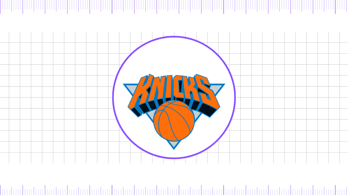
In 1992, the New York Knicks unveiled a modernized logo that reflected a bold shift in their visual identity. Renowned designer Michael Doret introduced the concept of a triangular motif, symbolizing strength and stability, while Tom O’Grady contributed additional design refinements. The word “KNICKS” appeared prominently across the top, slightly slanted backward to accentuate a dynamic, three-dimensional effect.
The custom lettering extended beyond the edges of the triangular backdrop, with subtle shading at the base of each letter to enhance depth. Positioned beneath the text was a stylized orange basketball featuring light blue seams and contours, complementing the cool bluish-gray geometric background. This updated emblem fused energy and modern aesthetics, with orange as the dominant color to represent the team’s iconic vibrancy.
1996 – 2011
The 1996 redesign is arguably the most iconic in franchise history. It preserved the triangular motif but refined all elements. The word “KNICKS” was written in a custom block-style font with deep blue outlines and an orange gradient fill.
Below, the basketball had a 3D appearance with light and shadow effects, exuding energy and motion. This design remained in place for over 15 years and became synonymous with Knicks basketball during the Ewing era and beyond.
2012 – Present
In 2012, the Knicks updated their logo for the digital age. While the core elements—triangular shape, basketball, and “KNICKS” typography—remained, the colors were slightly adjusted for a flatter, more web-friendly look.
The gradients were minimized, and the font received minor tweaks for scalability across platforms. This version continues to represent the team, balancing legacy with modern appeal.
Typography (Fonts)
The Knicks’ font style has evolved from classic sans-serif fonts to proprietary lettering. Since the 1990s, the team has used a bold, angular custom font known for its upward slant and sharp angles, conveying a sense of motion and aggression. The current font is clean, legible, and specifically designed to function well across digital and print media.
While the exact typeface is proprietary, it bears similarities to commercial fonts like “Knockout” and “NBA Knicks,” a custom type available for digital mockups. The font reflects the team’s tenacity and boldness, aligning with the brand identity of New York City—gritty, ambitious, and unapologetically strong.
Final thoughts,
The New York Knicks are more than just a basketball team—they are a cultural landmark. From their foundational logo in 1946 to the sleek, modern identity used today, the Knicks have preserved their rich legacy while embracing contemporary design trends. Their bold typography, iconic color scheme, and consistent visual identity stand as a testament to their enduring brand.
Whether you’re a lifelong fan or a newcomer to the NBA, the story behind the New York Knicks logo is a fascinating journey through the evolution of sports branding—rooted in heritage, elevated by design, and propelled by passion.
Reference: [1]
