The Milwaukee Brewers’ identity, much like the city’s rich baseball history, has evolved through a series of iconic logos that resonate deeply with generations of fans.
This journey, from their inception in 1969 to their current aesthetic, showcases a masterful use of typography, color, and design to capture the spirit of the franchise.
Logo Evolution: A Timeline of Milwaukee Baseball
![]()
1969
![]()
The 1969 logo marked the franchise’s debut, featuring a simple, powerful design: a script “Brewers” wordmark in blue and gold, set above a golden baseball. This initial effort established the franchise’s primary color palette and a clean, traditional look, which served as a foundation for future iterations.
1970 – 1977
![]()
During the period of 1970–1977, following the team’s move to Milwaukee and renaming to the Milwaukee Brewers, the club adopted a distinctive logo. This design featured the playful “Beer Barrel Man” character centered within a yellow ring. This character, whose body was stylized as a beer barrel and who wore a yellow cap, was depicted swinging a bat.
The city name, “Milwaukee,” arched above the figure, and the team name, “Brewers,” was positioned below. All typography for the team name was rendered in dark blue.
1978 – 1993
![]()
The period from 1978 to 1993 saw the debut of the Milwaukee Brewers’ most cherished emblem: the iconic “Ball-in-Glove” logo. This design wasn’t created by a big-name agency; it was the result of a contest held in November 1977 that drew over 2,000 applications from both professional and amateur designers. The winning entry came from Tom Mindl, an art history student at the University of Wisconsin-Eau Claire, who was awarded a $2,000 prize.
His design is a brilliant piece of visual shorthand: the blue letters “B” and “M” (for Brewers and Milwaukee) are seamlessly integrated to form the shape of a baseball glove, with a white baseball resting right in its center. This clever, unforgettable ambigram quickly became a classic.
1994 – 1997
![]()
A significant shift occurred between 1994 – 1997, moving away from the “Ball-in-Glove.” This era introduced a more aggressive, contemporary aesthetic. The primary image was a barrel-chested man swinging a bat, often nicknamed “Barrelman,” set within a stylized diamond shape. The color palette expanded to include teal and navy blue, signifying a departure from the traditional gold. This logo, while distinctive, received a mixed reaction from the loyal fan base accustomed to the classic design.
1998 – 1999
![]()
The 1998–1999 logo marked a refinement in the team’s identity, continuing the bold, contemporary aesthetic established in the mid-1990s. While moving away from the “Barrelman” figure, the design introduced a simplified yet powerful stylized glove clutching a baseball. This era retained the core color palette of teal and navy blue, utilizing white as a key outlining element to ensure dynamic contrast and visual presence.
2000 – 2017
![]()
The turn of the millennium, from 2000 – 2017, introduced another major rebrand that focused on a powerful, majestic depiction of a wheat leaf forming the letter “M” and a baseball within the design. This logo, often seen in a color scheme of navy blue and metallic gold (later a deeper gold/yellow), paid homage to Milwaukee’s agricultural and brewing heritage (“The Beer Barrel Capital of the World”). The typography became bolder and more angular, emphasizing modernity and strength.
2018 – 2019
![]()
The current iteration of the Milwaukee Brewers’ emblem represents a significant departure from its four immediate predecessors, successfully blending heritage with a modern aesthetic. It centers on a stylized, sophisticated letter “M,” which the design team intended to symbolize both the franchise’s deep tradition and its forward-looking modernity. This central “M” not only denotes the team’s home city and name but also subtly conveys the vital importance of the brewing industry to the team and the city’s identity. This nod to the franchise’s foundation is graphically represented by a gold-blue barley ear that is stretched across and occupies the entire space beneath the main letterform.
The overall composition features a large, dark navy blue letter “M” set against a lighter background. Graphically, the “M” is presented with a fluid, almost hand-drawn quality, lending it a distinguished and proprietary look. It is framed by a triple border composed of clean lines in white, a muted gold, and a contrasting blue, which helps the central element pop. The accompanying typography utilizes a clean, simple sans-serif font, ensuring high legibility and maintaining a professional, contemporary feel that complements the custom-designed main monogram.
2020 – Present
![]()
The drive for a refreshed visual identity began for the Milwaukee Brewers’ management as early as 2015, but the definitive change didn’t materialize until the 2020 season. This new official logo was not a completely novel design; rather, it was a carefully executed modernization of the team’s most beloved and distinctive emblem: the 1978 “Ball-in-Glove” logo.
The genius of this design, and the reason for its triumphant return, lies in its masterful use of negative space and form to create a baseball ambigram. This twist, the simultaneous depiction of two stylized letters, made the emblem instantly recognizable and deeply cherished by the fan base.
The logo features an ingeniously structured glove that harmoniously renders the club’s initials, “M” and “B.” Specifically, the index, middle, and ring fingers of the glove collectively form the letter “M” for Milwaukee. Concurrently, the thumb, along with a portion of the clenched palm, conveys the letter “B” for Brewers. The baseball itself serves a crucial design function, visually separating the two letters while completing the iconic sporting context. This balance of clever typography and strong visual identity ensures the logo remains a timeless piece of sports branding.
Milwaukee Brewers Color Codes: A Modern Palette
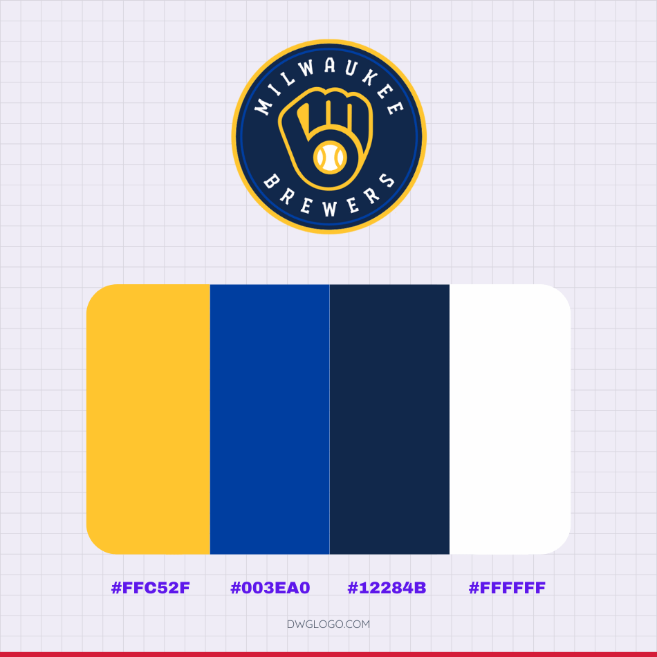
The official brand palette for the Milwaukee Brewers is a carefully curated selection of colors that blend heritage with modern sports aesthetics.
These colors are integral to the team’s current identity, reflecting their connection to both the city’s brewing tradition and their contemporary professional look. The primary color is Gold, represented by the hexadecimal code #FFC52F, a vibrant and rich hue that connects directly to the golden color of beer and the theme of excellence. Complementing this is a deep Navy Blue (#003EA0), which provides a strong, authoritative base for the logo and uniforms, symbolizing stability and strength.
A secondary, darker shade of blue, often used for detailed accents and lettering shadows, is the Dark Blue (#12284B). Finally, White (#FFFFFF) is utilized extensively for contrast, clarity, and as a clean base color for uniforms, ensuring that the primary gold and navy hues remain crisp and prominent across all branding materials.
Milwaukee Brewers Cap insignia

FAQ’s
Why did the Brewers stop using the original “Ball-in-Glove” logo in 1994?
The decision to change the logo in 1994 was part of a league-wide trend toward more aggressive, contemporary designs and a new stadium initiative. The ownership at the time sought a more modern, less playful image to represent the team.
What is the significance of the “M” and “B” hidden in the current logo?
The design is an ambigram, a logo that is cleverly designed to be read in multiple ways. The entire shape of the glove and its stitching forms the letter “M” (for Milwaukee), and the space created by the glove’s fingers and webbing forms the letter “B” (for Brewers).
Who is the team’s all-time greatest player?
The consensus is Robin Yount (The Kid), who played his entire 20-year career (1974–1993) with the Brewers. He is a two-time MVP (1982, 1989) and the first player to enter the Hall of Fame primarily as a Brewer.
When was the franchise established?
The Brewers franchise was established as the Seattle Pilots in 1969. They relocated to Milwaukee and officially became the Brewers just six days before the 1970 season began, led by future Commissioner of Baseball Bud Selig.