The Marriott Hotels logo has undergone significant changes over the decades, reflecting the company’s growth, modernization, and evolving identity in the global hospitality industry. As one of the world’s leading hotel brands, Marriott has always paid careful attention to its visual identity, ensuring that its logo captures both heritage and innovation.
The transformation of the Marriott Hotels logo from the 1960s to the present highlights the brand’s strategic vision, with each design update introducing a refined balance between tradition and modernity.
From Classic to Modern: The Story Behind the Marriott Logo
1960s – 1989
![]()
During the 1960s to 1989, the Marriott logo carried a classic and sophisticated look, which aligned with the hotel chain’s position as a growing and reputable player in the hospitality sector. The wordmark “Marriott” was styled in a serif typeface that emphasized elegance and reliability.
This early version of the logo often appeared in simple, monochromatic tones such as black or dark red, creating a professional and timeless image that appealed to both business travelers and leisure guests. At this stage, Marriott was establishing its brand identity across the United States and internationally, and the logo served as a trusted emblem of quality and comfort.
1989 – 2013
![]()
From 1989 to 2013, Marriott introduced one of its most iconic logos, which became instantly recognizable worldwide. The design featured a bold, custom serif typeface with the distinctive red “M” as its centerpiece. This stylized “M” incorporated unique diagonal strokes, giving the wordmark a modern yet sophisticated appeal. The choice of red as the primary color symbolized passion, energy, and warmth—qualities that Marriott wanted to associate with its hospitality experience.
This version of the logo was widely used across marketing campaigns, hotel signage, and promotional material, cementing Marriott’s reputation as a global hospitality leader. For nearly twenty-four years, this design represented consistency, trust, and a forward-thinking approach, making it one of the most enduring symbols in the hotel industry.
2013 – Present
The current logo, introduced in 2013, represents the most significant departure from its predecessors. It is a sleek, minimalist design that fully embraces a modern, digital-first aesthetic. The logo completely abandons the M-shaped emblem, replacing it with a simple, elegant wordmark.
The font is a custom, elegant sans-serif typeface with clean lines and subtle curves. The primary color is a deep, rich red, now known as “Marriott Red”, which signifies passion, energy, and a bold presence. This change was part of a larger rebranding effort to unify Marriott’s diverse portfolio of hotels under a single, cohesive brand identity.
The simplicity of the new logo makes it highly versatile and effective across various digital platforms, from websites to mobile apps. This modern design reflects Marriott’s commitment to innovation and its position as a forward-thinking leader in the hospitality industry.
Marriott Color and Brand Identity
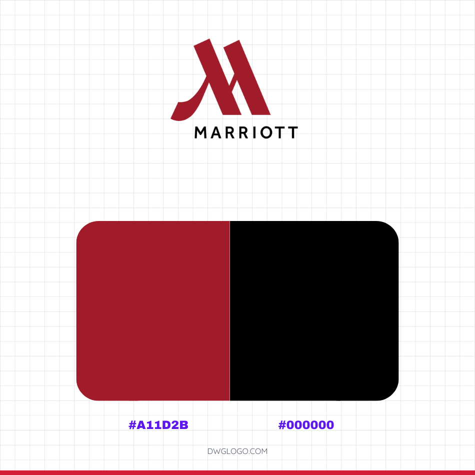
The current Marriott logo uses a specific color palette to project a sophisticated and modern brand identity. The primary colors are a deep, rich red, known as Marriott Red, and a very dark gray or black. While the text provided uses a general black hex code #000000, the brand often uses a slightly softer, off-black like #1C1C1C to avoid a harsh contrast. This subtle detail ensures a more professional and elegant feel.
The signature Marriott Red, which is a custom brand color, is frequently represented by a hex code close to #B41F3A or #A80023. These colors work in harmony to convey a sense of passion, energy, and luxury, making the brand instantly recognizable and visually distinct. The clean design and strategic use of color reflect Marriott’s forward-thinking approach as a leader in global hospitality.
Final thoughts,
The Marriott Hotels logo evolution is a clear reflection of the brand’s journey from a regional hotel chain in the 1960s to a global leader in hospitality today. Each redesign has carried forward the essence of Marriott—trust, comfort, and excellence—while adapting to the design trends and business needs of its time. The early serif logo conveyed tradition and reliability, the 1989 version introduced boldness and a recognizable identity through the iconic red “M,” and the 2013 update embraced modern minimalism to stay relevant in the digital era.
The consistency of the red color across all versions highlights Marriott’s commitment to passion, warmth, and memorable guest experiences. More than just a visual symbol, the Marriott logo represents a promise of quality hospitality and has become a timeless emblem in the global travel industry.
Reference: [1]