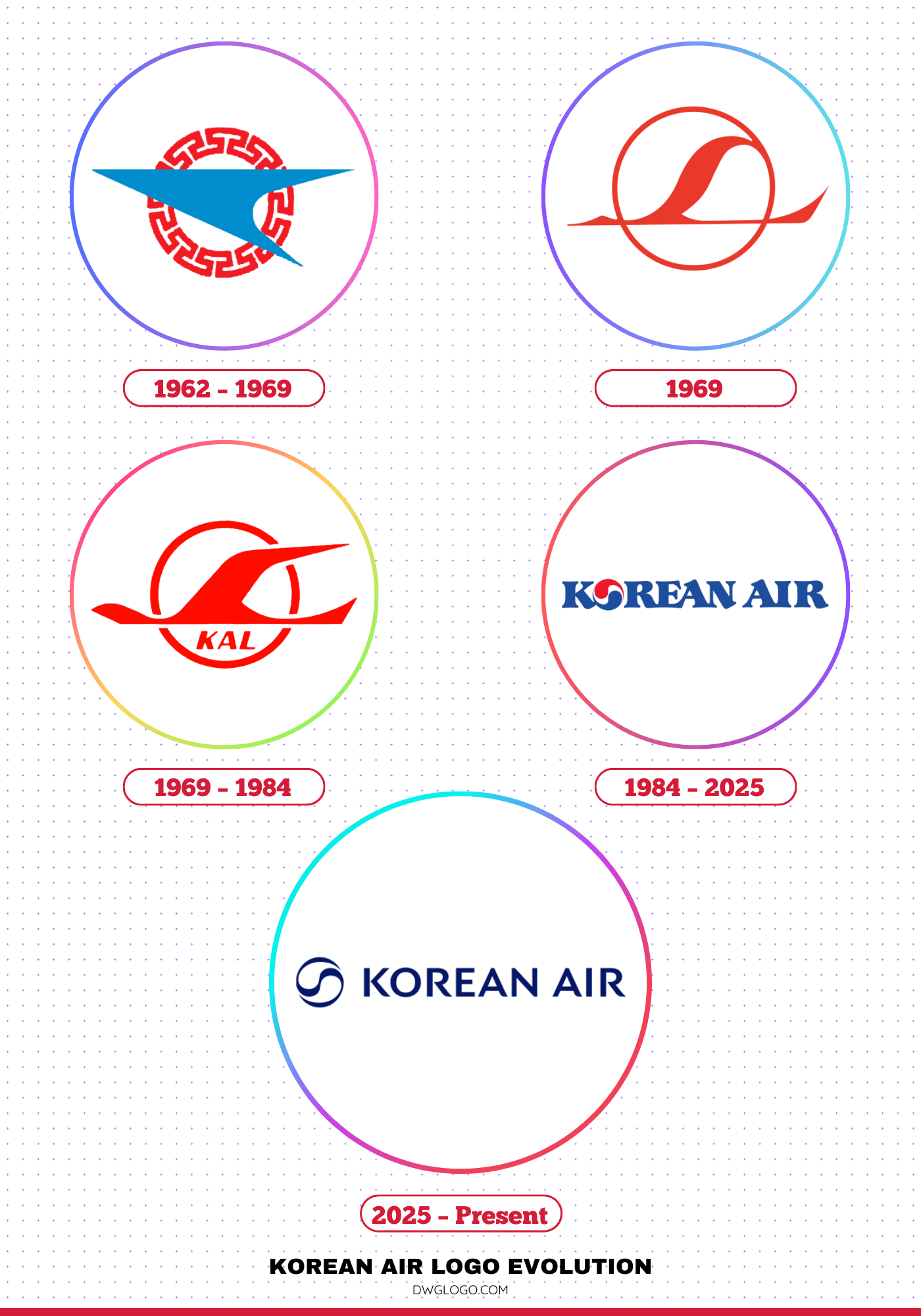
The story of Korean Air’s logo evolution is one that reflects not only the growth of South Korea’s flag carrier but also the development of its national identity, branding strategy, and visual communication over more than six decades. From simple beginnings with modest typography to the globally recognizable Taegeuk-inspired design that has endured for decades, the Korean Air logo has consistently carried the message of national heritage and forward-looking ambition.
Korean Air Logo Evolution

1962 – 1969
The story of Korean Air began in 1962 when the South Korean government acquired Korean National Airlines and renamed it Korean Air Lines. This was a period of initial struggle, with the airline facing limited infrastructure and a shortage of aircraft. It operated with leased planes on domestic routes, laying the groundwork for future expansion.
This era was characterized by its status as a state-owned entity, serving the nation’s transportation needs during a time of rebuilding and economic planning.
1969
The year 1969 marked a pivotal moment in the airline’s history. The Hanjin Group, a South Korean conglomerate, acquired the state-owned airline, initiating its privatization. This move fundamentally changed the company’s trajectory, transforming it from a government-run service into a commercially driven enterprise. Under private ownership, the newly named Korean Air began its ambitious expansion, pioneering new international routes and focusing on building a global network. This marked the true beginning of Korean Air as a modern, competitive airline.
1969 – 1984
Following its privatization, Korean Air, also known internationally as KAL, entered a dynamic phase of aggressive expansion. The airline launched long-haul trans-Pacific freight and passenger services, strengthening its global presence by introducing wide-body aircraft such as the Boeing 747.
During this transformative period, the airline’s branding remained simple yet effective, with the initial logo—used until 1984—setting the stage for the iconic design that would later define its identity. The livery often showcased a classic cheatline alongside the airline’s full name, creating a clean and professional look. This era was pivotal in shaping KAL’s reputation as a reliable and ambitious international carrier, laying the foundation for its rise as one of the world’s leading airlines.
1984 – 2025
In 1984, Korean Air underwent a major brand overhaul that solidified its global identity for over four decades. A new livery was introduced, featuring a powder blue top fuselage and a redesigned logo. The new logo, a stylized Taegeuk symbol, was inspired by the South Korean flag’s yin-yang pattern. This design, with its distinctive red, white, and blue colors, became instantly recognizable worldwide.
The new font for “Korean Air” was custom-made, combining elements of traditional Korean lettering with modern typography. This branding was so successful that it remained largely unchanged for 41 years, becoming a timeless symbol of the airline’s legacy and its connection to South Korea.
2025 – Present
In 2025, Korean Air unveiled its first major rebranding in over four decades, driven by its acquisition of Asiana Airlines and a desire to present a unified, modern image. The new identity, designed by Lippincott, signifies a significant shift. The most striking changes are to the livery and logo. The familiar red from the Taegeuk symbol has been removed, leaving a monochromatic, dark blue swirl that is a more minimalist and elegant interpretation of the national symbol.
The fuselage now reads “KOREAN” in a new custom-made font with a sleek, metallic blue finish. The word “Air” was dropped to emphasize the airline’s status as a national flagship carrier. This rebrand is not merely a cosmetic change; it’s a strategic move to reposition the airline as a premium global carrier and integrate its operations with Asiana Airlines, with the full merger expected to be complete by January 1, 2027.
The colors and fonts of Korean Air’s branding have always been central to its identity. The iconic 1984 livery featured a powder blue and white fuselage, with the Taegeuk logo on the tail in its tricolor scheme of red, white, and blue. The new 2025 branding retains the signature blue but in a deeper, metallic shade, and eliminates the red entirely for a more refined, two-color palette of blue and white. The new font is a bespoke, sans-serif design with a minimalist aesthetic, reflecting global branding trends.
Final Thoughts,
The Korean Air logo evolution is a fascinating journey through history, design, and cultural symbolism. From its humble beginnings with a simple wordmark in the 1960s to the bold embrace of the Taegeuk in 1984 and its modern refinement in 2025, the airline has demonstrated an ability to balance heritage with innovation.
Each redesign has been a response to broader cultural, technological, and market changes, ensuring that Korean Air remains both globally recognizable and deeply tied to South Korea’s identity. With its modernized yet heritage-rich logo, Korean Air continues to symbolize not only safe and reliable air travel but also the pride of a nation looking confidently toward the future.


