The Johnson & Johnson logo is more than just a corporate emblem—it is a symbol that has shaped public trust in healthcare for well over a century. First introduced in 1886, the handwritten script became instantly recognizable and stood as one of the longest-lasting logos in business history.
For generations, its flowing red letters reflected compassion, reliability, and a personal touch, embodying the company’s mission to improve human health.
From Handwritten Legacy to Modern Simplicity: The Transformation of an Iconic Healthcare Logo
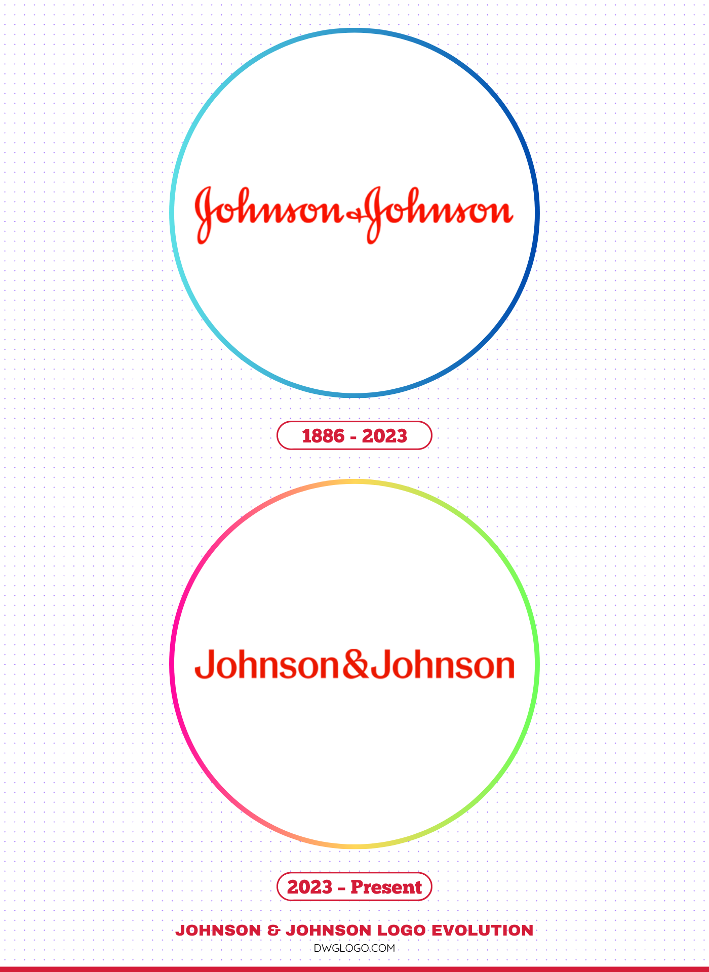
1886 – 2023
![]()
The original Johnson & Johnson logo, first registered in 1887, was one of the longest-used corporate emblems in the world. It was inspired by the authentic signature of one of the company’s co-founders, James Wood Johnson.
The flowing, cursive script was a direct link to the company’s founding principles and a deeply human touch that conveyed a sense of care and personal commitment. The classic red color of the logo was a deep, classic red that was instantly recognizable.
This logo became synonymous with an array of household products, from Band-Aids to Tylenol, solidifying its place in the public’s collective memory. For over 136 years, this emblem represented a brand that families trusted for generations. The personal, handwritten quality of the logo was a powerful representation of the company’s commitment to patient care and its credo.
2023 – Present
![]()
In September 2023, Johnson & Johnson announced a major rebrand, introducing a new logo that is a bold departure from its predecessor. The new logo features a modern, sans-serif font, replacing the familiar cursive script. While the ampersand remains, it is now an updated, more contemporary symbol that represents a caring and human nature while also being globally recognizable. The color has also been subtly updated to a brighter, more contemporary red.
This change reflects the company’s new strategic direction. Having spun off its consumer health business into a new, separate company called Kenvue, Johnson & Johnson is now a “pure-play” healthcare company focused solely on innovative medicine and medical technology. The new logo is designed to reflect this focus, projecting a modern, scientific, and forward-looking image. The simpler, more legible font is better suited for a digital-first world and is easier to read and reproduce on various platforms.
FAQ’s
Why did Johnson & Johnson change its logo?
The logo change was a strategic move to reflect the company’s new identity. Following the separation of its consumer health business into Kenvue, Johnson & Johnson wanted to signal its renewed focus on pharmaceuticals and medical technology.
The new, modernized logo communicates this shift and helps to distinguish the corporate brand from the consumer products that will now be part of Kenvue’s portfolio. The previous cursive logo was more strongly associated with the consumer products that had been spun off.
What is the new Johnson & Johnson logo font?
The new logo uses a bespoke, modernized sans-serif font. The company stated that the typeface was chosen to be more “clean, contemporary, and confident,” with each letter drawn in a single pen stroke to maintain a sense of humanity and flow
Final thoughts,
Johnson & Johnson logo evolution represents more than just a visual redesign—it reflects a significant strategic transformation in the company’s identity and direction. The 1886 to 2023 handwritten script logo will forever remain a symbol of tradition, human touch, and legacy in healthcare. However, the 2023 redesign marks a new era, focusing on science, technology, and innovation while still retaining the familiar red that has always defined the brand.
With this change, Johnson & Johnson bridges its historical past with its future vision, ensuring that its logo remains relevant, adaptable, and aligned with its mission of improving global health.