The Jaguar logo is more than just a symbol; it’s a chronicle of a company’s transformation from a motorcycle sidecar manufacturer to a global luxury automotive icon. The brand’s visual identity has evolved through a series of significant changes, reflecting shifts in corporate strategy, brand philosophy, and market trends. From its humble beginnings as the Swallow Sidecar Company to its current, sleek representation, the Jaguar emblem tells a story of elegance, power, and innovation.
The Roaring Legacy: A Deep Dive into the Jaguar Logo Evolution
1922 – 1935
Jaguar’s roots date back to 1922 when the company was founded as the Swallow Sidecar Company (SS Cars Ltd.). The earliest emblem had no reference to the jaguar animal. Instead, it showcased a simple SS monogram, usually displayed in a bold, geometric typeface with clean, straight lines. The focus was on symmetry and precision, reflecting the early 20th-century design aesthetic.
This initial logo was minimalistic, practical, and somewhat industrial, perfectly aligning with the company’s early focus on motorcycles and sidecars. The black-and-white palette reinforced seriousness and functionality.
1935 – 1945
In 1935, SS Cars introduced a new line of sports cars branded as “Jaguar.” This was the first appearance of the Jaguar name in the logo. The design was elegant, with sharp lettering and elongated forms, creating a sense of speed. The typography featured clean sans-serif styling, emphasizing modernity while retaining a refined edge.
This era marked the birth of the Jaguar identity, even though the visual symbol of the leaping cat had not yet appeared. The focus was entirely on the name, presented with confidence and boldness.
1945 – 1951
After World War II, the company faced a critical rebranding decision. Due to the negative associations of the initials “SS”, the brand officially changed its name to Jaguar Cars Ltd. in 1945. This decision was crucial in reshaping its global image.
The logo during this period displayed the full wordmark “Jaguar” in sleek, sharp lettering, often placed above a winged emblem. The wings symbolized speed and aspiration, linking the brand to freedom and forward motion. The typography grew bolder and more distinctive, creating a sense of prestige.
1951 – 1957
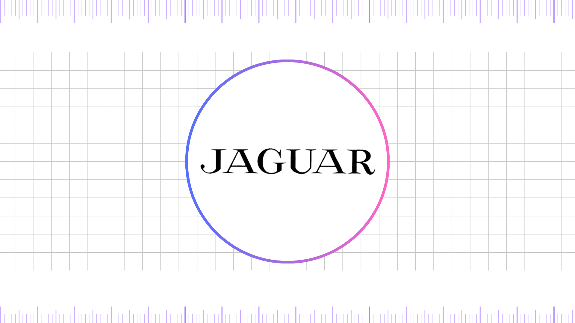
The Jaguar logotype took a major step forward in the early 1950s with the debut of the iconic leaping jaguar symbol. This bold design featured a cat in mid-leap, perfectly capturing agility, speed, and strength. Mounted proudly on car bonnets, it quickly became one of the most recognizable emblems in the automotive world.
While the wordmark continued to be an important branding element, the leaping jaguar logotype truly defined the company’s identity. Its flowing, aerodynamic curves symbolized luxury and precision engineering, while the dominant use of black and silver conveyed timeless elegance and premium quality.
1957 – 1965
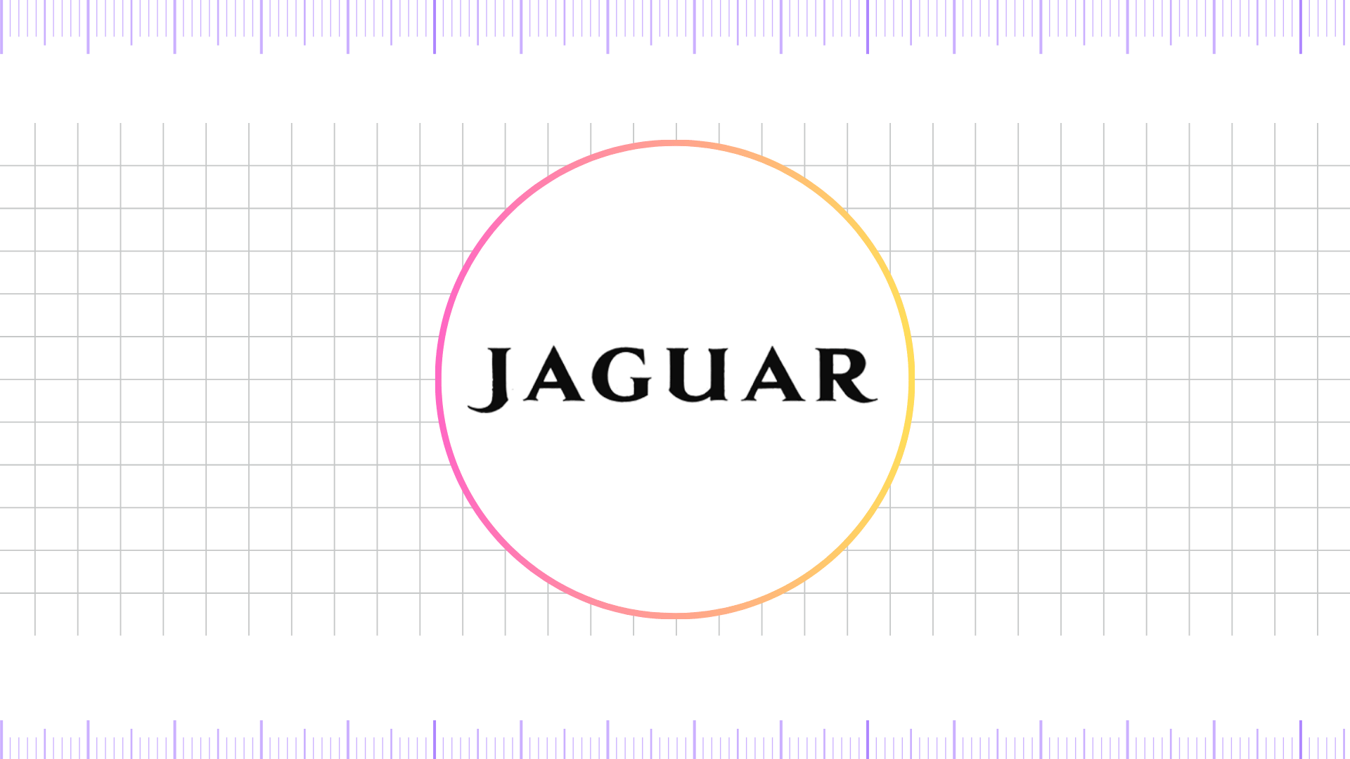
In 1957, Jaguar refined its leaping logo, streamlining the animal’s form to make it sharper and more realistic. The emblem projected authority, aggression, and class while reinforcing brand distinction.
Typography also became more sophisticated. The Jaguar wordmark used a serif typeface, characterized by sharp edges and tall proportions, aligning with luxury branding trends of the time. The logo increasingly appeared in chrome finishes on vehicles, which enhanced its premium appeal.
1965 – 1966
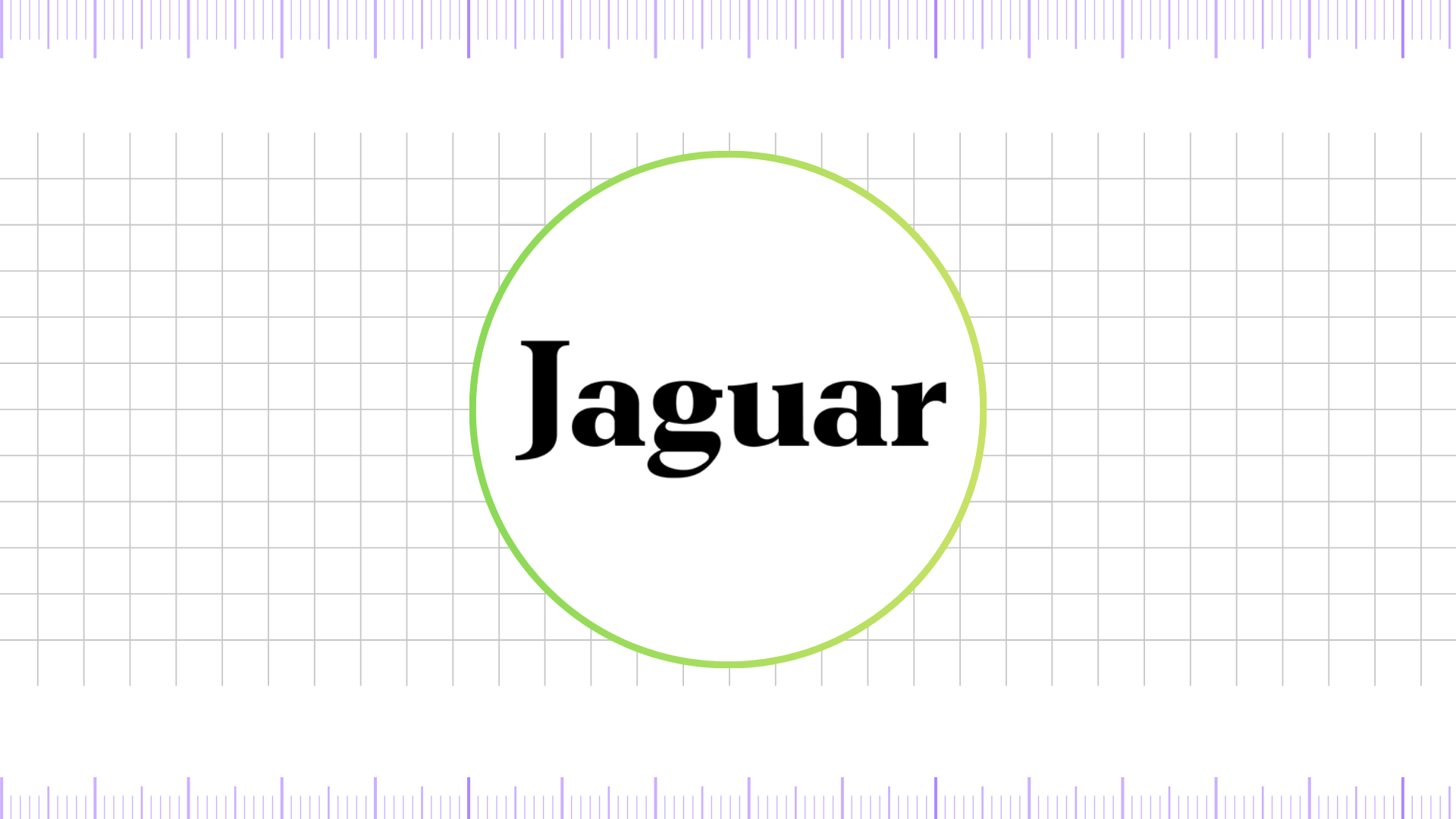
For a brief period, Jaguar experimented with updated logo concepts. The leaping jaguar remained central, but adjustments were made to proportions and styling. This transitional design phase was short-lived, but it demonstrated Jaguar’s commitment to continuously refining its brand image.
The colors largely stayed metallic silver or chrome, aligning with mid-century automotive design trends.
1966 – 1979
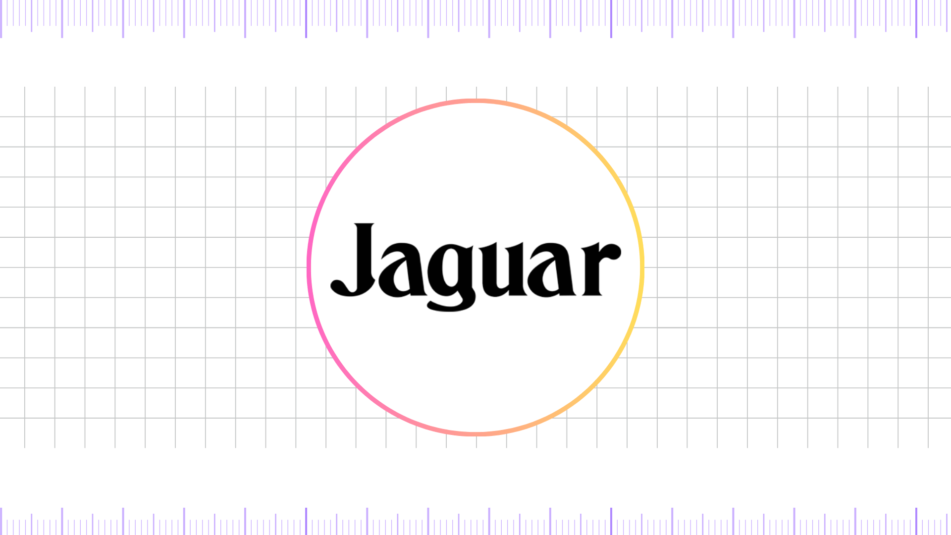
Under British Leyland, Jaguar’s logo underwent a slight simplification to fit a more corporate, streamlined look. The leaper and the wordmark continued to be used, but the overall branding sought a more modern feel.
The wordmark font was sometimes rendered in a cleaner, less ornate serif font, aiming for a broader appeal. This period was about maintaining the brand’s luxury image while operating within a larger, more complex automotive group.
1979 – 2001
During the late 1970s and into the 1980s, Jaguar streamlined the leaper logo into a cleaner, more modern form. The cat became sleeker and less detailed, focusing on smooth curves and aerodynamic styling.
The growler badge also evolved, becoming more stylized with bolder lines. The wordmark featured a refined serif typeface, balanced between tradition and modernity. Chrome and metallic finishes dominated, enhancing Jaguar’s luxury positioning.
1982 – 2001
By the early 1980s, Jaguar enhanced the Growler logotype, giving the emblem a sharper, more three-dimensional appearance. The animal jaguar’s face became bolder and more defined, with exaggerated features that highlighted aggression, strength, and confidence.
During this era, the brand also reinforced its dual identity: the Leaper logotype, representing elegance and dynamic motion, and the Growler, symbolizing raw power and boldness. Often displayed against the classic Castleton Green background—a shade strongly associated with Jaguar’s racing heritage—the logo projected both luxury and performance, firmly establishing Jaguar as a leader in premium automotive design.
2001 – 2012
The turn of the millennium brought a significant overhaul. The logos were made more slick and contemporary. The wordmark font was changed to a custom sans-serif font called JaguarSans. This font was clean, modern, and highly readable, signaling a break from the traditional, classic look. The leaper was also simplified and rendered in a more fluid, dynamic form.
The color palette became more focused on a modern metallic silver, black, and a vibrant gold for special editions. This shift was a clear move to appeal to a younger, more global, and tech-savvy audience. The logos were often rendered with gradients and subtle highlights, giving them a polished, digital-friendly appearance.
2012 – 2021
During this period, Jaguar undertook another significant rebranding effort, shifting toward minimalism and precision. The updated wordmark featured a custom sans-serif font that was lighter, more elegant, and easier to adapt across digital platforms. The iconic leaper was simplified into a more abstract, flowing shape with cleaner lines, while the growler received a flatter interpretation. Unlike the earlier bold 3D looks that emphasized chrome and depth, this era embraced a flat, two-dimensional style that reflected modern digital and corporate design trends.
The primary colors of this phase were sleek metallic gray and black, creating a premium, contemporary aesthetic. By stripping away unnecessary ornamentation, Jaguar reinforced its image of sophistication, agility, and modern luxury, perfectly aligning with the brand’s forward-looking vision.
2021 – 2024
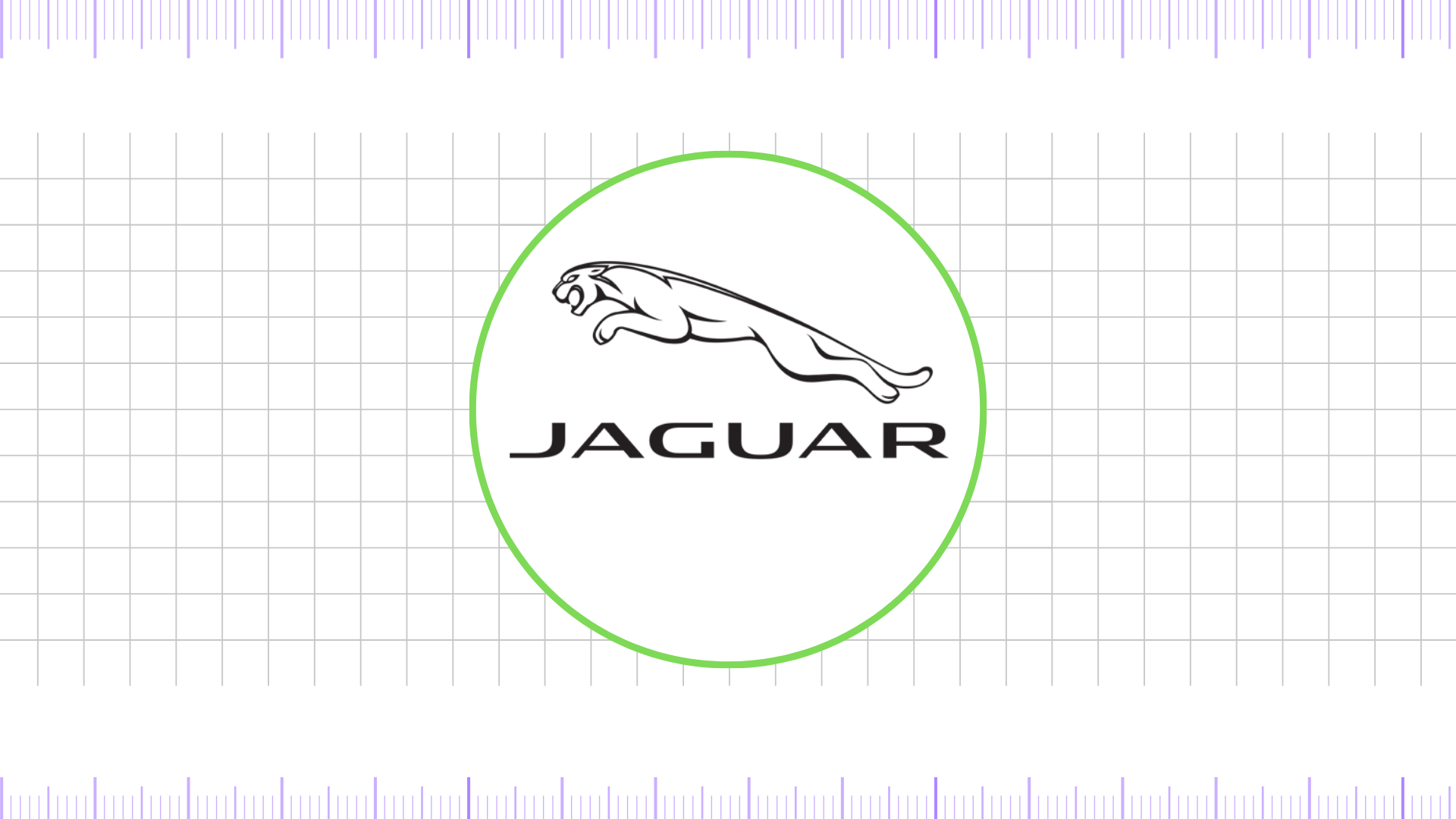
As Jaguar announced its plans to become an all-electric luxury brand, the branding underwent subtle but significant changes. The logos, particularly the wordmark and the leaper, were simplified even further. The font became a very clean, minimalist sans-serif, and the leaper was often presented as a flat, single-color icon.
This look was designed to be easily scalable and recognizable across all platforms, from a car’s grille to a smartphone app. The color palette shifted towards a more technologically-focused metallic silver, often paired with a deep matte black.
2024 – Present
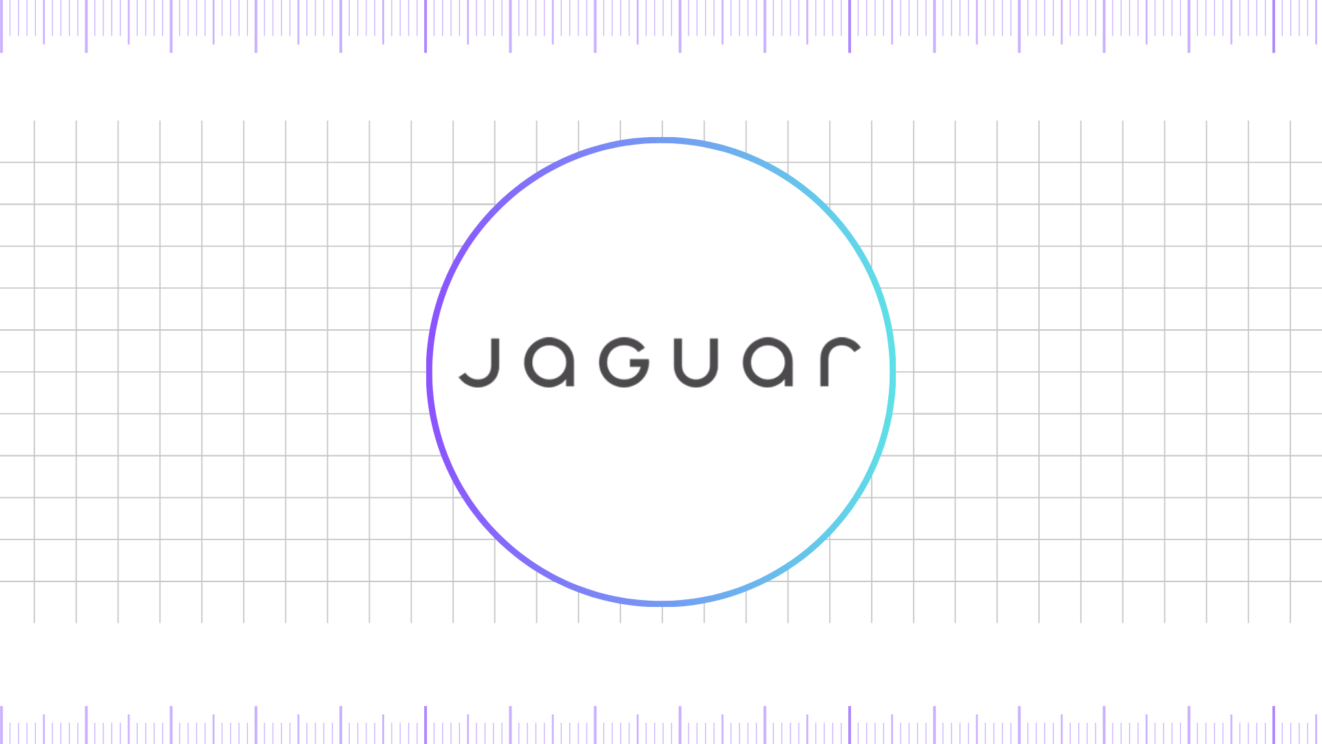
In 2024, Jaguar unveiled its latest logo update. The design retained the minimalist leaper but with subtle refinements for greater clarity and versatility. The wordmark was updated with sharper, geometric forms, striking a balance between elegance and modernism.
The color scheme highlights metallic silver, black, and white, reinforcing sophistication while preparing the brand for its all-electric future. This new logo represents Jaguar’s bold step into a new era of luxury and sustainability.
Fonts Used in the Jaguar Logo
Over the decades, Jaguar has shifted from bold serif fonts to modern sans-serif typography.
- Early years (1930s–1950s): Serif fonts with tall proportions, reflecting tradition and class.
- 1960s–1980s: Refined serif typefaces with sharp cuts for distinction.
- 2001–2012: Bold, all-capital serif font symbolizing authority.
- 2012–Present: Modern custom sans-serif fonts, clean and futuristic.
Typography has played a key role in reinforcing Jaguar’s brand values of luxury, agility, and precision.
Colors of the Jaguar Logo
The Jaguar logo has consistently used a premium palette to emphasize luxury:
- Black: Strength, elegance, and timelessness.
- Silver/Chrome: Modernity, technology, and sophistication.
- White: Purity, simplicity, and versatility.
This consistent color strategy has ensured global recognition and adaptability across print, digital, and automotive surfaces.
FAQ’s
What role did Sir William Lyons play in the creation and early development of the Jaguar logo?
Sir William Lyons, co-founder and long-time managing director of the company that became Jaguar Cars, played a decisive role in shaping the brand’s identity. It was under his leadership in 1935 that the “Jaguar” name was first introduced as part of a strategic rebrand from SS Cars to a more distinctive, globally marketable identity.
Although Lyons was not a graphic designer, he personally approved the earliest wordmarks and visual treatments that bore the Jaguar name. His vision for a marque that symbolized grace, speed, and prestige directly informed the decision to adopt the leaping jaguar mascot and the elegant typography that defined Jaguar’s early logos.
In essence, Sir William Lyons provided the creative direction and brand philosophy that allowed the Jaguar logo to evolve into one of the most iconic emblems in automotive history.
What role did Ian Callum play in the design and evolution of the Jaguar logo?
Ian Callum, Jaguar’s Director of Design from 1999 to 2019, played a pivotal role in shaping the modern evolution of the Jaguar logo. Under his leadership, the brand underwent two of its most significant visual transformations. In 2001, he introduced a bold redesign that gave both the leaper and growler a sleek chrome 3D look, reinforcing Jaguar’s luxury image and aligning it with premium automotive trends of the era.
Callum’s vision emphasized elegance, strength, and dynamism, qualities that translated directly into the logo’s sculptural depth and polished finishes. Later, in 2012, he oversaw another major update, where the logo shifted toward a flat, minimalist style to better suit digital applications while retaining its iconic identity. This redesign reflected modern branding principles and prepared Jaguar for a digital-first future. Through these contributions, Callum not only modernized Jaguar’s visual identity but also ensured its logos remained timeless, sophisticated, and globally recognizable.
Why is Jaguar’s logo a leaping cat?
The leaping jaguar symbolizes speed, power, and agility—qualities associated with Jaguar cars.
Why did the company change its name from SS Cars to Jaguar?
The name change was a direct result of the negative connotations associated with the “SS” initials following World War II, as they were closely linked to the Nazi Schutzstaffel (SS). The company’s founder, Sir William Lyons, wisely decided to rename the brand to Jaguar Cars Ltd. to avoid any confusion or negative association.
What is the “leaper” and the “growler”?
The “leaper” is the iconic hood ornament or emblem of a leaping jaguar. It symbolizes speed, grace, and power. The “growler” is a separate circular badge featuring a frontal, snarling jaguar’s head. It represents the brand’s raw, aggressive performance capabilities.
Final thoughts,
The Jaguar logo evolution reflects a journey of innovation, identity, and prestige. From the early SS monogram to today’s sleek minimalist leaper, the emblem has continuously evolved to match global design trends and brand aspirations. The combination of the leaper, the growler, elegant fonts, and timeless colors has ensured Jaguar’s place among the most recognizable automotive brands in the world.
As Jaguar transitions into an all-electric future, its latest logo captures both its proud heritage and its bold, sustainable vision. The story of the Jaguar logo is not just about design—it is a reflection of luxury, speed, and the pursuit of excellence.