The journey of Huawei’s logo evolution is a testament to the company’s commitment to innovation and its ability to adapt to the ever-changing landscape of technology and design. Founded in 1987, Huawei has grown from a small telecommunications company to a global leader in the tech industry.
A significant part of its brand identity, the Huawei logo has undergone several transformations since 1998, each reflecting the company’s growth and vision.
The Evolution of the Huawei Logo: A Journey Through Design and Innovation
1998 – 2006
From 1998 to 2006, Huawei’s logo was characterized by a simple yet effective design that captured the essence of the company’s ambitions. The logo featured a stylized red flower, symbolizing growth, vitality, and prosperity.
The petals of the flower were arranged in a way that suggested movement and dynamism, qualities that were integral to Huawei’s identity as a forward-thinking company. The font used during this period was bold and modern, conveying a sense of confidence and stability. The red color of the logo was not only eye-catching but also symbolized passion and energy, traits that Huawei wanted to associate with its brand.
2006 – 2018
Huawei decided to update its logo to reflect its expanding presence in the global market. The new design retained the iconic red flower but introduced subtle changes to make it more contemporary and streamlined. The petals were made more angular and were spaced slightly apart, giving the logo a more open and inviting appearance.
This redesign was a strategic move to emphasize Huawei’s commitment to openness and collaboration in its business practices. The font remained modern and bold, maintaining the brand’s strong and reliable image. The red color persisted, reaffirming Huawei’s passion and energy while also ensuring continuity and brand recognition.
2018 – Present
The most recent change to the Huawei logo came in 2018, as the company sought to further modernize its image and align with its vision for the future. This iteration of the logo saw a significant transformation in both the symbol and the font. The flower was further simplified, with the petals becoming more abstract and minimalistic. This change reflected Huawei’s pursuit of simplicity and elegance in its products and services. The font was also updated to be sleeker and more refined, aligning with contemporary design trends. Although the red color was retained, it was given a slightly deeper hue, adding a touch of sophistication and maturity to the brand’s visual identity.
Huawei’s careful consideration of font and color throughout its logo evolution demonstrates the company’s understanding of the importance of branding in communicating its values and mission. The consistent use of red has created a strong visual identity that is instantly recognizable and synonymous with the brand’s core attributes of passion, energy, and innovation. Similarly, the choice of fonts over the years has been deliberate, ensuring that they convey the desired message of reliability, modernity, and forward-thinking.
FAQ’s
What does the flower in the Huawei logo represent?
The flower in the Huawei logo symbolizes growth, vitality, and prosperity. It represents the company’s dynamic nature and its commitment to innovation and progress.
Has the color of the Huawei logo always been red?
Yes, the color of the Huawei logo has consistently been red. This color choice reflects the brand’s passion, energy, and commitment to excellence.
Why is branding important for a company like Huawei?
Branding is crucial for a company like Huawei because it helps establish a strong identity and differentiates the company from its competitors. A well-designed logo and consistent branding can communicate the company’s values, build trust with consumers, and enhance brand recognition globally.
Why did Huawei remove the 3D effect in the 2018 logo?
The removal of the 3D effect in 2018 was a strategic move to follow global minimalist design trends, making the logo more versatile, scalable, and legible across all digital and physical applications, from smartphone screens to corporate reports.
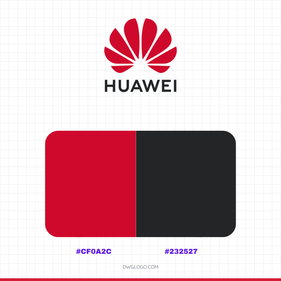
Huawei Color Codes: A Modern Palette
The color codes you’ve provided, #CF0A2C and #232527, represent the official primary color palette for Huawei’s current brand identity, particularly for its logo and corporate communications since the 2018 refresh. These colors are strategically chosen to convey the company’s maturity, sophistication, and technological focus.
Final thoughts,
The evolution of the Huawei logo from 1998 to the present day is a reflection of the company’s journey from a regional player to a global technology leader. Each iteration of the logo has been carefully crafted to embody Huawei’s core values and to resonate with its target audience.
The thoughtful design choices in terms of font, color, and symbolism have ensured that the Huawei logo remains a powerful representation of the brand’s identity and aspirations. As Huawei continues to innovate and expand, its logo will undoubtedly remain an integral part of its story and success.