![]()
The Cracker Barrel Old Country Store, an American institution synonymous with Southern hospitality, hearty comfort food, and nostalgic retail, has cultivated a brand identity that is both deeply rooted in tradition and subtly adaptive to modern sensibilities. At the heart of this identity lies its logo, a visual mark that has evolved not through a series of drastic transformations but rather through careful, strategic refinements.
Contrary to a common misconception of frequent overhauls, the Cracker Barrel logo has seen only a few key updates since its inception in 1969, each designed to preserve its core nostalgic appeal while enhancing its clarity and digital presence. The journey of the logo is a testament to a brand that understands the value of visual heritage, making subtle tweaks to stay relevant without losing its iconic charm.
The Timeless Charm and Strategic Evolution of the Cracker Barrel Logo
1969 – 1977
![]()
The first Cracker Barrel logo, introduced in 1969, featured a distinctive two-line wordmark that conveyed a rustic and nostalgic character. For printed materials, the design appeared in monochrome, while signage and banners often carried a warm yellowish tone.
The main inscription was crafted in a decorative wishbone-style typeface reminiscent of old Western saloons, reinforcing the brand’s country-inspired identity. Beneath it sat the phrase “Old Country Store,” presented in a smaller, more understated yet equally stylized uppercase font, which balanced the boldness of the primary lettering and highlighted the brand’s traditional roots.
1977 – 2006
![]()
The modern era of Cracker Barrel’s visual identity began in the 1970s and, with only subtle refinements, continues to define the brand today. At the heart of the design is the iconic illustration of a man seated beside a large wooden barrel, a symbol that perfectly reflects the company’s name and rustic heritage. This imagery is paired with a flowing yellow banner that carries warm brown lettering rendered in two distinct styles.
The tagline is set in the timeless Helvetica font, while the primary wordmark features a custom-designed typeface that reinforces the brand’s unique and recognizable character.
2006 – 2015
![]()
The 2006 redesign placed strong emphasis on color, introducing a background vivid orange tone that enhanced the logo’s warmth and visibility.
Alongside this brighter palette, the contours of the illustration and the lettering were slightly refined, giving the emblem a cleaner and more modern appearance. These updates made the badge look more distinctive and contemporary, while still maintaining the brand’s traditional charm and recognizable identity.
2015 – 2024
![]()
Another redesign of the logo was introduced by the Cracker Barrel chain in 2015, reflecting a shift toward cleaner, more modern branding. The wordmark adopted a more laconic typeface, creating a smoother and more balanced look. The contours of the interior frame, which previously extended from the “K,” were minimized, allowing a larger flat yellow background to dominate the design.
At the same time, the tagline was restyled, appearing in a capitalized and narrowed format to emphasize the heritage of the OLD COUNTRY STORE, reinforcing the brand’s timeless connection to tradition while adapting to contemporary design standards.
2024 – 2025
![]()
In 2024, to celebrate 55 years of heritage, Cracker Barrel began phasing out the Herschel iconography, removing the familiar man with the barrel and focusing instead on a streamlined design. The update left only the bold wordmark within its container, marking a significant shift toward modern simplicity while still honoring the brand’s long history.
August 14 2025 – August 26 2025
Cracker Barrel unveiled a brand-new logo as part of a bold rebranding effort. The redesign, which appeared on or around August 14–15, 2025, marked a significant departure from the company’s traditional identity. Instead of the beloved “Old Timer” figure sitting by the barrel—a symbol that had defined the brand for decades—the updated version presented a cleaner, more modern look that focused solely on typography.
However, the change was met with immediate and widespread backlash from customers and fans of the restaurant chain, many of whom felt that the new design stripped away the warmth, heritage, and familiarity that made Cracker Barrel iconic. The response on social media was swift and critical, with thousands calling for the return of the original logo.
![]()
Listening closely to its customer base, Cracker Barrel made the rare decision to reverse course. On August 26, 2025, less than two weeks after introducing the new logo, the company officially retired it and reinstated the classic design. This means the updated logo was in use for only 10 to 12 days, making it one of the shortest-lived corporate rebrands in recent memory.
The episode highlights the powerful role brand identity plays in consumer loyalty. While companies often refresh their visual identities to appeal to new audiences, the Cracker Barrel case shows that long-standing symbols tied to nostalgia and tradition can hold deep emotional value—sometimes too strong to replace.
2025 – Present
![]()
Cracker Barrel has officially brought back its classic logo after briefly experimenting with a modern redesign earlier this month. The company discontinued the rectangular, text-only version following strong customer backlash and reinstated the traditional emblem featuring the well-known “Old Country Store” in bold capital letters. This return reflects the brand’s commitment to heritage, comfort, and familiarity—values that longtime customers strongly associate with Cracker Barrel’s identity.
The swift reversal highlights the importance of customer feedback in brand decisions and reinforces how iconic visuals carry lasting emotional connections. By restoring the old logo, Cracker Barrel reassures loyal guests that tradition still matters.
Cracker Barrel Color Codes
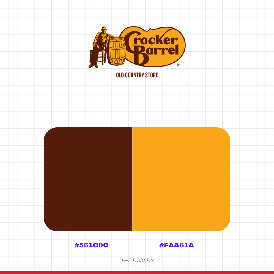
The deep brown shade (#561c0c) conveys tradition, strength, and heritage, perfectly aligning with the nostalgic feel of the “Old Country Store.” Alongside it, the vibrant golden yellow (#faa61a) adds brightness, warmth, and a sense of hospitality that reflects the inviting nature of the restaurant.
Together, these colors create a balanced contrast that maintains Cracker Barrel’s classic charm while reinforcing its timeless character. The combination of #561c0c and #faa61a ensures the logo remains both recognizable and emotionally engaging.
FAQ’s
Why did Cracker Barrel remove the man with the barrel from its logo?
In 2024, as the company celebrated 55 years, Cracker Barrel began phasing out the Herschel iconography to modernize its identity. By 2025, the new logo focused solely on a clean wordmark within a barrel-shaped container, dropping the illustration to improve versatility in digital and print formats.
What colors are used in the Cracker Barrel logo?
The brand consistently uses warm shades of gold (mustard yellow) and brown. These colors symbolize warmth, comfort, nostalgia, and rustic authenticity, aligning with the company’s country-inspired theme.
How long has Cracker Barrel used its classic logo?
From 1969 until 2024, Cracker Barrel kept the iconic man-and-barrel imagery in every version of its logo, making it one of the most recognizable dining emblems in the U.S. The move to a simplified design in 2025 marked the biggest change in the company’s visual history.
Why is the 2025 Cracker Barrel logo considered controversial?
The 2025 redesign sparked debate because it completely removed the beloved “Uncle Herschel” illustration and the “Old Country Store” tagline. Fans felt the change erased a piece of the brand’s identity, while critics argued it was a necessary step to keep the logo modern and scalable across digital platforms.
Final thoughts,
The history of the Cracker Barrel logo evolution reflects a careful balance between tradition and modernization. Since its introduction in 1969, the brand’s identity was built around the nostalgic imagery of the man with the barrel, symbolizing warmth, southern charm, and the old country store experience. For more than five decades, this emblem resonated deeply with customers and became one of the most iconic restaurant logos in America.
However, as design trends shifted and digital adaptability became a priority, Cracker Barrel gradually refined its visual identity, leading to the most dramatic change in 2025 with the adoption of a simplified wordmark.
While this transition sparked both admiration and controversy, it underscores the company’s commitment to evolving with the times. The Cracker Barrel logo story is not just about design—it is about preserving heritage while embracing the future, ensuring the brand remains timeless and relevant.
Obviously, Herschel was Jewish — an old man who owned a store named Herschel!!! In order to comply with the new Woke anti-Semitism, it was necessary that Uncle Herschel be eliminated. What is worse is that people then realized that Uncle Herschel was an uncle and not a grandfather because he had never married and lived with Uncle Issac. Uncle Herschel was Jewish and Gay — Bless their hearts. Now if you believe that, you’ll believe anything