The Chick-fil-A logo is more than just a brand mark; it’s a cultural symbol recognized by millions, instantly evoking images of crispy chicken sandwiches and friendly service. Its journey from a simple design in the 1960s to the polished, modern emblem we know today is a fascinating case study in branding and corporate identity.
The evolution of the Chick-fil-A logo reflects the company’s growth, its commitment to quality, and its strategic shift from a local Georgia eatery to a national fast-food powerhouse. Each iteration, from the earliest hand-drawn designs to the sleek, digital-friendly version, tells a part of the Chick-fil-A story. Understanding these changes provides a deeper appreciation for the thought and strategy behind one of the most successful and beloved brands in America.
The Iconic Bovine: A Journey Through the Chick-fil-A Logo’s Evolution
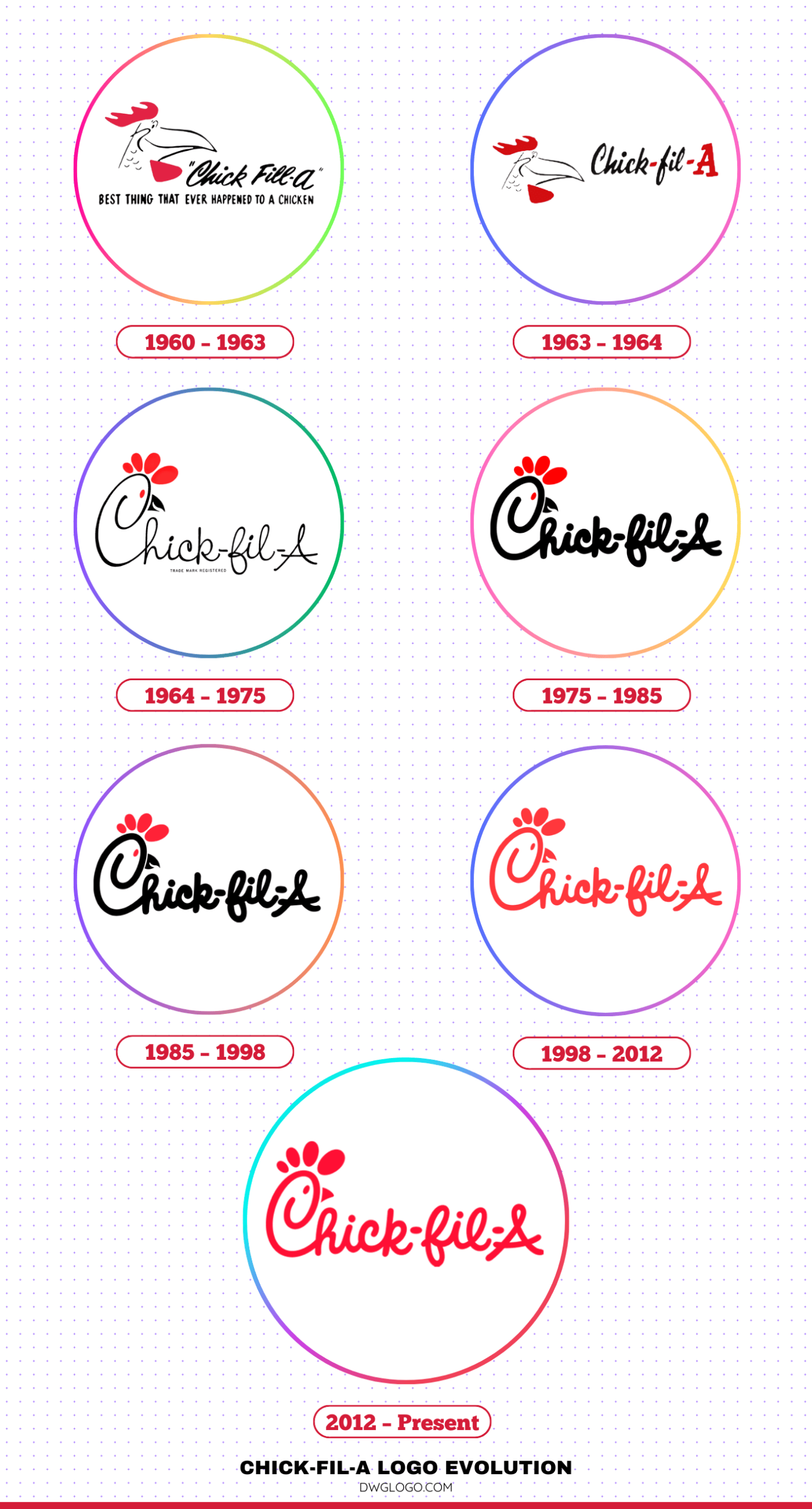
1960 – 1963
The story of the Chick-fil-A logo begins with its founder, S. Truett Cathy. Before the Chick-fil-A name was even established, Cathy’s Dwarf Grill restaurant in Hapeville, Georgia, served a chicken sandwich that would become the cornerstone of his empire. The first logo, representing the “Chicken Filet” concept, was simple and utilitarian. It featured the words “Chick-fil-A” in a straightforward, sans-serif font. This early design was pragmatic, focusing on clearly communicating the product rather than creating a sophisticated brand identity.
The color palette was likely black and white or a basic two-color scheme, common for the era’s budget-conscious small businesses. There was no stylized ‘C’ or the now-famous bovine mascot. The emphasis was on the product’s name, a playful take on the phrase “chicken fillet,” with the ‘A’ signifying the highest quality—a grade-A product. This foundational logo was the starting point, a no-frills representation of a burgeoning idea that would eventually change the fast-food industry.
1963 – 1964
A pivotal moment in the logo’s history occurred in 1963 when the company introduced its first stylized element: a capital ‘C’ with a rooster’s head integrated into its design. This was a clever and memorable way to immediately connect the brand with its core product—chicken. The rooster’s head was positioned to form the upper curve of the ‘C,’ creating a unique and distinctive mark. This version of the logo still used a relatively simple, bold sans-serif font for the rest of the name.
This design was more intentional than its predecessor, moving beyond mere text to create a symbol that was both descriptive and memorable. The color scheme remained simple, but the introduction of the rooster ‘C’ marked a significant step toward developing a recognizable visual identity. It was a clear sign that the brand was becoming more than just a sandwich; it was becoming an entity with its own personality.
1964 – 1975
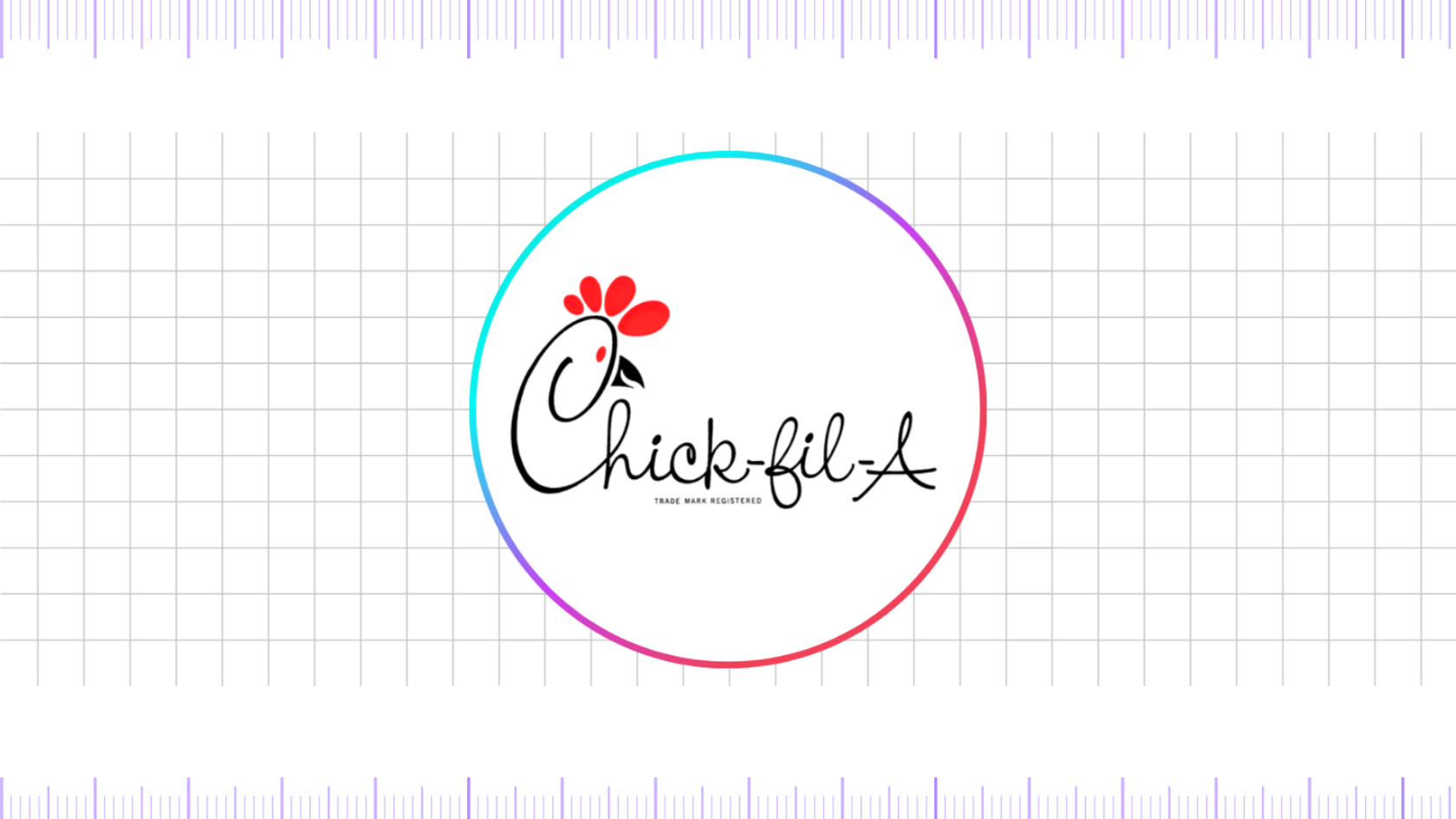
The most significant and enduring element of the Chick-fil-A logo—the bovine mascot—emerged in 1964. This period saw the introduction of the “Eat Mor Chikin” campaign, and the logo evolved to include the now-iconic cow. The logo featured a more refined, slightly curved sans-serif font. The most notable change, however, was the bovine head integrated into the ‘C.’ . This was a bold and counter-intuitive move for a chicken restaurant, but it worked.
The cow, often depicted with a mischievous or determined expression, added a touch of humor and personality. This design was playful and instantly stood out. It was a powerful tool for marketing, and the cow became the de facto mascot for the brand. The color palette during this period was primarily red and black, a striking combination that conveyed energy and confidence. This logo cemented the brand’s identity and provided a foundation for the subsequent evolutions.
1975 – 1985
The 1975 iteration of the logo saw a slight refinement of the existing elements. The font became more angular and defined, giving the logo a cleaner, more professional appearance. The stylized ‘C’ with the cow’s head remained, but its lines were crisper, and the overall design felt more polished. This change reflected the company’s growth and its transition from a regional chain to one with aspirations of a wider reach. The logo was no longer just a quirky symbol; it was a professional brand mark.
The red color was often a slightly deeper shade, and the overall design had a more serious, corporate feel while retaining the playful cow element. This period of the logo’s evolution was about solidifying the brand’s image and preparing it for a broader audience.
1985 – 1998
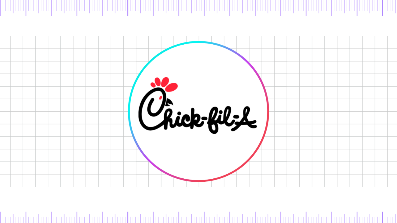
The 1985 logo is perhaps the most recognizable version for a generation of customers. It featured the full “Chick-fil-A” name in a thick, custom, rounded, and playful sans-serif font. The capital ‘C’ remained the focal point, with the bovine’s head elegantly integrated into its form. The entire logo was predominantly a vibrant, bold red, and the ‘A’ at the end was often a different color, such as black or white, to create a strong visual contrast.
The word “fil-A” was written in a more traditional, slightly smaller font, creating a visual hierarchy that emphasized “Chick.” This logo was energetic and approachable. The rounded edges of the letters gave it a friendly and welcoming feel, aligning perfectly with the brand’s reputation for excellent customer service. This design became synonymous with the Chick-fil-A experience and was the first to be widely featured on restaurant signs, packaging, and marketing materials across the country.
1998 – 2012
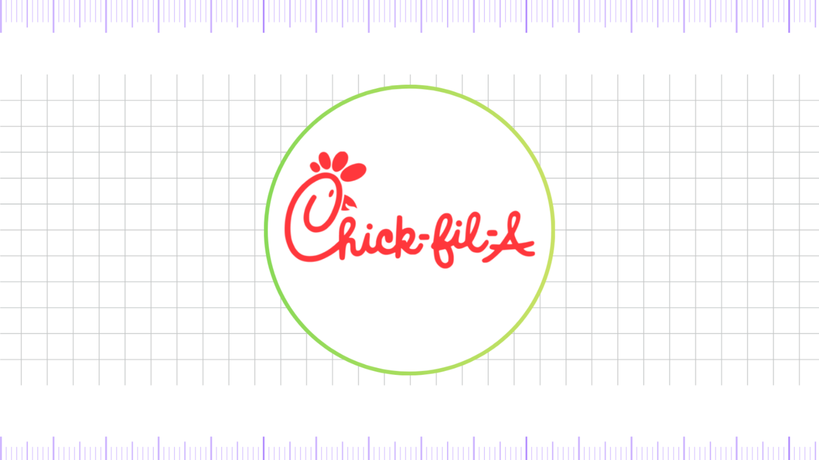
In 1998, Chick-fil-A introduced a more streamlined and contemporary version of its logo. The font was made cleaner and more symmetrical, and the lines of the cow’s head within the ‘C’ were simplified. The most significant change was the shift to a more uniform, flat red color palette. The entire logo, including the full name and the ‘A,’ was rendered in a consistent, bold red.
This change gave the logo a more sophisticated and modern look, making it more adaptable for various digital and print applications. The design was less about the playful hand-drawn feel of the past and more about a polished, corporate identity. It represented the brand’s maturity and its status as a major player in the fast-food industry. This logo served the company well for over a decade, representing its continued growth and expansion.
2012 – Present
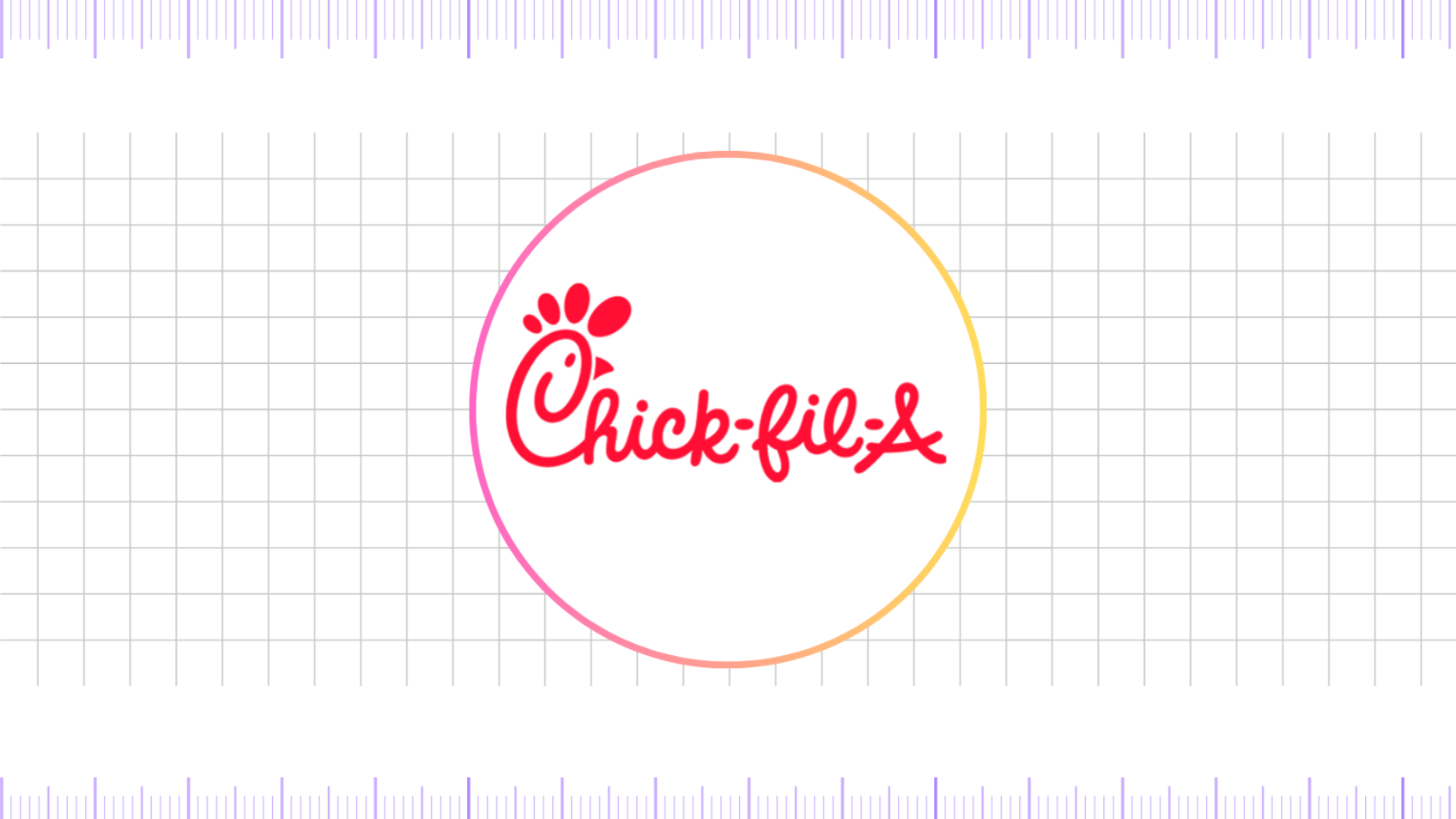
The current Chick-fil-A logo, introduced in 2012, is a masterclass in modern branding. It’s a simplified, flattened version of its predecessor, optimized for digital use. The cow’s head within the ‘C’ is now less detailed, with the horns and snout being reduced to a few essential lines. The font has been slightly adjusted to be more readable at smaller sizes. The color remains a signature, single shade of red. This design is clean, minimalist, and highly versatile.
It works perfectly on app icons, websites, and social media profiles. The 2012 logo is a testament to the brand’s forward-thinking approach, recognizing that a brand’s visual identity must be as effective on a smartphone screen as it is on a roadside billboard. It represents the culmination of a half-century of design evolution, a symbol that is both nostalgic and modern, instantly recognizable, and perfectly suited for the digital age.
FAQ’s
Why did Chick-fil-A use a cow in their logo and marketing?
Chick-fil-A’s use of a cow as a mascot and in their logo is a strategic marketing move. The “Eat Mor Chikin” campaign, which features the cows, was designed to be humorous and memorable. The cows are a playful and friendly way to promote the consumption of chicken, and the campaign has become one of the most successful and long-running in fast-food history. It’s a form of “reverse psychology” that has endeared the brand to customers.
How did Truett Cathy influence the creation and evolution of the Chick-fil-A logo?
Cathy’s first key decision was the brand name, Chick-fil-A. He created this name as a play on “chicken fillet,” with the capital ‘A’ at the end serving as a deliberate and powerful symbol. This “A” signified “Grade A” or “Grade A quality,” directly communicating his commitment to using the highest-quality chicken. This foundational concept of quality has been a consistent message throughout the logo’s evolution.
Final thoughts,
The Chick-fil-A logo’s evolution is a masterclass in purposeful branding. It began as a simple, utilitarian wordmark and transformed into a powerful cultural symbol. Truett Cathy’s initial vision, with the “A” signifying quality, laid the groundwork for a brand built on principle. The introduction of the stylized ‘C’ with the bovine head was a stroke of marketing genius, a bold and humorous choice that created an instantly recognizable and beloved mascot.
Each subsequent change, from the vibrant red to the modern, minimalist design, has been a strategic refinement rather than a complete overhaul. The logo’s journey reflects the company’s growth, maintaining its core identity while adapting to the demands of a changing world, from roadside signs to digital screens.
Reference: [1]
