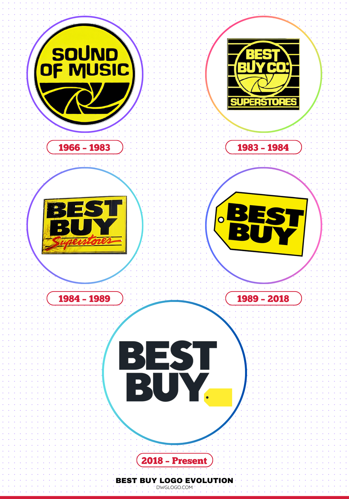
The Best Buy logo is an iconic symbol of retail, recognizable to millions. Its journey from a small Minnesota stereo store to a global electronics giant is mirrored in the evolution of its branding. This article delves into the significant changes the Best Buy logo has undergone from its inception in 1966 to its present-day form, examining the shifts in font, color, and design that reflect the company’s changing identity and market position.
The Evolution of the Best Buy Logo: 1966 to Present
1966 – 1983
Best Buy began its life not as Best Buy, but as Sound of Music. Founded by Richard M. Schulze, the company focused on high-quality audio equipment. The initial logo, used until 1983, was a far cry from the sleek design we know today. It was a wordmark that simply read “Sound of Music” in a typeface that evoked a sense of craftsmanship and classicism, often seen in the branding of audio companies of that era. The color palette was typically limited, often black and white or a simple two-color combination, reflecting the straightforward, no-frills nature of its early retail environment.
This logo was functional, serving its purpose of identifying the store, but it lacked the distinctive character that would later define the brand. Its design was more of a product of its time rather than a strategic branding effort, focused on conveying what the store sold rather than building a memorable identity. This period was about establishing a presence and building a reputation for quality products, and the logo was a simple, yet effective, tool in that process.
1983 – 1984
The year 1983 was a turning point for the company. Following a devastating tornado that destroyed one of its stores, the company held a “Tornado Sale” at the damaged location. The success of this event prompted Schulze to rebrand the company, moving away from the specialty name “Sound of Music” to a broader, more appealing name: Best Buy. This name change was a strategic move to capitalize on the growing consumer electronics market beyond just music. The logo introduced during this brief period was a transitional design.
It incorporated the new name, “Best Buy,” often in a simple, sans-serif font. The design was clean and direct, signaling a shift in the company’s focus. This short-lived logo served as a bridge between the company’s past and its future, and while it wasn’t a long-term solution, it was a crucial step in establishing the new brand identity. The shift in name from a niche product to a value-driven promise was a fundamental change that needed to be reflected in the logo, and this design did just that. It was a bold move that set the stage for the company’s expansion into a retail powerhouse.
1984 – 1989
The logo that emerged in 1984 was a significant evolution, marking the beginning of the brand’s iconic identity. It was during this time that the now-famous yellow tag design was first introduced. The logo featured the name “Best Buy” in a bold, capitalized sans-serif font. The most notable element, however, was the bright yellow tag graphic placed next to the wordmark. This tag, reminiscent of a price tag, was an innovative and memorable visual element.
It immediately conveyed a message of value, affordability, and savings, aligning perfectly with the company’s new market position. The primary colors of this logo were a combination of blue for the text and yellow for the tag, a striking and high-contrast combination that was easy to spot and remember. This design was a masterstroke in retail branding, as it transcended a simple wordmark and became a symbol of a promise—the promise of a “best buy.”
The simplicity and boldness of this logo made it highly effective, ensuring it stood out in a competitive retail landscape. This period solidified the core visual elements that would define the brand for decades.
1989 – 2018
For nearly three decades, the Best Buy logo remained largely consistent, a testament to its effectiveness and enduring appeal. The logo from 1989 to 2018 refined the design introduced in 1984. The font for “Best Buy” became even more pronounced, a sturdy, capitalized sans-serif typeface that exuded strength and reliability. The iconic yellow tag was often placed directly behind the text or integrated into the wordmark itself, creating a unified and powerful visual. The colors were consistently a deep blue and a vibrant yellow, a color combination that had become synonymous with the brand.
This long-standing logo was a cornerstone of Best Buy’s marketing and brand identity. It was seen on storefronts, in advertisements, and on employee uniforms, building an unparalleled level of brand recognition. The design was simple enough to be easily reproduced but distinctive enough to be memorable. It represented a period of massive growth and expansion for the company, and the logo became a symbol of its dominance in the consumer electronics market.
Its familiarity and consistency created a sense of trust and reliability with consumers, a crucial element for a company dealing with high-value electronics.
2018 – Present
In 2018, Best Buy undertook a significant rebrand, unveiling a new logo that reflected a more modern, minimalist approach. The most dramatic change was the removal of the iconic yellow tag from its prominent position next to the wordmark. Instead, the yellow tag was shrunk and integrated into the bottom right corner of the logo, almost as a subtle footnote.
The wordmark itself was updated to a more contemporary, cleaner sans-serif font. The blue was lightened, and the yellow was slightly desaturated, resulting in a softer, less aggressive color palette. The goal of this rebrand was to signal a shift in the company’s focus from a traditional brick-and-mortar retailer to a more tech-forward, services-oriented company. The new logo is cleaner, more sophisticated, and less reliant on the “price tag” aesthetic of its predecessor.
It aims to project an image of professionalism and innovation rather than just value. While the change was met with some initial resistance from those who loved the classic design, it ultimately represented a forward-looking strategy, aligning the brand with modern design trends and a new business model that emphasizes expert advice and technical support. The shift reflects a move from selling “things” to providing “solutions,” and the logo is a visual representation of that strategic pivot.
FAQ’s
What was Best Buy’s original name?
Best Buy was originally named Sound of Music. The name was changed in 1983 following a successful “Tornado Sale.”
What is the significance of the yellow tag in the Best Buy logo?
The yellow tag, which was a prominent feature of the logo for decades, symbolizes value, savings, and a “best buy.” It was designed to resemble a price tag, reinforcing the company’s commitment to offering good deals.
What font is used in the Best Buy logo?
The font used in the current Best Buy logo is a proprietary, custom-designed sans-serif typeface. The various logos throughout the company’s history have used different sans-serif fonts, but they have all been bold and capitalized to convey strength and reliability.
Why is Richard M. Schulze considered an important figure in Best Buy’s history?
Richard M. Schulze is considered an important figure in Best Buy’s history because he is the company’s founder and the driving force behind its transformation from a small audio equipment store into a global retail giant. His key contributions include his entrepreneurial vision, strategic decisions, and innovative business models.
Final thoughts,
The Best Buy logo evolution from 1966 to the present is a story of adaptation, recognition, and brand continuity. From its early Sound of Music beginnings to the transitional 1983 version, the streamlined 1984 design, the iconic 1989 price tag, and the minimalist 2018 redesign, each logo has reflected both the times and the company’s ambitions.
Fonts, colors, and symbolism have shifted in response to consumer expectations and design trends, but the core values of affordability and accessibility have remained consistent. Today, the Best Buy logo represents more than just a retailer; it symbolizes decades of consumer trust, brand recognition, and the ability to stay relevant in a rapidly changing retail landscape.


