The Baltimore Ravens franchise, born from the controversial relocation of the Cleveland Browns in 1996, needed a powerful visual identity to connect with its new city. Named after Edgar Allan Poe’s famous poem, “The Raven,” the team’s logo evolution reflects not only branding strategy but also a legal battle and the profound connection to its community. This journey from a heraldic shield to a dynamic raven’s head defines the team’s identity, symbolizing resilience, strength, and a deep-rooted Baltimore heritage.
The Shield and The Raven: A Visual History of the Baltimore Ravens Logo

1996 – 1998
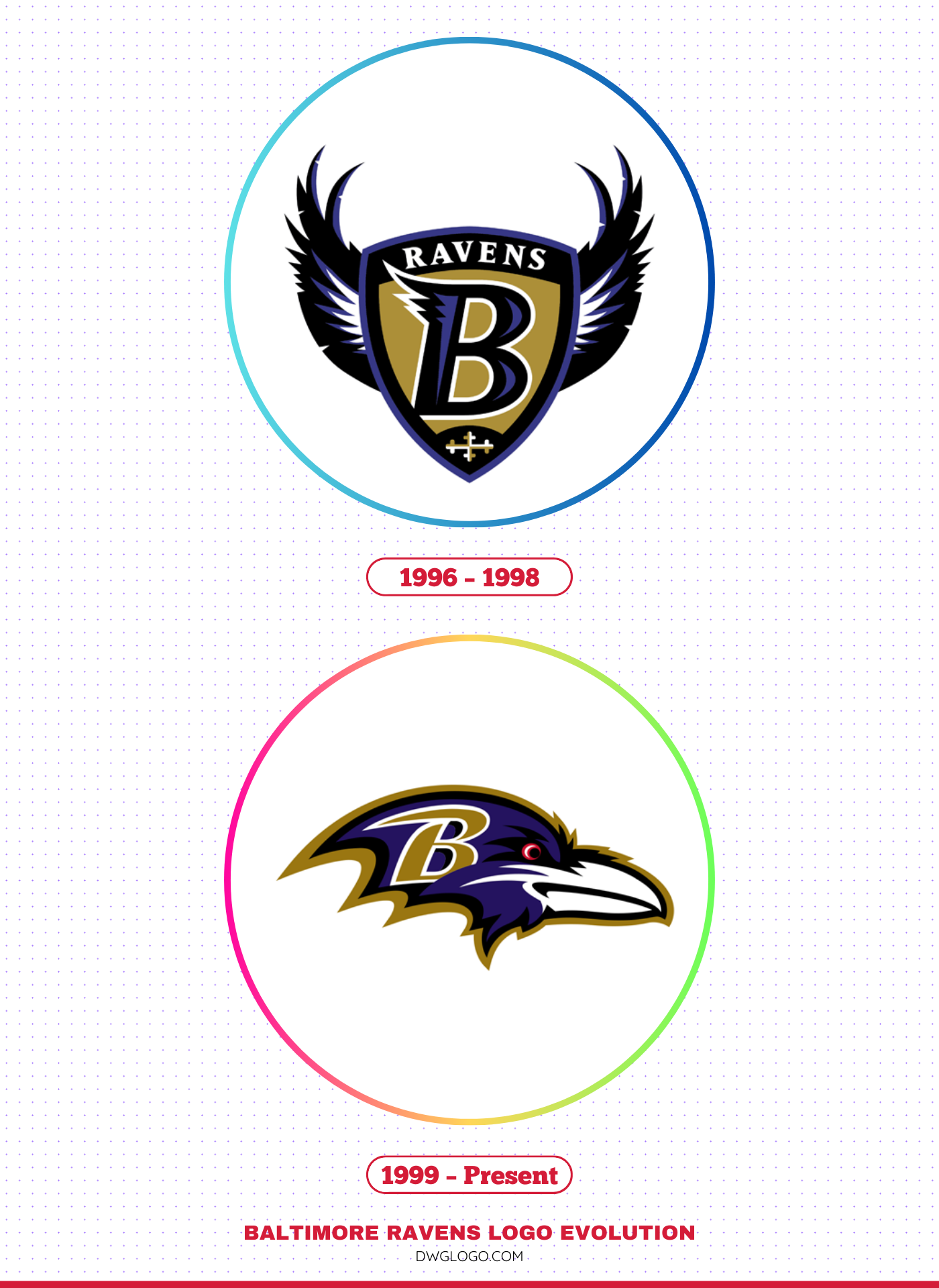
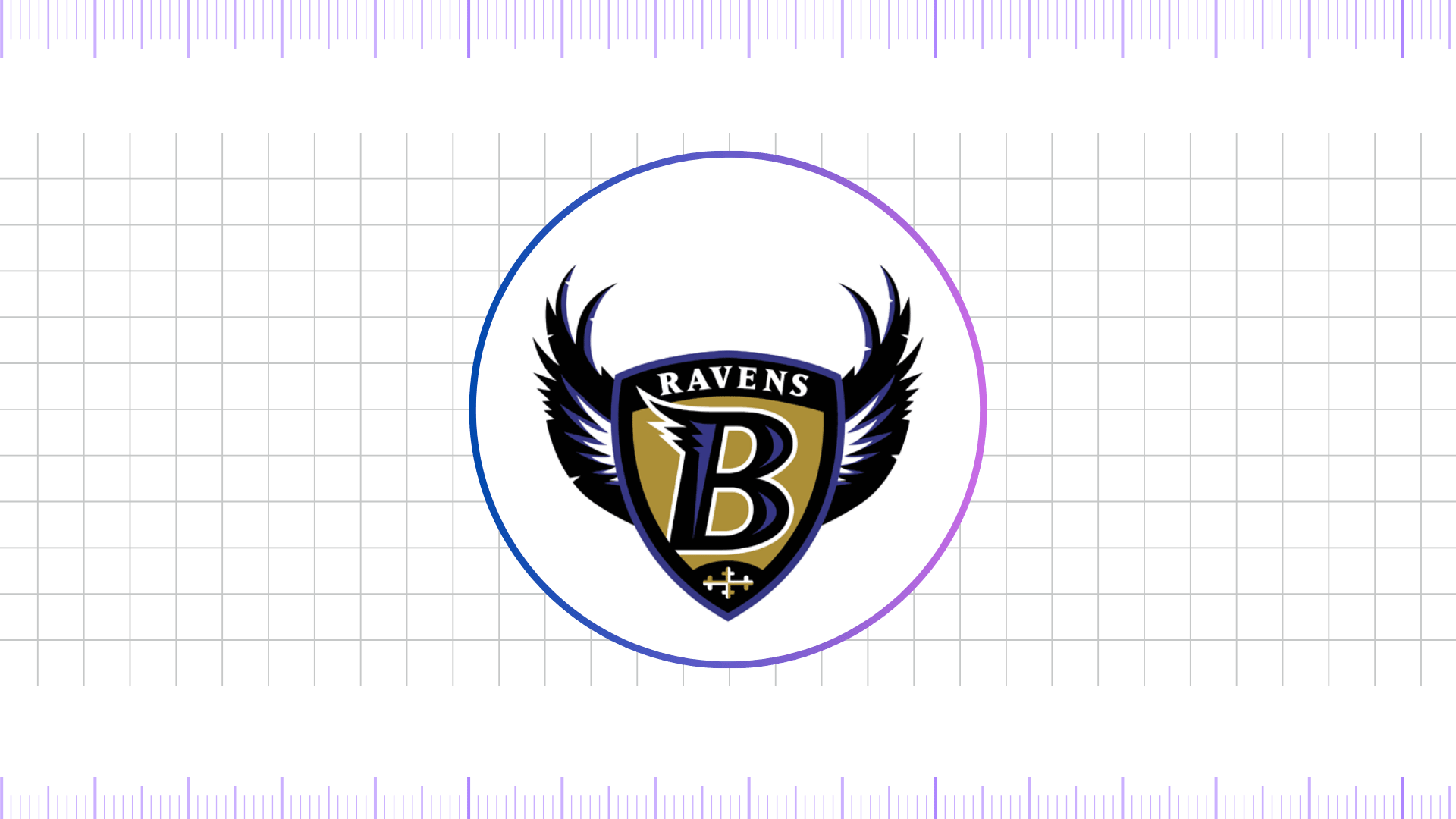
The inaugural Baltimore Ravens logo, used from 1996 to 1998, was a complex and symbolic design. It featured a stylized shield with a large, winged “B” for Baltimore at its center. The word “RAVENS” arched above the shield, and beneath it, a cross bottony, a direct nod to the Maryland state flag, tied the team to its home.
The primary colors were purple, black, and a distinctive metallic gold. This logo was meant to convey a sense of nobility and medieval strength, a warrior mentality that the franchise wanted to embody. It was an ambitious design that established a regal and unique color palette in the NFL.
However, the lifespan of this first logo was cut short by a copyright infringement lawsuit. An amateur artist, Frederick Bouchat, claimed the logo was based on a design he had submitted to the team. A jury agreed in 1998, ruling that the Ravens had indeed infringed upon his copyright.
Although the team could still use the logo for historical purposes, the legal setback forced the organization to scrap its primary mark and embark on a hurried rebranding effort to avoid further litigation. This pivotal moment set the stage for one of the most significant logo changes in modern sports history.
1999 – Present
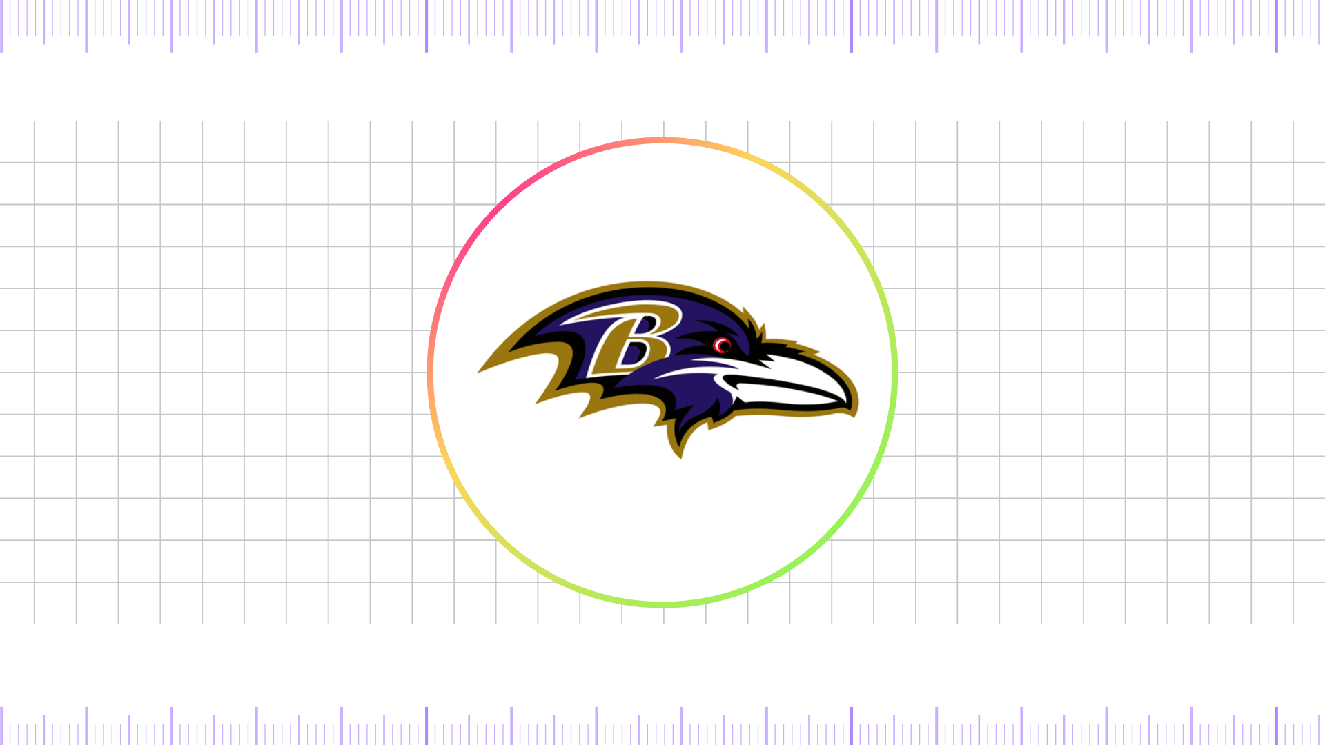
The legal verdict spurred a rapid redesign, culminating in the unveiling of the new logo in 1999. The team, with direct input from fans, chose a simpler, more aggressive design: a stylized profile of a raven’s head.
This mark was a stark departure from the intricate shield. It was clean, bold, and modern, featuring a raven’s head facing to the right with the letter “B” subtly integrated into the bird’s eye. The design maintained the signature colors of purple, black, and metallic gold, reinforcing the established brand identity. This new logo, which has become iconic, perfectly captures the ferocity and intelligence of the raven while honoring the team’s name and its literary inspiration.
Over the years, the current logo has seen only minor refinements, a testament to its timeless design. It is now instantly recognizable and synonymous with the Baltimore Ravens’ two Super Bowl victories and their reputation for a tenacious, defensive-minded brand of football.
The transition from the ornate shield to the streamlined raven’s head symbolizes the team’s maturity and its singular focus on building a powerful, no-nonsense identity. The logo’s clean lines translate exceptionally well to merchandise, helmets, and jerseys, becoming a powerful symbol of Baltimore pride.
Baltimore Ravens Logo Colors and Their Symbolic Meaning
The colors of the Baltimore Ravens logo further enhance its striking appearance. The official color palette includes purple #24135f, gold #9a7611, black #000000, red #ca1633, and white #ffffff. Purple serves as the primary color, symbolizing royalty and dominance, while black represents strength and intimidation.
Gold adds an element of prestige and success, while red provides energy and intensity, especially visible in alternate branding applications. White is used for contrast and clarity, ensuring the raven head and accompanying elements stand out across digital, print, and apparel mediums. This combination not only makes the Ravens unique but also ensures their visuals stand out in a crowded sports landscape.
Final thoughts,
The Baltimore Ravens logo evolution is a compelling case study in branding, identity, and resilience. The initial 1996 shield, though well-intentioned, was a legal casualty that forced the franchise to pivot. This unexpected hurdle ultimately led to the creation of a more impactful and enduring symbol. The 1999 raven’s head is not just a logo; it’s a statement.
Its clean, aggressive design perfectly embodies the team’s on-field mentality and its connection to the city. This visual journey from a complex, short-lived emblem to a streamlined, iconic mark showcases the power of effective rebranding and the importance of a visual identity that resonates with fans and defines a legacy.


