Alaska Airlines’ brand identity is an intriguing study of a company balancing its historical roots with modern aspirations. The evolution of its logo, particularly the iconic face on its tail, reflects a journey from a small, regional carrier to a major national airline.
Each redesign tells a story of strategic change, adapting to new markets and technology while holding onto a core identity that has resonated with customers for decades. This progression highlights how a logo is far more than just a symbol; it’s a living representation of a company’s past, present, and future.
The Evolving Identity of Alaska Airlines: A Journey Through Its Logos
1966 – 1972
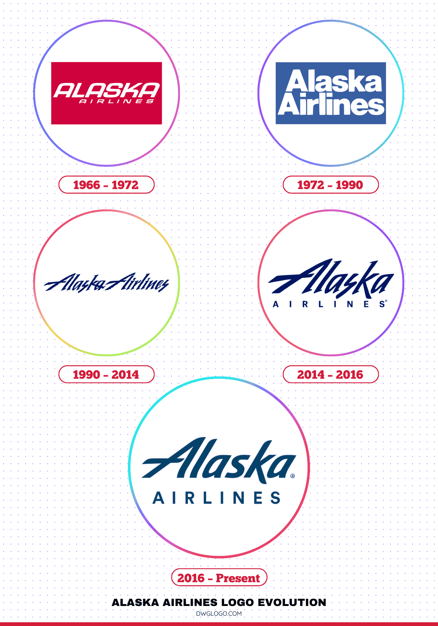
The period from 1966 to 1972 saw Alaska Airlines using a logo that was primarily functional and straightforward, mirroring its role as a regional carrier. The wordmark was simple and bold, often in a sans-serif typeface, with the airline’s name prominently displayed on the fuselage. During this time, the airline’s livery featured a simple, clean design with a distinct tail emblem.
This era’s logo and branding were about clear communication and reliability, establishing the airline as a trusted mode of transport in the rugged Alaskan landscape. The design was less about artistic flair and more about practical, no-frills branding that suited its operational focus. It laid the groundwork for the more character-driven logos that would follow.
1972 – 1990
A significant turning point came in 1972 with the introduction of the now-famous smiling Native Alaskan man on the tail of the aircraft. This new branding was a bold move that aimed to personify the “Spirit of Alaska” by paying homage to the state’s rich cultural heritage. The logo, often referred to as “Chester” by airline staff and fans, was a part of a four-logo identity scheme that also included a gold prospector, a Russian Orthodox spire, and a totem pole.
The face, an Inuit man in a traditional parka, quickly became the most enduring symbol. The wordmark during this time was a classic, bold, and custom-made sans-serif font, often based on Helvetica. The colors were predominantly a deep blue and white, colors that evoke the vast Alaskan skies and snowy landscapes. This iconic face created an immediate, emotional connection with passengers, giving the airline a unique and recognizable personality.
1990 – 2014
The 1990 redesign marked a move toward a more consistent and contemporary look. While keeping the cherished Native Alaskan face on the tail, the airline introduced a new typeface for its wordmark, famously nicknamed the “icicle” font due to its sharp, jagged serifs. This bespoke, italicized font felt more dynamic and rugged, reflecting the adventurous spirit of flight. The fuselage livery was also updated with thin, green and blue stripes that ran down the length of the plane.
The colors were refined, moving from a standard blue to a darker, more sophisticated Midnight Blue, with a secondary Tropical Green added to the palette. This era’s branding struck a careful balance: it modernized the airline’s look to appeal to a broader market while preserving the core, beloved element that had become synonymous with its identity.
2014 – 2016
RRecognizing the need to evolve in an increasingly digital world, Alaska Airlines implemented a subtle refresh in 2014. This was less a complete overhaul and more a smoothing of the existing design. The “icicle” font was refined, with its sharp edges softened and rounded to appear more modern and clean. The color palette remained largely the same, but the application was updated to be more uniform and consistent across all branding materials.
The goal of this refresh was to maintain brand recognition while ensuring the logo and wordmark were legible and effective in smaller digital formats, such as on mobile apps and websites, where the previous jagged font could be difficult to read. This period represents the airline’s proactive step into the modern digital age without alienating its loyal customer base.
2016 – Present
2016–Present: The Bold New Look
Focus group participants described the previous designs as “cool” but “too corporate,” which influenced the decision to refresh the font. Under the leadership of CEO Brad Tilden, Alaska Airlines partnered with the branding agency Hornall Anderson to develop the updated look. The redesigned logo debuted on a newly painted Boeing 737-800 and was soon rolled out across signage, the airline’s website, and promotional materials.
FAQ’s
When was the Alaska Airlines Eskimo logo introduced?
The Eskimo face logo was first introduced in 1972 and has remained a defining feature of the brand since then.
What font is used in the Alaska Airlines logo?
The modern Alaska Airlines logo uses a custom sans-serif typeface with smooth curves, designed specifically for the brand to ensure clarity and friendliness.
Final thoughts,
The logo evolution of Alaska Airlines is a masterclass in brand stewardship, demonstrating how to honor heritage while embracing modernity. From the simple, no-frills wordmarks of the early years to the introduction of the universally recognized Native Alaskan face, each change was a strategic step. The shift to a custom “icicle” font and subsequent refinements showcased a commitment to contemporary design.
The 2016 rebrand, with its simplified, vibrant identity, successfully positioned the airline for the digital age while retaining the core symbol that has built decades of trust. Ultimately, Alaska Airlines’ logo is more than an image; it is a narrative of growth, resilience, and a deep connection to its roots.
Reference: [1]
