The Los Angeles Dodgers are one of Major League Baseball’s most storied franchises, with a history spanning over 130 years and deeply rooted in both Brooklyn and Southern California. The team’s narrative is not just one of championships and legendary players; it is also a fascinating study in brand evolution, marked by a dazzling array of name changes, iconic color schemes, and subtle typographical shifts that reflect the cultural and sporting landscape of their time.
From the early days in Brooklyn to their current status as a global powerhouse, the journey of the Dodgers’ visual identity is a testament to the power of enduring brand recognition built on a foundation of tradition and strategic adaptation.
The Enduring Evolution of an Icon: A Chronicle of the Los Angeles Dodgers’
The franchise’s numerous name changes, particularly in its first few decades, often reflected its ownership, its location, or even the transportation methods that fans used to reach the ballpark. The long list of names, often overlapping or used simultaneously by the press, tells a tale of a team searching for a permanent identity.
1899 – 1901
The team that would become the Dodgers began its life in Brooklyn in 1883 as the Brooklyn Grays. By the time the 20th century arrived, they were known, officially and unofficially, as the Brooklyn Bridegrooms. This unusual name stemmed from an 1888-1889 season where several players got married. As the team entered the National League in 1890, they were often simply called the Brooklyn Base Ball Club. In 1899, the team adopted the name Brooklyn Superbas, a nod to a popular Vaudeville troupe of the time, the “Hanlon’s Superbas,” reflecting manager Ned Hanlon’s importance. This name stuck through 1901.
1902 – 1908
The Brooklyn Superbas moniker remained the preferred name for this extended period. This era was characterized by the team’s solid, if unspectacular, performance, anchoring them as a fixture in the National League.
1909
The year 1909 is pivotal, as it saw the official adoption of the name that would eventually stick: Trolley Dodgers. This was not a completely new name; it had been used by fans and local newspapers since the late 1890s. It was a local, organic nickname referencing the complex network of trolley cars in Brooklyn and the necessity for pedestrians to “dodge” them—a dangerous but commonplace part of daily life near the home field, Washington Park. This name was a true reflection of the local culture and transportation of the time.
1910
![]()
In 1910, the blue color used for the letters on the uniform darkened again to a deep, dark blue. This was a return to a more traditional, perhaps more dignified, navy-like hue, moving away from lighter or brighter blues that may have appeared in the preceding years.
More significantly, this dark blue was used to frame an important feature on the team’s jersey: the letter “B.” This large “B,” signifying the team’s home in Brooklyn, was prominently placed inside a white diamond that featured a dark blue outline. This emblem was a bold, geometric statement, presenting the team’s city pride in a sharp, clear design that would stand out on the field.
1911
![]()
In 1911, the franchise made another stop on its journey back to a classic name, officially changing its designation to the Brooklyn Trolley Dodgers. Yes, the full name!
This switch was a nod to the now-famous, locally-inspired nickname referencing Brooklyn pedestrians having to “dodge the trolley cars” near the ballpark. The name had been used unofficially for years, but the organization periodically made it formal before shortening it to just “Dodgers.”
1912 – 1913
The name Trolley Dodgers officially returned for these two seasons, solidifying the cultural reference and moving the franchise closer to its modern identity.
1914 – 1925
Following the hiring of beloved manager Wilbert Robinson, the team adopted the popular nickname the Brooklyn Robins. Robinson’s tenure brought a period of stability and relative success, including two World Series appearances (1916 and 1920). This period is one of the longest continuous names in the franchise’s pre-Dodger history.
1926 – 1927
Though Wilbert Robinson was still the manager, the name Dodgers began to dominate the press and fan usage once again. It was a clear sign that the public preference was overriding the official designation.
1928
![]()
In the long and often chaotic chronicle of the Dodgers’ early identity, few details are as distinct and historically specific as a brief uniform design from 1928. While the classic Dodger Blue and the sweeping cursive script are timeless hallmarks of the franchise today, the uniform worn that season featured an unusual, almost academic design element: the letter “B.”
This “B” represented the team’s home city, Brooklyn, and it wasn’t just any font. The design utilized the bold, authoritative serifs of Bruce Double Pica. This typeface, with its strong vertical lines and classic construction, gave the uniform an air of traditional gravitas, a stark contrast to the whimsical “Daffiness Boys” nickname sometimes applied to the team during that era.
1929
![]()
In 1929, the franchise, still known to many as the Brooklyn Robins, made a notable, albeit brief, modification to their primary visual mark. The logo’s lettering underwent a stylistic shift, with its color transforming to a light blue. This change was further emphasized by the inclusion of a thin, bright red outline that traced the edges of the design, lending the team’s visual identity a unique, vibrant, and distinctly Roaring Twenties flair that wouldn’t last long before the classic Dodger Blue reasserted its dominance.
1930
![]()
The 1930 season brought a visually significant, yet artistically subtle, change to the Brooklyn Dodgers’ uniform, showcasing how minor adjustments can redefine a team’s aesthetic.
While the team was still in a period of naming fluidity—often still called the Robins by the press, though Dodgers was growing in popularity—their uniform lettering took a bold step forward. The iconic, flowing script font used on the jerseys in 1929 remained completely unchanged. This beautiful, custom-drawn script was already on its way to becoming the timeless typeface we know today.
1931
![]()
The year 1931 marks a brief but significant chapter in the storied history of the Dodgers franchise. Known at the time as the Brooklyn Robins—a charming nickname honoring their beloved manager, Wilbert Robinson—the team was on the cusp of an identity shift. And their logo that year perfectly reflected that transitional moment.
While the flowing, iconic “Dodgers” script we know today was still just around the corner, 1931 saw the Robins adopt a logo that was both classic and a little experimental: a block letter ‘B’ for Brooklyn.
1932 – 1936
With Wilbert Robinson’s departure in 1931, the name Robins faded, and the franchise officially embraced the name Brooklyn Dodgers. The original “Trolley Dodgers” was shortened, cementing the permanent brand.
1937
![]()
In 1937, the team used the letter “B” on their uniform for the final time. This particular iteration of the “B” was rendered in a classic, block-style print and featured the color green (specifically, the shade with the hex code #007a3b). This marked the last season the club incorporated the letter, which often stood for “Brooklyn,” into their design.
1938 – 1944
This era marks the definitive adoption and establishment of the franchise’s enduring visual identity. After years of changing nicknames, the team firmly embraced the Brooklyn Dodgers name. The iconic uniform script debuted, featuring the team’s full name, “Dodgers,” written in the now-famous flowing cursive script (often called the Hackathorn script) across the chest. The script was rendered in Dodger Blue (a vibrant royal blue) and slanted diagonally upward. Crucially, a sweeping blue curve, which famously trails from the letter ‘S’ and underscores the entire wordmark, was also introduced, cementing the classic look that has persisted with only minor variations for over eight decades.
The primary color was the deep blue, which by contemporary digital standards approximates a hex color like #053a8d, though the specific shade was not formalized digitally at the time. This period is the origin of the clean, classic aesthetic that defines the franchise.
1945 – 1957
![]()
This period, covering the final, legendary years in Brooklyn, saw subtle yet significant refinements to the iconic logo. The flowing script of the word “Dodgers” maintained its style but was adjusted for a slightly cleaner, more aligned presentation. Crucially, the underline beneath the name became notably thinner and more refined. This era also marked the maturation of the team’s visual brand with the formal integration of the flying baseball image.
1958 – 1967
![]()
In a momentous and controversial move, the team relocated to the West Coast and became the Los Angeles Dodgers. Despite the change of location, the core identity—the name, the colors, and the typography—was preserved, ensuring a smooth transition of brand loyalty to a new market.
1968 – 1971
The Los Angeles Dodgers continued their success, becoming one of the most recognizable and successful franchises of the era.
1972 – 1978
1979 – 2011
For over three decades, the Los Angeles Dodgers maintained an unswerving brand identity. This long period of stability reinforced their status as a global brand, recognizable by their clean look and classic design.
2012 – Present
The Los Angeles Dodgers brand has entered a modern era under new ownership. While the core visual identity remains unchanged, the franchise has focused on global marketing, expanding the reach of the classic Dodgers logo and brand to an international audience while celebrating their deep history.
Los Angeles Dodgers Color Codes: A Modern Palette
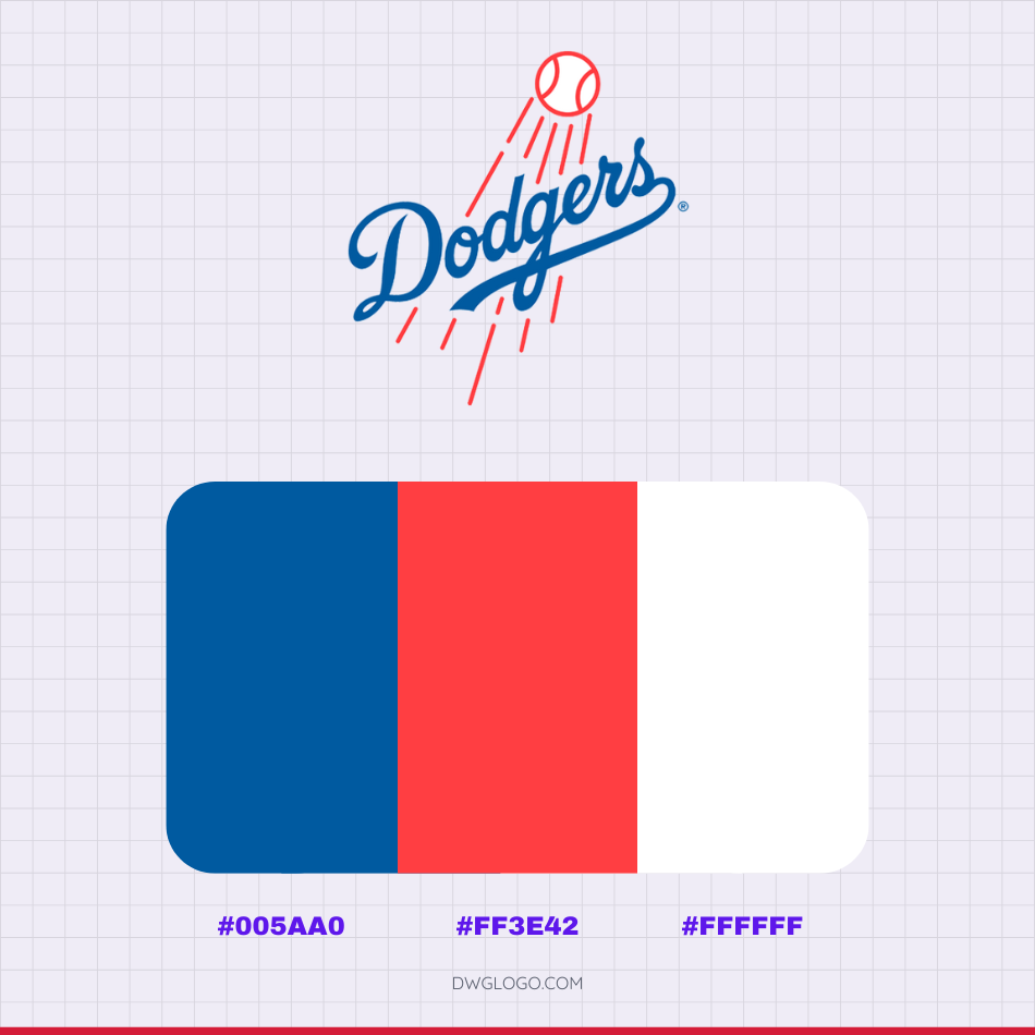
The primary visual identity of the Los Angeles Dodgers is defined by a classic and recognizable color palette consisting of three core colors. The central and most dominant hue is the signature Dodger Blue, officially represented by the hexadecimal color code #005aa0. This vibrant, deep royal blue is paired with a distinct bright red, used primarily for the numbers on the front of the home jerseys and for accents, which corresponds to the hex code #ff3e42. Finally, the necessary contrast and foundation of their uniforms and logos is pure white, designated by the color code #ffffff.
Los Angeles Dodgers Cap insignia
FAQ’s
Why did the Brooklyn Dodgers move to Los Angeles?
The primary reasons for the move in 1957 were financial and infrastructural. Walter O’Malley, the team owner, had long been seeking a new stadium to replace the aging and poorly-maintained Ebbets Field. Despite trying for years to secure land in Brooklyn for a modern ballpark, local government resistance proved insurmountable.
Simultaneously, the city of Los Angeles offered O’Malley a lucrative deal, including a large parcel of land (Chavez Ravine) for the construction of a brand-new stadium and a massive untapped market on the West Coast. The combination of stalled progress in New York and the enticing offer from Los Angeles led to the controversial but ultimately successful relocation.
Who designed the iconic “Dodgers” script wordmark?
The famous cursive script wordmark was designed and drawn in the 1930s by team cartoonist and graphic artist, Bill Hackathorn. He created the distinct, flowing script used on the home jerseys, as well as the initial design of the famous “swooshing baseball” logo that debuted in 1938, which features the word “Dodgers” flowing across a baseball trajectory. The design’s enduring quality speaks to its timeless simplicity and effective branding.
How did the name “Dodgers” originally come about?
The name “Dodgers” is a shortened form of “Trolley Dodgers.” The name originated in the late 19th and early 20th centuries, referring to the many streetcar lines (trolleys) that crisscrossed the borough of Brooklyn, particularly near the team’s first fields. Fans and pedestrians would frequently have to “dodge” the fast-moving trolley cars on their way to the ballpark, making “Trolley Dodgers” a highly localized and unique nickname that stuck with the team.