Canva, the graphic design platform, has become a household name, empowering millions to create stunning visuals without extensive professional training. A key element of its identity is its logo, which, like the company itself, has undergone significant evolution since its launch in 2013. Understanding the changes in its visual identity—the design, font, and color—provides insight into Canva’s brand strategy as it grew from a startup to a global powerhouse.
The Evolution of the Canva Logo: 2013–2021 and 2021–Present
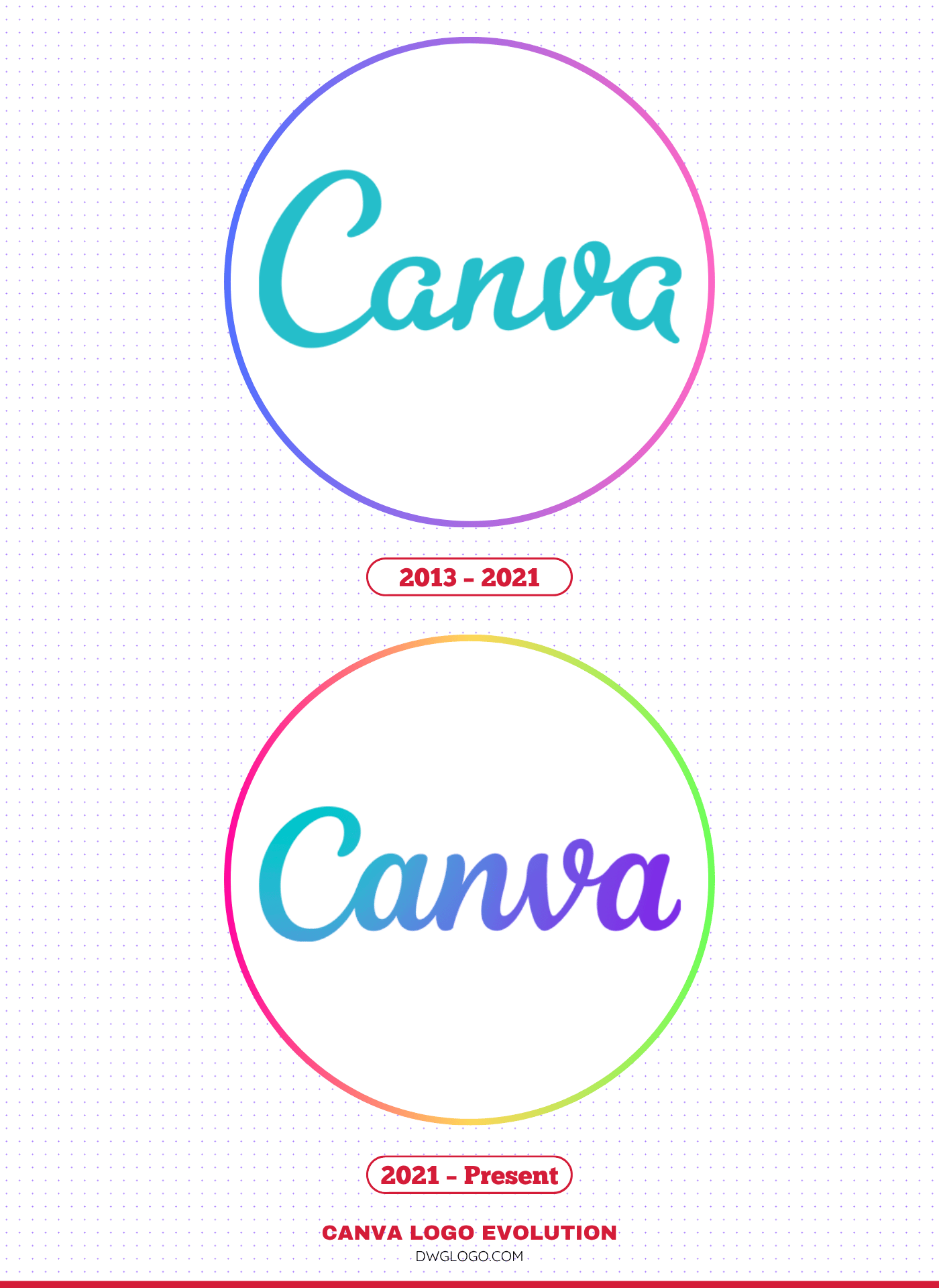
2013 – 2021

The original Canva logo, used for the better part of a decade, was a bold, approachable, and friendly mark that perfectly encapsulated the platform’s mission to democratize design. The wordmark featured the company name, “Canva,” with a distinct visual flourish.
Design and Font: The 2013–2021 logo was characterized by its friendly, rounded, sans-serif typeface. The most distinguishing feature was the open counter in the letter ‘a’ and the slightly extended crossbar on the letter ‘t’ (though ‘t’ isn’t in ‘Canva,’ this style was often associated with the family). The font itself was a custom-designed typeface, leaning into a geometric style that felt clean and modern, yet inviting. A critical element was the connection of the ‘C’ and ‘a’, subtly suggesting connectivity and the ease of creation. The overall feeling was one of simplicity and accessibility.
Color Palette: The primary color used was a vibrant, appealing teal/turquoise (often referenced as a specific shade of hex #25beca or similar). This color choice was strategic. Teal is often associated with creativity, imagination, and sophistication, perfectly aligning with a design tool. It was distinct and stood out in a saturated digital landscape, lending the brand an energetic and contemporary feel.
2021 – Present

In 2021, Canva unveiled a refined, updated logo designed to reflect its maturity, expansion into the enterprise sector, and broader set of tools (including video and presentations). This change wasn’t a radical departure but a thoughtful evolution towards a more robust and professional identity while retaining the core friendliness.
Design and Font: The current logo maintains the sans-serif wordmark but adopts a cleaner, more geometric and balanced typeface. The roundness is subtly preserved, but the characters are more structured. The custom font used, while similar, shows a slightly more uniform weight and a less exaggerated connection between the letters. The most noticeable change is the ‘C’: it’s now a perfect circle (a ‘perfect’ letter) representing completeness and the seamless integration of all design elements. This simplified, cleaner look signals professionalism and reliability, appealing to both individual users and large businesses. The overall design is optimized for digital scaling, looking sharp across all mediums from app icons to billboards.
Canva Color Codes: A Modern Palette

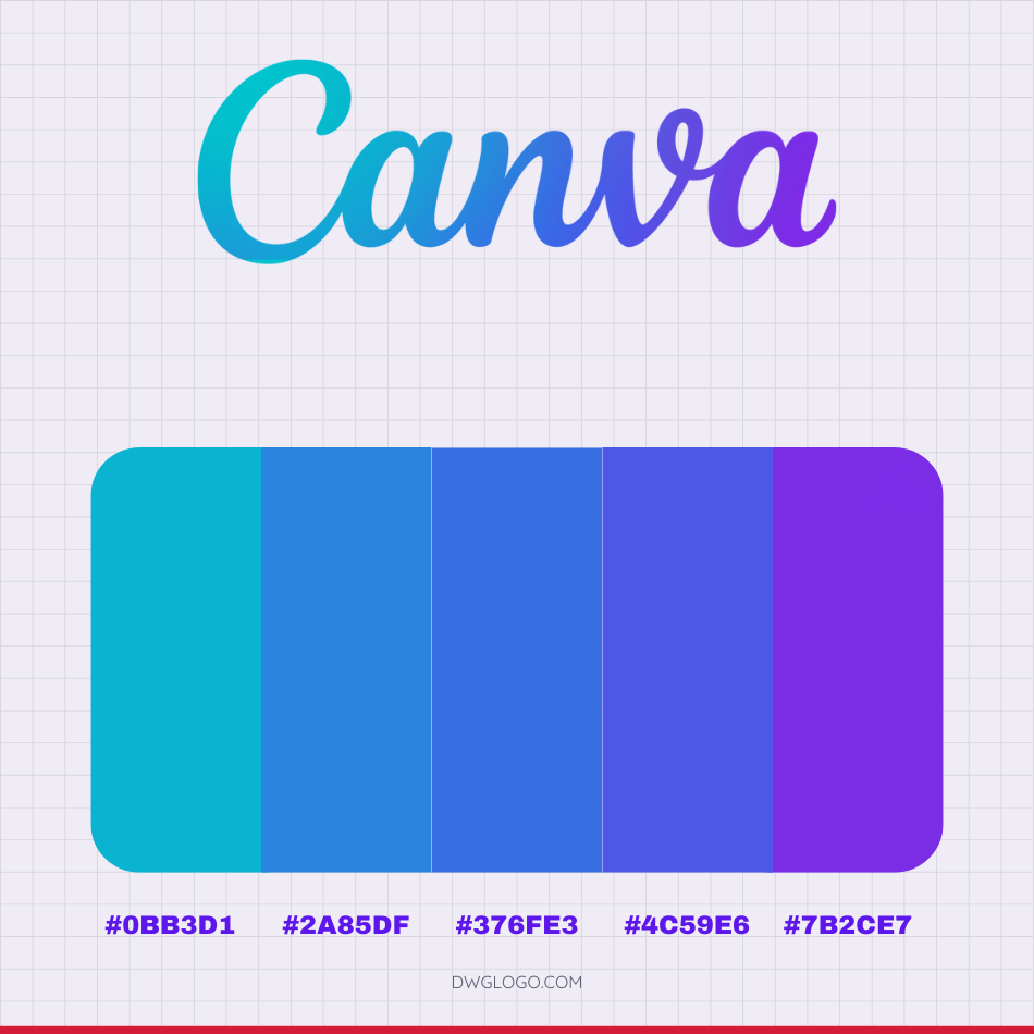
The Canva visual identity is instantly recognizable, not just by its ease of use, but by its captivating gradient. This palette of five key hexadecimal color codes is a masterclass in modern, energetic design, moving seamlessly through the blue family to embody sophistication and creative energy. Far from being random, these codes form a perfectly blended, analogous color scheme that is both harmonious and dynamically varied, providing a versatile foundation for any digital creation.
The Five Pillars of the Canva Palette
The chosen sequence of colors carefully orchestrates a transition from cool, accessible tones to deep, energetic hues:
- Teal/Cyan(#0bb3d1): This is the starting point, a brilliant, accessible teal that strongly anchors the palette in the traditional Canva brand identity. It is immediately associated with technology, freshness, and clarity, acting as the brand’s core accessible tone.
- Sky Blue(#2a85df): A smooth transition from teal, this sky blue introduces more stability and depth. It represents the reliability and open nature of the platform.
- Electric Blue(#376fe3): This richer blue intensifies the message of trust and professionalism. This color is more saturated and signifies the platform’s robust and professional capabilities, appealing to both individual users and enterprise clients.
- Indigo(#4c59e6): The color deepens further into an intense indigo, bridging the gap between steadfast blue and vibrant purple. This hue introduces a sense of sophistication and deeper creative energy.
- Bright Violet/Purple(#7b2ce7): The sequence culminates in a punchy, vivid violet. This final shade introduces elements of magic, luxury, and imaginative flair, qualities essential for a platform that empowers users to design anything.
Design Philosophy and Application
This curated palette is strategically functional, not merely decorative. By being anchored in the blue family, the colors maintain visual harmony, a core principle of good design. Designers can leverage the inherent versatility of this spectrum:
- Cohesive Branding: Use the middle codes, like the sky and electric blues (#2a85df and #376fe3), to craft subtle, trustworthy, and near-monochromatic brand identities.
- Dynamic Gradients: The full five-color spectrum can be stretched across digital assets to create the dynamic, high-impact gradients popular in modern design, ensuring the resulting visual is always balanced.
- Emotional Conveyance: The palette offers a ready-made formula to convey different emotions: trustworthiness and competence with the deep blues, and imaginative flair and modern energy with the teal and violet accents.
The Canva gradient, therefore, serves as a ready-made formula that allows any creator to achieve a professional, eye-catching aesthetic. This carefully curated sequence is the aesthetic cornerstone of the platform, confidently modernizing designs while ensuring seamless visual transition and cohesion within the Canva ecosystem.
