The logo of a company is more than just a graphic; it’s a visual shorthand for its mission, values, and evolution. For Udemy, a leading global online learning platform, its corporate emblem has undergone several distinct transformations since its founding, each reflecting a shift in its brand identity and market position. Tracing the changes from its nascent years to its current iteration reveals a compelling move towards simplicity, maturity, and accessibility.
The Visual Journey of Learning: Analyzing the Evolution of the Udemy Logo
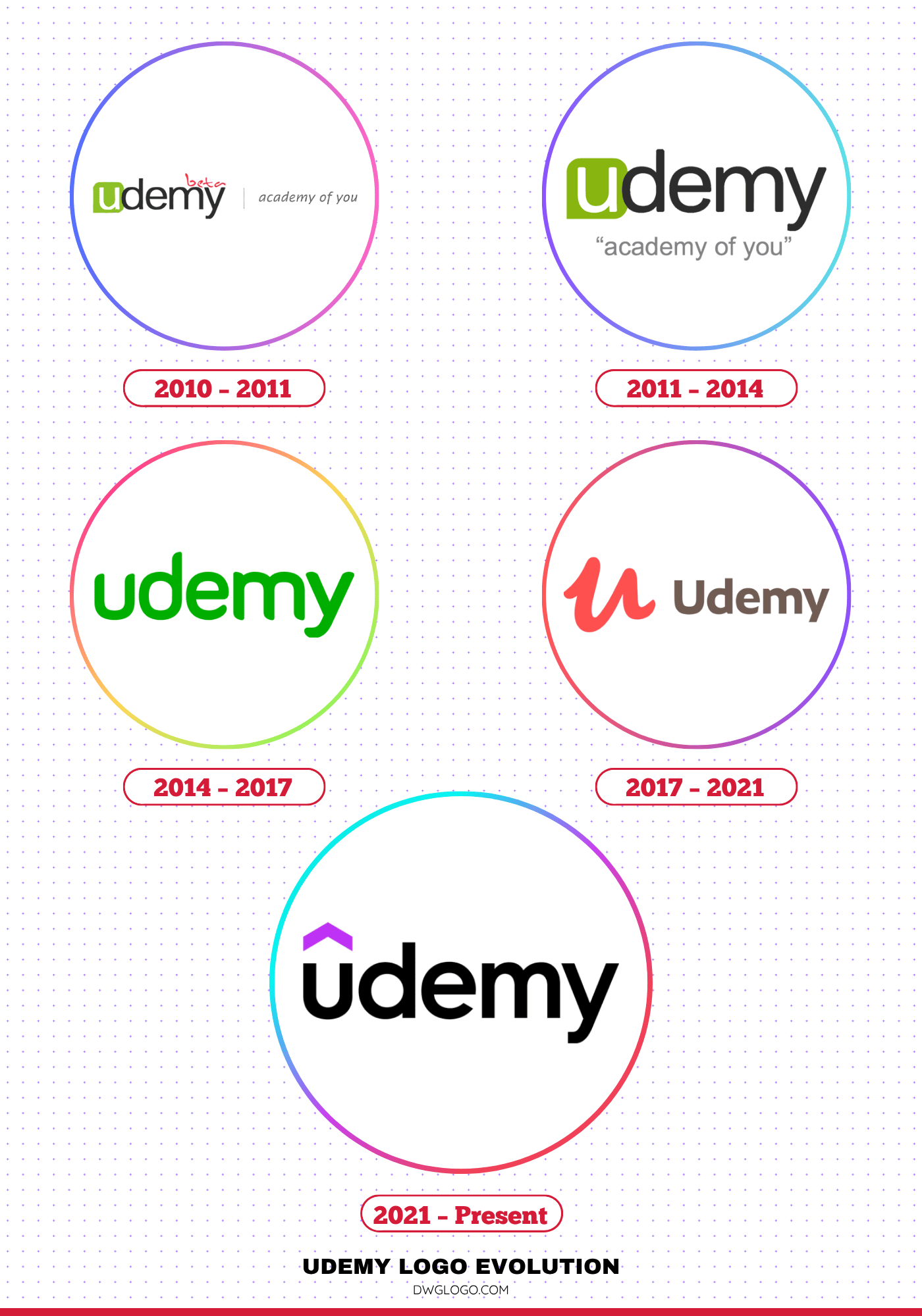
2010 – 2011
The very first Udemy logo, introduced shortly after the company’s 2010 launch, reflected the characteristic aesthetics of early tech startups: ambitious, functional, and perhaps a little unpolished. This initial identity was a direct and descriptive representation of their core offering. While specific visual records are less common than later versions, the design from this era likely focused on establishing immediate recognition. The platform’s name, “Udemy,” a portmanteau of “You” and “Academy,” was central.
The color palette was likely a simple, straightforward blue—a color often associated with trust, knowledge, and stability—perhaps paired with black or grey typography. The font would have been a legible, likely sans-serif typeface, prioritizing clarity over stylistic flourish, designed to be easily readable on a desktop interface where the burgeoning online learning revolution was taking shape. The goal was simple: to tell the user what the platform was—an online university or academy for “you.”
2011 – 2014
The year 2011 marked a significant turning point for Udemy, not just in its offerings, but in its visual identity. Having established itself beyond the initial testing phase, the company officially launched the main version of its site and, critically, unveiled a new logo to match its evolving status.
The most telling change was the disappearance of the word “beta.” Dropping this qualifier was a strong, confident statement to the market: Udemy was no longer an experiment; it was a fully functional, professional educational platform.
The logo’s design itself underwent a notable simplification. The vertical dividing line that had previously separated elements was removed, creating a cleaner, more cohesive visual field. Furthermore, the company’s motto was integrated more deliberately. It was repositioned to the bottom, aligned precisely to the center of the wordmark, giving it a stable foundation. To emphasize the motto’s importance and differentiate it from the main brand name, the designers enclosed it in quotation marks—a subtle nod to its role as a key statement of purpose. Finally, the typography for the motto was updated from a softer, possibly less formal italics to a clear, straight font, reinforcing the brand’s new sense of seriousness and maturity.
This 2011 refresh was a visual declaration that Udemy was ready to scale and compete, setting the stage for its rapid growth in the years to follow.
2014 – 2017
The 2014 to 2017 period marked Udemy’s push for greater corporate partnerships and a wider global reach, demanding a logo that felt more mature and sophisticated. The design during this stage focused on refinement and simplification. The color scheme often shifted towards a deeper, more authoritative green—a color that speaks to trust and quality education—with less reliance on the secondary colors for the core logo itself. The brandmark, if present, became cleaner and more abstract, removing unnecessary details.
Crucially, the wordmark became paramount. The typeface was likely a modern, heavyweight sans-serif, perhaps customized or subtly altered for a unique brand personality. The emphasis was on a clean, professional appearance suitable for both B2C and B2B marketing. This logo successfully conveyed that Udemy was a serious educational institution, ready to compete not just with other online platforms but also with traditional education models. It was a visual consolidation of their position as a mature market leader.
2017 – 2021

The 2017 brand refresh introduced what is perhaps the most enduring and recognizable version of the Udemy logo before the current one. This iteration embraced the philosophy of minimalism and immediate brand recall. The core of this design was the introduction of a distinct “U” emblem. This graphic element was highly stylized, often depicted as an abstract, circular, or semi-circular shape containing negative space, visually suggesting an open door, a community, or a rising graph—all metaphors for opportunity and learning.
The color palette was anchored by a vibrant, friendly, and distinctive shade of blue. This specific blue was chosen for its digital clarity and its ability to stand out. The typography for the wordmark was a clean, rounded, geometric sans-serif, often set in a slightly less bold weight than the previous iteration, balancing the strong visual presence of the emblem. This logo signaled confidence, accessibility, and a future-forward approach, perfectly suited for mobile app icons and modern digital interfaces, simplifying a complex global service into a single, memorable letter.
2021 – Present

The latest evolution, introduced around 2021, represents a subtle yet significant shift. The design philosophy moved towards a greater focus on the wordmark itself, underscoring the brand’s established equity. While the “U” emblem remains a powerful and independent asset, the full logo often features a more balanced relationship between the graphic and the text, or sometimes relies solely on a refined wordmark.
The primary color remains the signature Udemy bright purple, maintaining brand continuity and recognition. The most noticeable change is in the font: it’s a custom or semi-custom geometric sans-serif, carefully crafted for perfect legibility and a contemporary, professional feel. The letters are spaced and weighted to convey stability and accessibility. This version is a sign of a fully matured, globally dominant brand that no longer needs a complex graphic to explain its purpose. It’s a clean, confident statement of who they are.
Udemy Color Codes: A Modern Palette
The Udemy brand identity hinges on a striking and memorable color combination that perfectly encapsulates its mission of accessible, modern education.
The most defining color is a vibrant shade of bright purple, often represented by the hex code #a435f0. This arresting purple is a strategic choice: it conveys creativity, wisdom, and a premium feel, yet retains an energetic, youthful spirit. Purple, historically associated with ambition and quality, signals that Udemy offers high-value learning that helps users achieve their career aspirations. It’s instantly recognizable across digital platforms, setting the brand apart from the common blues of traditional tech and finance.
Complementing this bold primary color is the timeless sophistication of #000000—true black. In the logo and typography, black provides the ultimate foundation of professionalism and legibility. Paired with the vivid purple, the black wordmark anchors the design, ensuring the brand name is clear, authoritative, and easily readable on any background. This high-contrast pairing ensures the logo is impactful, modern, and effective at communicating the balance between innovative learning (purple) and credible knowledge (black).
Reference: [1]
