The Buffalo Bills’ logo history is a fascinating journey that mirrors the team’s evolution in the NFL. From the team’s inception in 1960 to its present-day branding, the logos have undergone significant transformations, each reflecting a specific era.
A Professional Look at the Buffalo Bills Logo Evolution
1960 – 1961
The original Buffalo Bills logo, used from 1960 to 1969, featured a charging red bison with a determined expression. It was a simple yet powerful design, representing the raw strength and tenacity of the American buffalo. The logo first appeared with the team’s inaugural season in the American Football League (AFL).
1962 – 1969
![]()
A lesser-known version from 1962 to 1969 subtly added a football and a star to the bison’s horn. This logo symbolized the team’s early days and their competitive spirit in a new league. The color palette was straightforward, consisting of red, white, and a touch of black. The fonts used during this period were generally blocky and utilitarian, complementing the rugged aesthetic of the logo itself. This era’s branding was foundational, establishing the team’s identity as a force to be reckoned with.
1970 – 1973
![]()
In 1970, with the AFL-NFL merger, the Bills introduced a new, short-lived logo. This version featured a standing red buffalo, a more static and less aggressive design than its predecessor. This logo only lasted until 1973, highlighting a transitional period for the team and its branding as they experimented with different visual identities.
The font during this time remained similar to the earlier block letters. This logo’s brief use underscores the team’s search for a lasting and iconic image. The shift from the dynamic charging bison to a more stationary figure might have reflected the changes in the league and the team’s ongoing efforts to find their footing.
1974 – Present
![]()
The most iconic and enduring logo for the Buffalo Bills was introduced in 1974. This design, often referred to as the “Leaping Buffalo”, features a blue and white buffalo with a red streak trailing behind its horns. The design conveys speed and motion, perfectly symbolizing the fast-paced nature of football. It was created by graphic designer Stevens Wright. This logo has become synonymous with the team and its fan base, earning a permanent place in sports branding history. The official team colors are royal blue, red, and white, a classic and vibrant combination.
The team’s primary font, used for the “Bills” wordmark, is a bold, custom-designed serif typeface. This font style is strong and clear, ensuring excellent readability on jerseys and merchandise. The enduring nature of this logo speaks to its timeless design and its powerful association with the team’s legacy, including their four consecutive Super Bowl appearances in the 1990s. The logo’s evolution from a simple drawing to a dynamic, modern symbol showcases the Bills’ journey through professional football.
A Closer Look at the Colors of the Leaping Buffalo
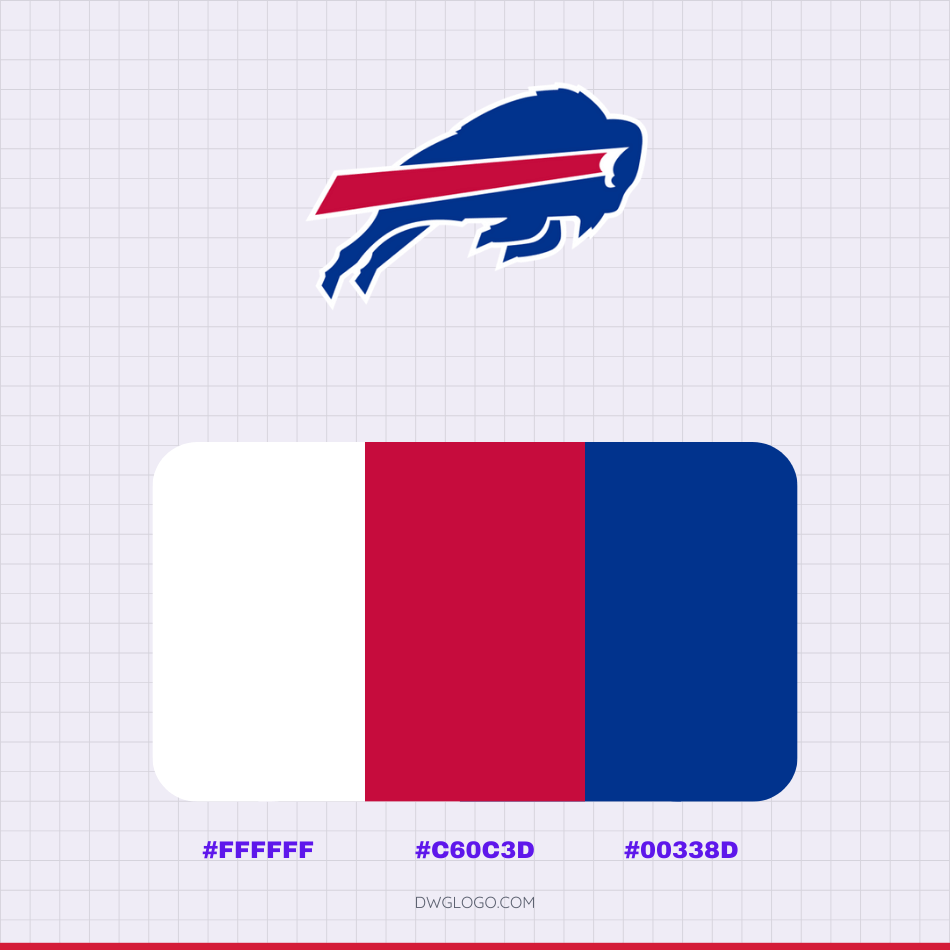
The Buffalo Bills’ current logo, the iconic “Leaping Buffalo,” is instantly recognizable thanks to its bold and vibrant color scheme. The primary colors of the logo are royal blue, red, and white. Specifically, the royal blue that defines the main body of the buffalo is represented by the hexadecimal color code #00338d, a deep, rich shade that evokes a sense of strength and tradition. This is complemented by a striking red streak trailing from the buffalo’s horn, which has the hexadecimal color code #c60c3d.
This vivid red provides a dynamic contrast and symbolizes the speed and energy of the team. Finally, the color #ffffff, or pure white, is used for the outlines of the buffalo and the wordmark, providing a clean separation between the other colors and ensuring the entire logo stands out clearly against various backgrounds. This specific combination of blue, red, and white has been the cornerstone of the Bills’ branding since 1974, creating a timeless and powerful visual identity for the franchise.
Final thoughts,
The Buffalo Bills’ logo has undergone a significant evolution, moving from complex, illustrative designs to the iconic, minimalist symbol used today. The team’s first logo in 1960 featured a blue football with a herd of buffalo and two players. This was simplified in 1962 to a brown football with a single buffalo and player, and then in 1970 to a plain red silhouette of a standing buffalo.
The most dramatic and enduring change came in 1974 with the introduction of the “Charging Buffalo” logo, designed by Stevens Wright. This iconic design, featuring a blue buffalo in motion with a dynamic red streak extending from its horn, has been the team’s primary logo ever since. Its clean, powerful, and symbolic nature has stood the test of time, and its enduring popularity was demonstrated when a proposed change in 2002 was met with fan backlash, leading the team to stick with the classic design. The “Charging Buffalo” has become a timeless symbol of the team’s identity, representing speed, determination, and strength.