The history of a company is often encapsulated in its visual identity, and few corporate logos tell a story of transformation quite like that of BASF. From its humble beginnings in 1865 to its current status as a global chemical powerhouse, the company’s logo has undergone a fascinating evolution, reflecting not only changes in design trends but also shifts in its strategic direction and corporate philosophy. Tracing this visual journey reveals a consistent move towards simplicity, modernity, and global recognition, while maintaining a core link to its heritage.
A Look at the BASF Logo Through Time
1865 – 1922
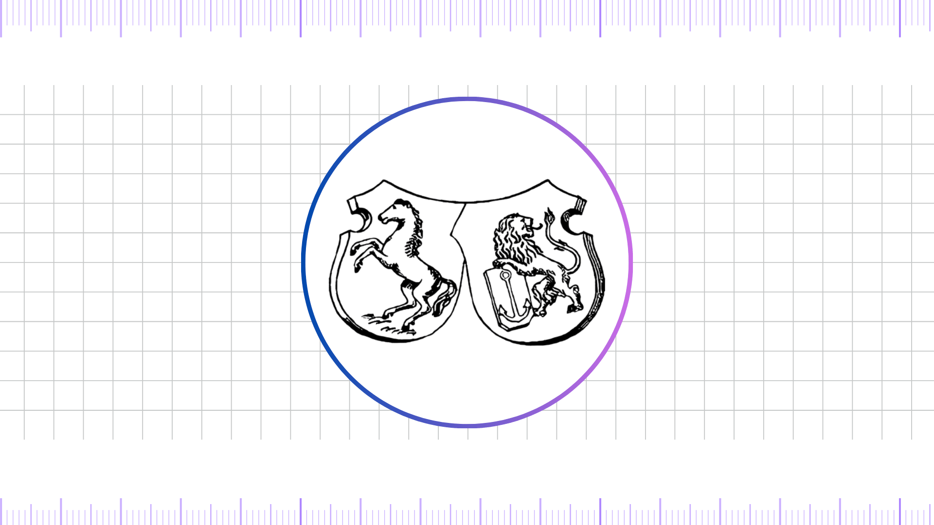
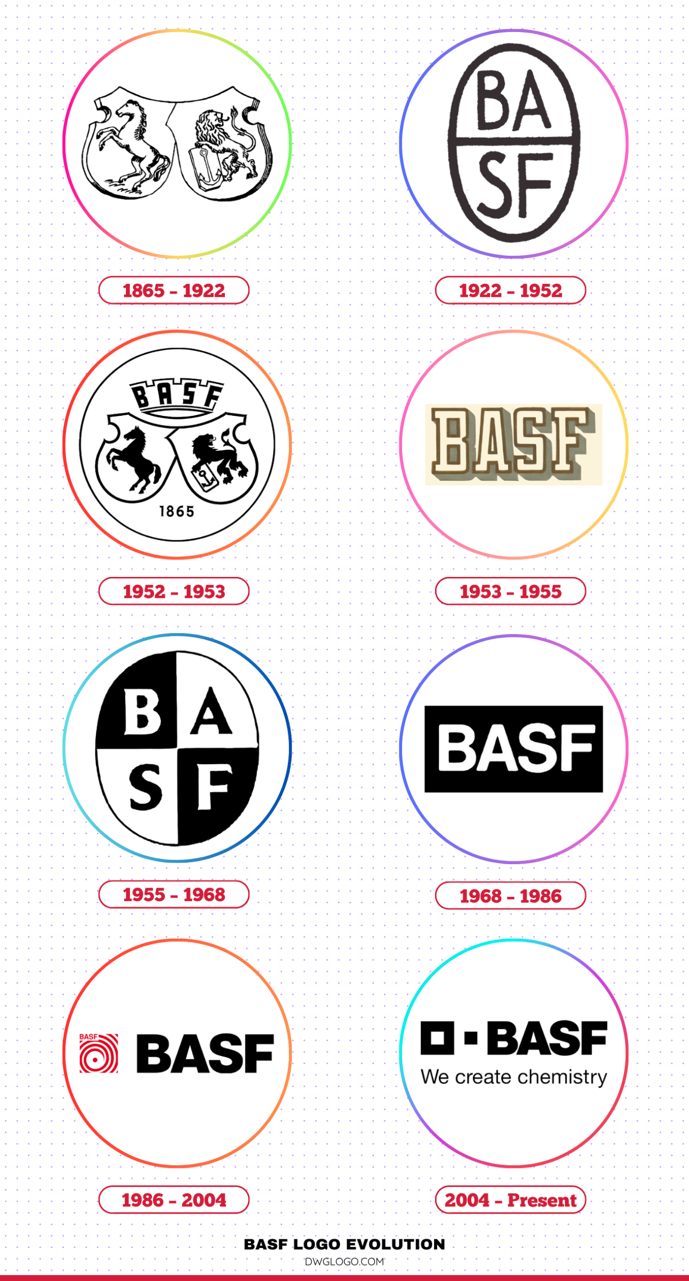
The very first logos of Badische Anilin- und Soda-Fabrik, founded by Friedrich Engelhorn, were more about descriptive utility than brand identity. The initial mark from 1865 was a straightforward, text-based emblem, often incorporating the full company name or a monogram. These early designs were typical of the industrial age, characterized by intricate, often calligraphic, lettering that reflected the craftsmanship of the era.
They were primarily used on letterheads, product labels, and official documents. There was no single, standardized logo, but rather a collection of marks that all served to identify the company. The fonts used were ornate, serif-based styles common in 19th-century German typography, such as Fraktur or other gothic scripts, which were prevalent for their perceived professionalism and historical gravitas.
The colors were limited, typically black or dark brown on a light background, dictated by the limitations of early printing technology. This period’s visual identity was functional, rooted in the formality and heavy industry of the time, and had yet to evolve into the concise, memorable brand mark that we know today.
1922 – 1952
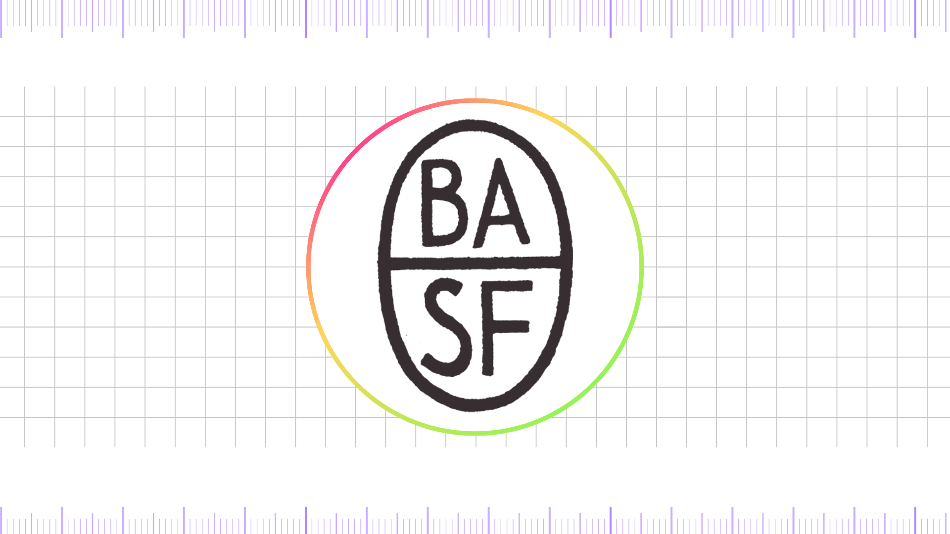
The interwar years saw a significant shift toward a more unified and recognizable symbol. The 1922 logo introduced a simplified monogram, featuring the intertwined letters “B,” “A,” “S,” and “F.” This mark was a considerable departure from the earlier descriptive text. It represented a move toward a modern, more abstract form of branding. The font was a robust, blocky serif that conveyed strength and stability, reflecting the company’s consolidation and growth during a turbulent period in European history. This logo was a product of its time, embracing the functionalist design principles that emerged in the early 20th century.
The color palette remained conservative, primarily in black and white, though occasional uses of deep blues or reds began to appear, hinting at the future use of color as a key brand element. This period marked the first real attempt by BASF to create a consistent, recognizable corporate logo that transcended language barriers and could be easily reproduced across various media, from factory signage to advertising campaigns.
1952 – 1953
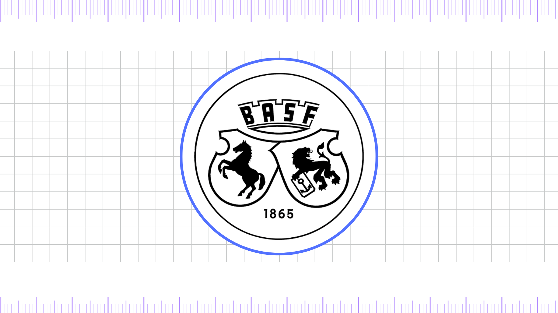
The early 1950s saw a short-lived but important transitional logo. This design simplified the monogram further, often placing it within a rectangular or circular frame. It was a step toward the cleaner lines and less embellished forms of post-war modernism. The font used for the company name, often placed alongside the monogram, became simpler and more geometric.
While this logo was in use for only a brief time, it served as a critical bridge between the ornate, complex monograms of the past and the minimalist, more universal designs that would follow. It demonstrated the company’s increasing awareness of design as a tool for corporate identity and its move away from historical aesthetics toward a more forward-looking visual language.
1953 – 1955
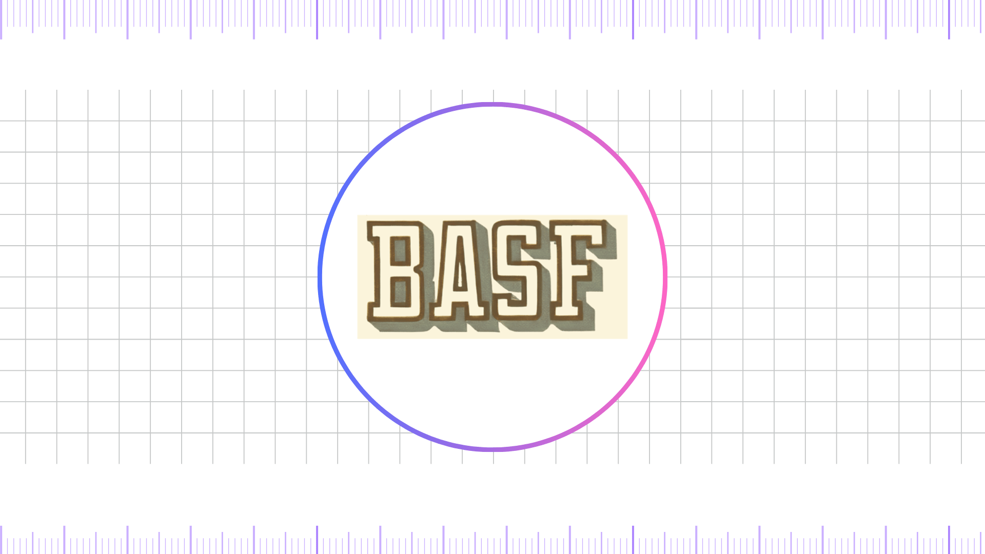
This era introduced a logo that was far more aligned with the burgeoning modernist movement. The design was clean, with a prominent, simplified monogram placed next to the full company name, often in a streamlined, sans-serif font. This was a decisive break from the past, embracing the legibility and directness that sans-serif typography offered. It reflected a post-war Germany rebuilding and looking to the future.
The colors began to become more standardized, with a focus on Yellow Metal or black, signifying professionalism, trust, and stability. This logo was a direct precursor to the more iconic designs to come, establishing the key elements of a modern corporate identity: a clear symbol and an equally clear wordmark.
1955 – 1968
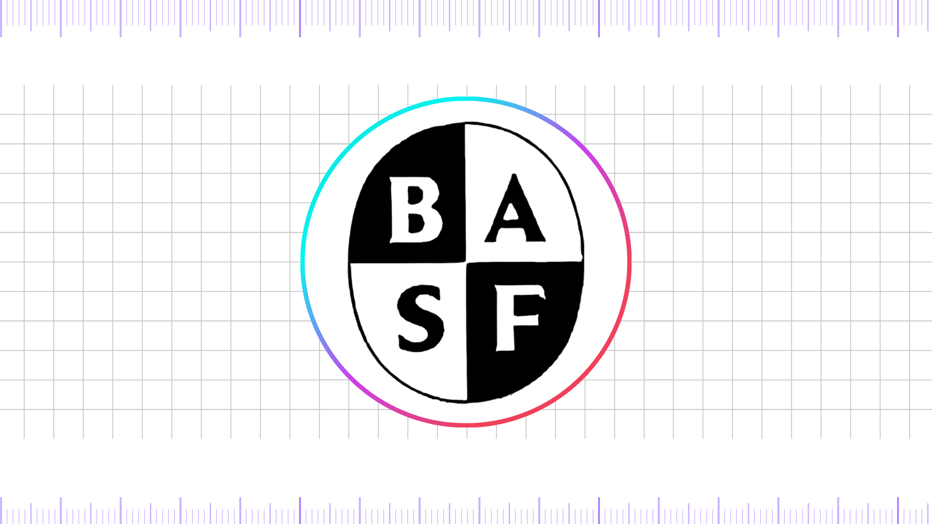
In 1955, BASF reintroduced a design reminiscent of the 1922–1952 logo, but with notable modifications in letter arrangement and structure. Each character was given its own dedicated space within the emblem, creating a more balanced and modern composition.
Instead of dividing the oval into two sections, the designers split it into four, corresponding to the four letters of the name. The “B” and “F” appeared inside black triangles, while the “A” and “S” were placed in white ones. This clever use of contrasting colors ensured that the letters stood out clearly, giving the logo a striking and memorable appearance.
1968 – 1986
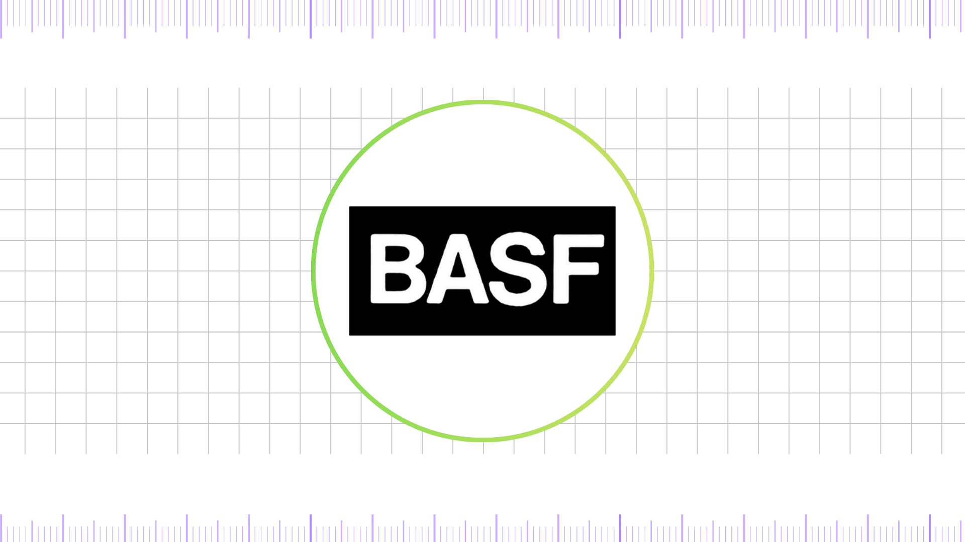
The following logo featured a horizontal black rectangle that acted as a backdrop for bold white lettering. The company’s name appeared entirely in uppercase, using a clean, sans-serif typeface. The strong contrast between black and white enhanced clarity and ensured excellent legibility.
1986 – 2004
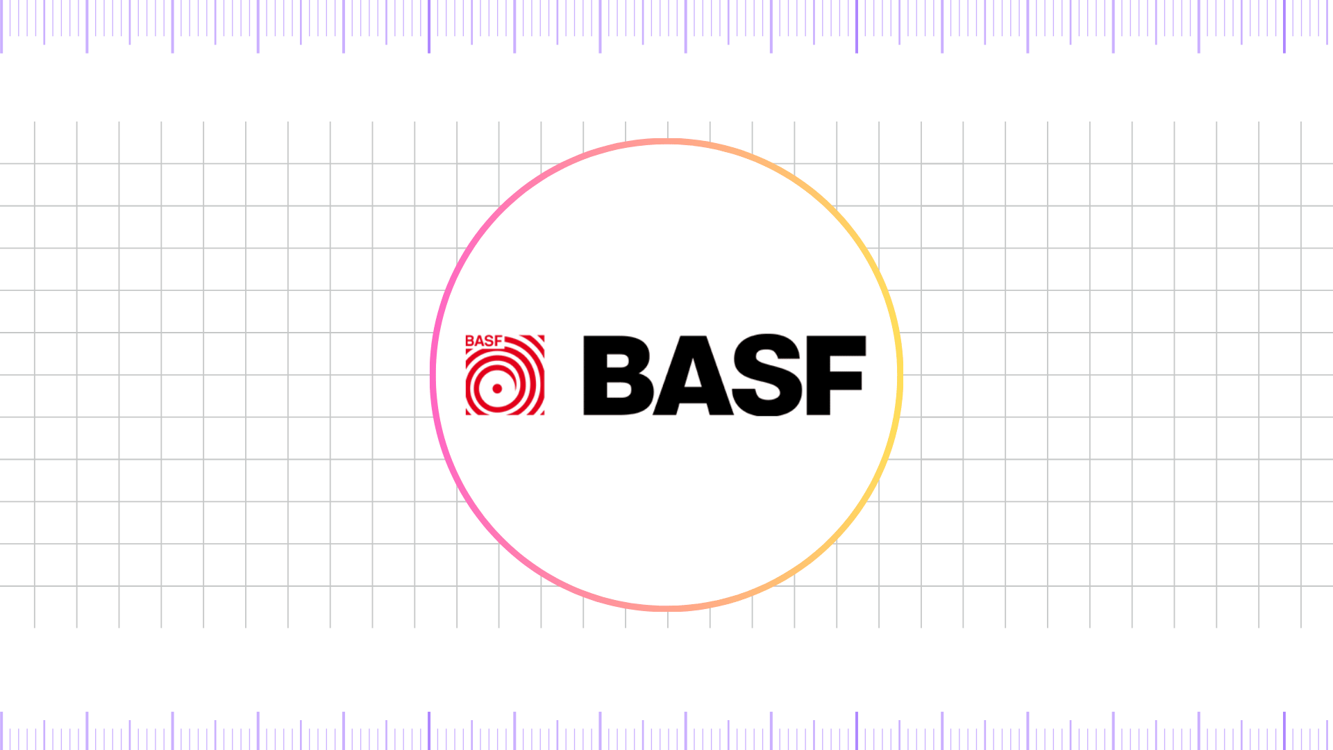
The logo introduced in the mid-1980s combined both a textual and graphical element, creating a bold and distinctive identity. The wordmark was rendered in solid black, set against a clean white background, with wide, heavy lettering that filled nearly all the spacing between characters, giving it a strong and commanding presence. To the left of the text appeared a small square emblem designed in a saturated red and white color scheme.
This graphic element featured a swirl logo resembling a spiral with a central dot, from which vertical coils radiated outward, symbolizing movement and energy. Adding to the composition, a miniature inscription with the abbreviated form of the company’s name was positioned neatly at the top left, reinforcing recognition while balancing the visual weight of the design.
2004 – Present
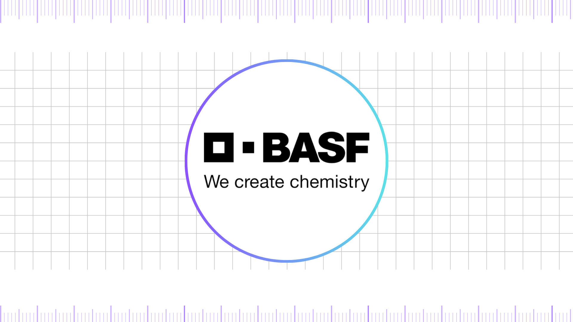
The current BASF logo, introduced in 2004, is a refined example of modern corporate branding. At its core, the design combines the bold BASF wordmark with a distinctive visual element: the left side square. This small square, placed before the letters, pairs with a larger square alongside the typography to create a symbolic system that conveys balance and partnership. The left side square represents BASF itself, while the adjacent larger square symbolizes customers, industries, and partners. Together, they reflect the company’s central philosophy of collaboration and innovation.
Final Thoughts,
What makes BASF’s logo evolution remarkable is its consistency in purpose. Rather than chasing trends, the company has carefully balanced tradition with innovation, ensuring that its identity remains recognizable while staying aligned with global design standards. Today, the BASF logo is more than a corporate emblem—it is a symbol of trust, sustainability, and forward-thinking solutions.
By combining bold typography, meaningful symbolism, and strategic use of color, the logo stands as a timeless representation of the company’s mission to connect science with society. The journey of the BASF logo serves as a powerful reminder that great branding is not static; it evolves with the brand, carrying its legacy forward while paving the way for the future.
Reference: [1]
