The Land Rover logo is more than just a brand mark; it’s a testament to a legacy of ruggedness, adventure, and British engineering. While the fundamental design has remained consistent, its subtle evolution over the decades reflects the brand’s growth from a utilitarian workhorse to a global luxury icon. Each iteration tells a story, from the early post-war years to the modern digital age, capturing the spirit of an enduring automotive legend.
The Evolution of the Land Rover Logo: A Journey Through Time
1948 – 1960s
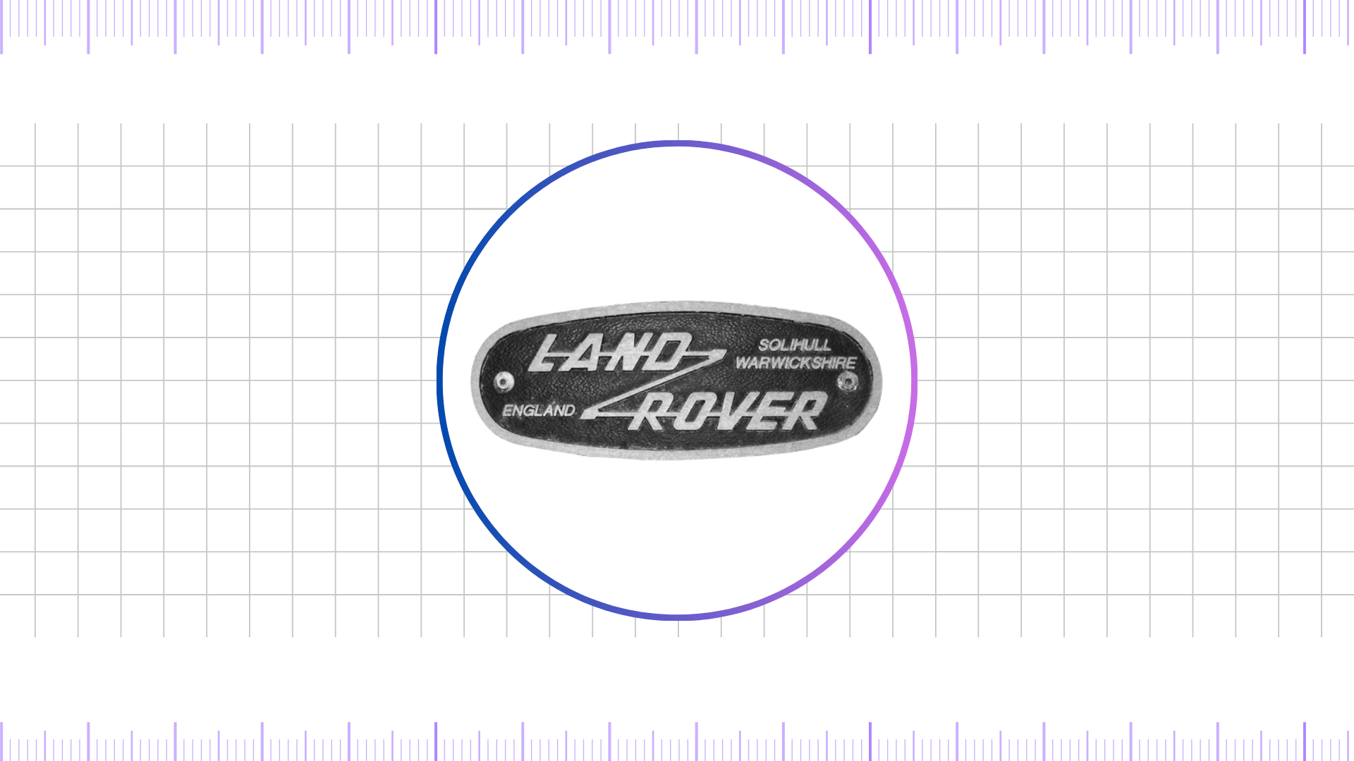
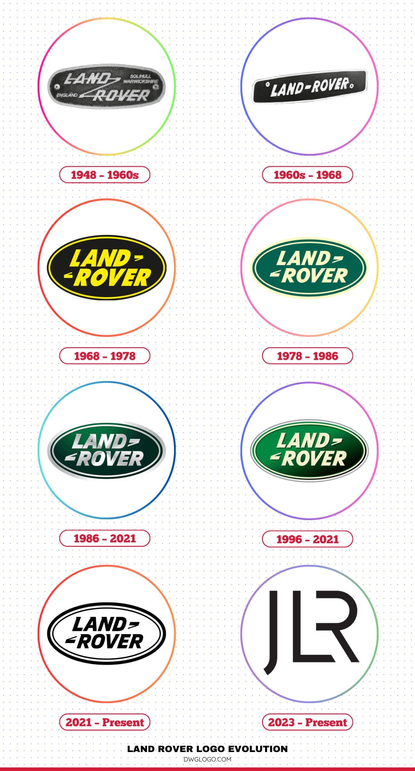
When Land Rover launched its first vehicle in 1948, the brand introduced a logo that was both practical and symbolic. The emblem took the form of a green oval with a metallic border, representing strength and reliability. Inside the oval, the words “Land Rover” appeared in a diagonal orientation, connected by a zig-zag line resembling the mathematical “≈” symbol, which was often interpreted as “about equal to.” This detail symbolized the versatility of the vehicle—neither a truck nor a car but something that combined the best features of both.
The dark green background of the early logo was a direct nod to the British countryside, where Land Rover vehicles proved their mettle in farming, exploration, and military use. The choice of white sans-serif lettering gave it a functional, no-nonsense appeal that perfectly aligned with the brand’s rugged character.
1960s – 1968
During the 1960s, Land Rover refined its logo while keeping the familiar oval shape intact. The green became lighter, moving closer to olive or moss tones, which enhanced visibility and modernized its look. The zig-zag connector remained, but the typography was subtly refined to appear bolder and more confident.
This era marked Land Rover’s growing reputation beyond British borders. The vehicles were becoming increasingly popular in Africa, Australia, and the Middle East. The logo’s updated color palette and stronger font mirrored this newfound global confidence while maintaining a link to its agricultural and military roots.
1968 – 1978
In 1968, Land Rover became part of the Rover Company, which brought subtle refinements to its visual identity. The familiar oval logo was retained, but the overall design leaned toward a more standardized corporate style. The font was sharpened for a stronger appearance, while the traditional green shade was deepened once again to reinforce values of reliability and heritage. During this era, Land Rover also experimented with variations of the emblem that incorporated yellow and black logo color accents, adding contrast and versatility to its branding.
Despite these updates, the distinctive zig-zag connector between “Land” and “Rover” remained intact, continuing to serve as a unique hallmark that set the brand apart from other automotive emblems. By this stage, Land Rover was evolving beyond its original identity as a purely utilitarian vehicle maker. The logo had become a visual bridge between the brand’s rugged heritage and its growing reputation as a symbol of adventurous spirit and premium off-road capability.
1978 – 1986
By 1978, Land Rover came under the British Leyland Group, which aimed to reinforce the brand’s global identity. The logo saw subtle refinements that gave it a more polished and professional appearance. The signature oval was deepened into a darker shade, leaning toward forest green with hints resembling the (00634f) very dark cyan tone, creating a stronger, more authoritative presence. At the same time, the lettering became bolder and cleaner, highlighted against a lighter contrast that echoed the elegance of a (fffac1) pale white color, enhancing readability and balance.
This era was pivotal, as Land Rover broadened its product lineup and began attracting more affluent buyers who valued both luxury and performance. The refined emblem conveyed a blend of rugged endurance and sophisticated style, signaling the company’s determination to enter new market segments while remaining true to its adventurous DNA.
1986 – 2021
The late 1980s brought about the most recognizable form of the Land Rover logo—the version that would endure for more than three decades. Introduced in 1986, the new design presented a clean, bold green oval with a sleek white border. The “Land Rover” inscription, still diagonally aligned, was written in a smooth, modern sans-serif font. The zig-zag connector was preserved, paying homage to the original design.
This iteration became synonymous with the brand’s global expansion. Land Rover was no longer just a rugged off-roader; it had become a premium SUV manufacturer competing in luxury markets worldwide. From the Range Rover to the Discovery and Defender, vehicles wearing this emblem conveyed prestige, durability, and cutting-edge technology.
1996 – 2021
During this time, the brand introduced the Discovery and Freelander, each with their own distinct identity. While still under the Land Rover umbrella, they often had unique badging. The main Land Rover logo, however, remained the familiar green oval. In a significant shift in branding, the company began to move away from a single model and towards a family of vehicles.
The Range Rover brand, in particular, was given more prominence, often featuring a sleek, sans-serif wordmark without the oval. This move signaled a new era where Land Rover was the parent brand for several distinct vehicle families, including Range Rover, Discovery, and Defender.
2021 – Present
With the launch of the new Defender and the strategic restructuring of its vehicle families, the Land Rover logo underwent its most significant transformation yet. The iconic green oval was retired as the primary brand emblem. Instead, the company now uses a more minimalist, two-dimensional logo featuring the “LAND ROVER” wordmark.
The lettering is in a clean, modern, sans-serif font. The color is predominantly black, silver, or white, reflecting a more premium, high-tech aesthetic. This logo is a statement of intent, positioning Land Rover as a forward-thinking, modern luxury brand. The traditional green oval now exists as a historical mark or in special heritage editions.
2023 – Present

In 2023, Land Rover, under the JLR (Jaguar Land Rover) umbrella, introduced another refinement of its logo, evolving the minimalist design first revealed in 2021. This update featured subtle yet meaningful adjustments, focusing on enhanced clarity and a more premium visual presentation. The signature green oval was slightly deepened to strengthen the brand’s identity, while the white lettering was sharpened to improve legibility across digital and physical platforms.
This updated emblem highlights JLR’s strategy of balancing heritage with modern innovation. It represents Land Rover’s forward-looking vision as the company accelerates its transition toward electric and hybrid vehicles, without losing the iconic oval shape and diagonal lettering that have defined its identity for decades. The 2023 version stands as a symbol of Land Rover’s ability to evolve under JLR while remaining deeply connected to its legacy of adventure, durability, and prestige.
Color Psychology and the Land Rover Logo
The color of the Land Rover logo, primarily green, is not an arbitrary choice. Green is a color deeply associated with nature, growth, and harmony. For a brand like Land Rover, which is all about off-road capability and exploring the outdoors, green is a perfect fit. It symbolizes the brand’s connection to the natural world and its commitment to building vehicles that can handle any terrain. The green color evokes a sense of freedom, adventure, and ruggedness.
It is also a color of safety and reliability, qualities that are central to the brand’s identity. The specific shade of green has varied over the years, but the core association has remained constant. The use of silver or black on the text provides a strong contrast, ensuring the logo is always legible and stands out. The color is not just a design element; it is a fundamental part of the brand’s storytelling, communicating its core values without a single word
FAQ’s
What is the “drooping tail” on the Land Rover logo?
The “drooping tail” is a unique feature of the early Land Rover logos, a stylized line connecting the “R” and “O” within the name. While its exact origin is debated, it is widely believed to have been a compass arc left by a draftsman, a small imperfection that became an iconic and recognizable part of the brand’s heritage. It symbolizes the handcrafted and somewhat serendipitous beginnings of the brand.
Why is the Land Rover logo green?
The green color of the Land Rover logo symbolizes its strong connection to nature and the outdoors. It represents the brand’s heritage of building all-terrain vehicles capable of exploring rugged, green landscapes. The color is a visual cue for adventure, growth, and harmony with the natural environment, aligning perfectly with the brand’s core values.
What is the JLR logo? Is it replacing the Land Rover logo?
The JLR logo, introduced in 2023, is the new corporate brand identity for the parent company of Jaguar and Land Rover. It is not replacing the individual Land Rover and Jaguar logos that appear on the vehicles. The JLR logo is a corporate symbol representing the unified vision and strategic direction of the combined entity, while the Land Rover and Jaguar logos maintain their unique brand heritage on the cars.
Final thoughts,
The Land Rover logo has evolved over the decades while retaining its essential DNA—the green oval, diagonal lettering, and distinctive connector. From its utilitarian beginnings in 1948 to its current minimalist yet premium design in 2023, the emblem reflects the brand’s growth from a rugged off-road vehicle manufacturer to a luxury automotive powerhouse.
With every iteration, the logo has balanced tradition with modernity, adventure with sophistication, and ruggedness with prestige. Today, the Land Rover emblem continues to symbolize not just a car brand, but a lifestyle of exploration, endurance, and elegance.
