Founded on November 16, 1920, in Winton, Queensland, Qantas was established by Hudson Fysh, Paul McGinness, and Fergus McMaster. Initially, the airline provided air mail services using small biplanes across remote areas of Queensland and the Northern Territory.
By the 1930s, Qantas began international flights in partnership with British Imperial Airways, laying the groundwork for what would become a global network. Today, Qantas operates both domestic and international services, with hubs at Sydney, Melbourne, Brisbane, and Perth airports. The airline is renowned for safety, service excellence, and innovation.
Its loyalty program, Qantas Frequent Flyer, is one of the most popular in the region, and its subsidiary, Jetstar, serves the low-cost segment.
Qantas Logo Evolution
Qantas Airways, officially known as Queensland and Northern Territory Aerial Services Limited, is the flag carrier of Australia and the country’s largest airline by fleet size, international flights, and destinations. Known as the “Flying Kangaroo,” Qantas is one of the world’s oldest continuously operating airlines, with a rich heritage dating back to 1920.
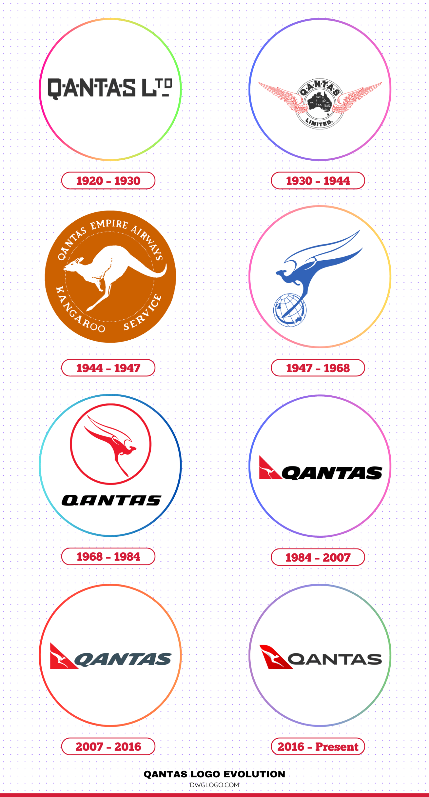
Over the past century, Qantas has not only evolved as an airline but also undergone significant brand transformations, particularly through its iconic logo.
1920 – 1930

The original Qantas logo, introduced in 1920, was simple and text-based. It featured the company’s full name in a formal serif font, reading “Queensland and Northern Territory Aerial Services.”
This design emphasized clarity and professionalism in a time when commercial aviation was in its infancy. The color scheme was black and white, which reflected the practical and utilitarian nature of early aviation branding.
1930 – 1944
In the 1930s, the logo was updated to a more streamlined version. The company name was abbreviated to “Qantas,” which made it easier to recognize and remember. This rebranding step marked the beginning of Qantas’ transition into a modern airline.
The font was slightly modernized, and the minimalist design retained the black-and-white theme, focusing on establishing a strong, typographic identity.
1944 – 1947
The most significant development in Qantas’ logo history came in 1944 with the introduction of the Flying Kangaroo. Inspired by the Australian penny coin, the kangaroo symbol was first used as a badge on Qantas aircraft flying between Australia and the UK. It soon became a brand icon.
The kangaroo, facing left, was illustrated in a simple but powerful way, symbolizing the airline’s Australian identity and pioneering spirit.
1947 – 1968

As Qantas entered the Jet Age in 1959 with the Boeing 707, the logo was redesigned to reflect speed and modernization. The kangaroo was stylized with wings, emphasizing the airline’s transformation into a global jet carrier.
The emblem adopted a bolder design with a red color scheme, signaling energy, progress, and national pride. The updated logo solidified Qantas’ international image and was used prominently on aircraft tails and promotional material.
1968 – 1984
The Qantas logo has undergone a symbolic transformation to reflect the airline’s modern vision. The iconic winged kangaroo now faces right, symbolizing forward momentum and a future-focused identity. While the previous globe element has been removed, a circular ring remains, reinforcing the airline’s global aspirations without tying it to specific geographic routes. The kangaroo, a national emblem of Australia, takes center stage within the ring, underscoring national pride and international reach.
A bold shift in color enhances this new image: red replaces the former blue, evoking energy, power, and confidence, while white offers balance and clarity. Black accents add contrast, giving the design a clean, commanding presence.
The “QANTAS” wordmark appears in bold, italicized, uppercase sans-serif lettering. This typeface choice—modern and assertive—emphasizes movement and dynamism, aligning with the speed and freedom associated with air travel. The overall design effectively communicates Qantas’s evolution into a globally recognized and forward-looking airline.
1984 – 2007
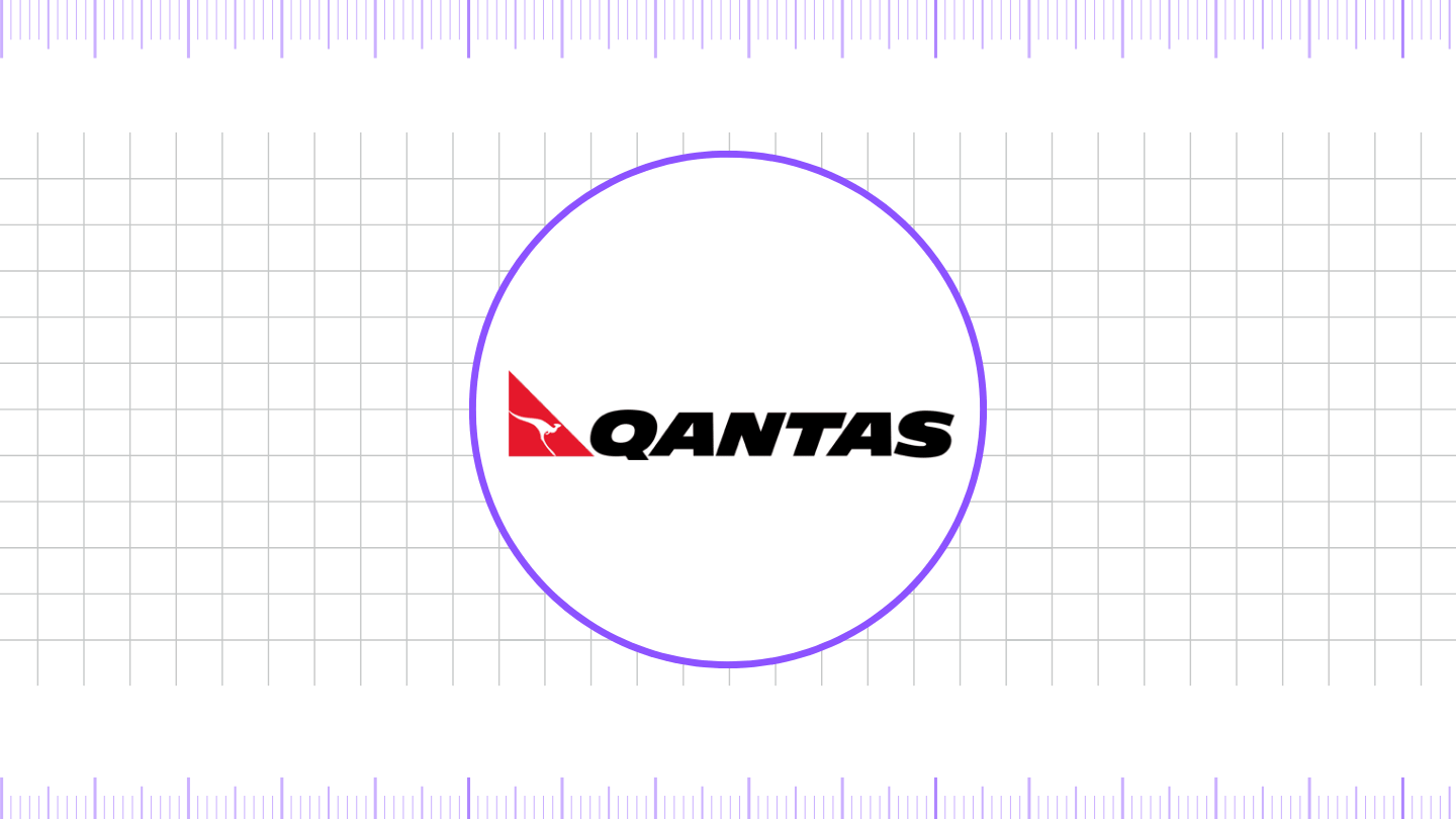
In 1984, Qantas introduced a bold new visual identity that marked a significant evolution in its branding. The iconic kangaroo symbol was refined for a more streamlined appearance, and notably, its wings were removed, resulting in a sleeker silhouette. Accompanying this was a contemporary, uppercase wordmark—“QANTAS”—set in a clean, sans-serif typeface that reflected modern design principles. Rendered in striking red and white, the logo enhanced visibility and recognition, even from a distance.
This update aligned with Qantas’ growing international presence and reinforced its stature as Australia’s flagship airline. During this period, the airline strengthened its global reputation for safety, innovation, and service excellence. The refined brand identity successfully captured Qantas’ aspirations as a modern carrier bridging Australia with the world.
2007 – 2016
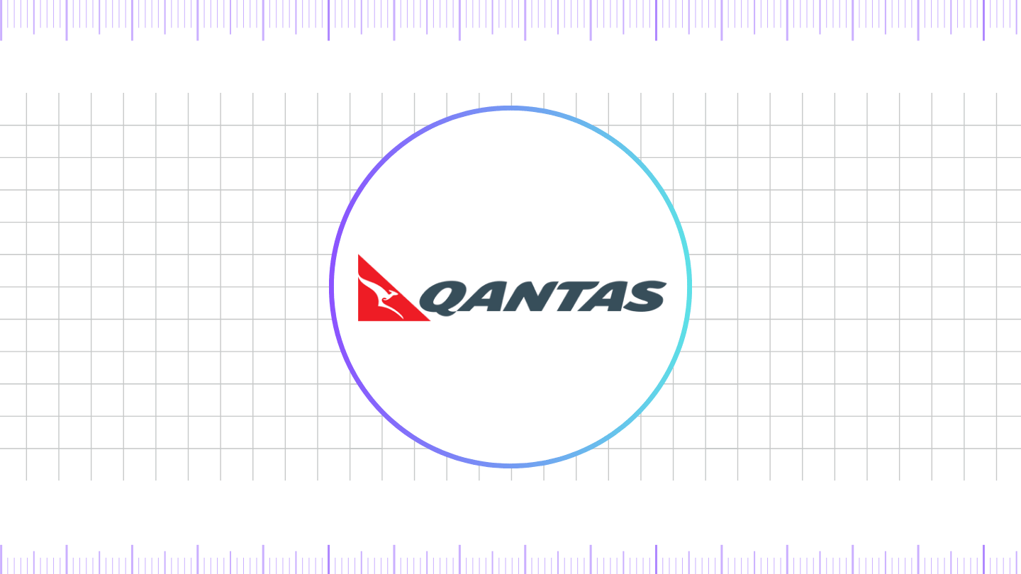
In 2007, the logo received a sleek, aerodynamic makeover to coincide with the introduction of the Airbus A380 into Qantas’ fleet. The kangaroo was rendered in a more fluid, minimalist style, eliminating legs in favor of a smoother shape to reflect modernity and innovation. The font was also revised, using a clean, custom-designed typeface with softer edges. This version maintained the red-and-white theme but embraced a more digital and global aesthetic.
2016 – Present
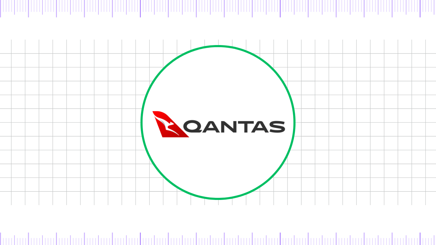
To mark the arrival of the Boeing 787 Dreamliner, Qantas unveiled a refined logo in 2016. Designed by Australian agency Houston Group in collaboration with designer Marc Newson, the logo retained the flying kangaroo but introduced subtle changes—sharper lines, a more aerodynamic curve, and a reshaped head and tail. The wordmark also saw updates, with a new custom typeface that emphasizes clarity and boldness.
This design was intended to look just as good on a smartphone screen as it does on a jetliner’s tail, reflecting Qantas’ push toward digital innovation. The red and white color scheme remains intact, symbolizing passion, trust, and the brand’s Australian heritage.
Fonts and Colors
Over time, Qantas has used a variety of fonts, primarily sans-serif styles, to maintain a clean, contemporary appearance. The current font is custom, with clean lines and a strong geometric structure, ensuring brand consistency across digital and physical media.
Color Palette:
- Red: #e4002b (symbolizing energy and national pride)
- White: #ffffff (representing purity, simplicity, and clarity)
These colors have remained largely consistent, reinforcing brand recognition over decades.
FAQ’s
1. What does the Qantas logo symbolize?
The Qantas logo symbolizes the airline’s Australian identity through the iconic kangaroo, a native animal and national symbol. The red color represents energy and national pride.
2. Who designed the current Qantas logo?
The current logo, introduced in 2016, was designed by the Houston Group in collaboration with Australian industrial designer Marc Newson.
3. Why was the kangaroo chosen as the Qantas symbol?
The kangaroo is a widely recognized symbol of Australia. It was adopted by Qantas in 1944 to represent its roots and pride in being the national carrier.
Final thoughts,
Qantas Airways has come a long way since its inception in 1920. With each passing decade, the airline has adapted to technological advances, customer needs, and global trends. Its logo evolution reflects not just changes in design aesthetics but also Qantas’ journey from a regional carrier to a world-class airline.
Today, the Flying Kangaroo remains one of the most recognizable and respected emblems in global aviation.
Reference: [1]