Nestlé, one of the world’s largest food and beverage companies, has built a remarkable legacy since its inception in 1866. The Swiss multinational is known for its vast portfolio of products, ranging from dairy and confectionery to baby food and pet care. With an unwavering commitment to quality and innovation, Nestlé has become a global household name. Its iconic logo has evolved over the decades, reflecting its growth and transformation.
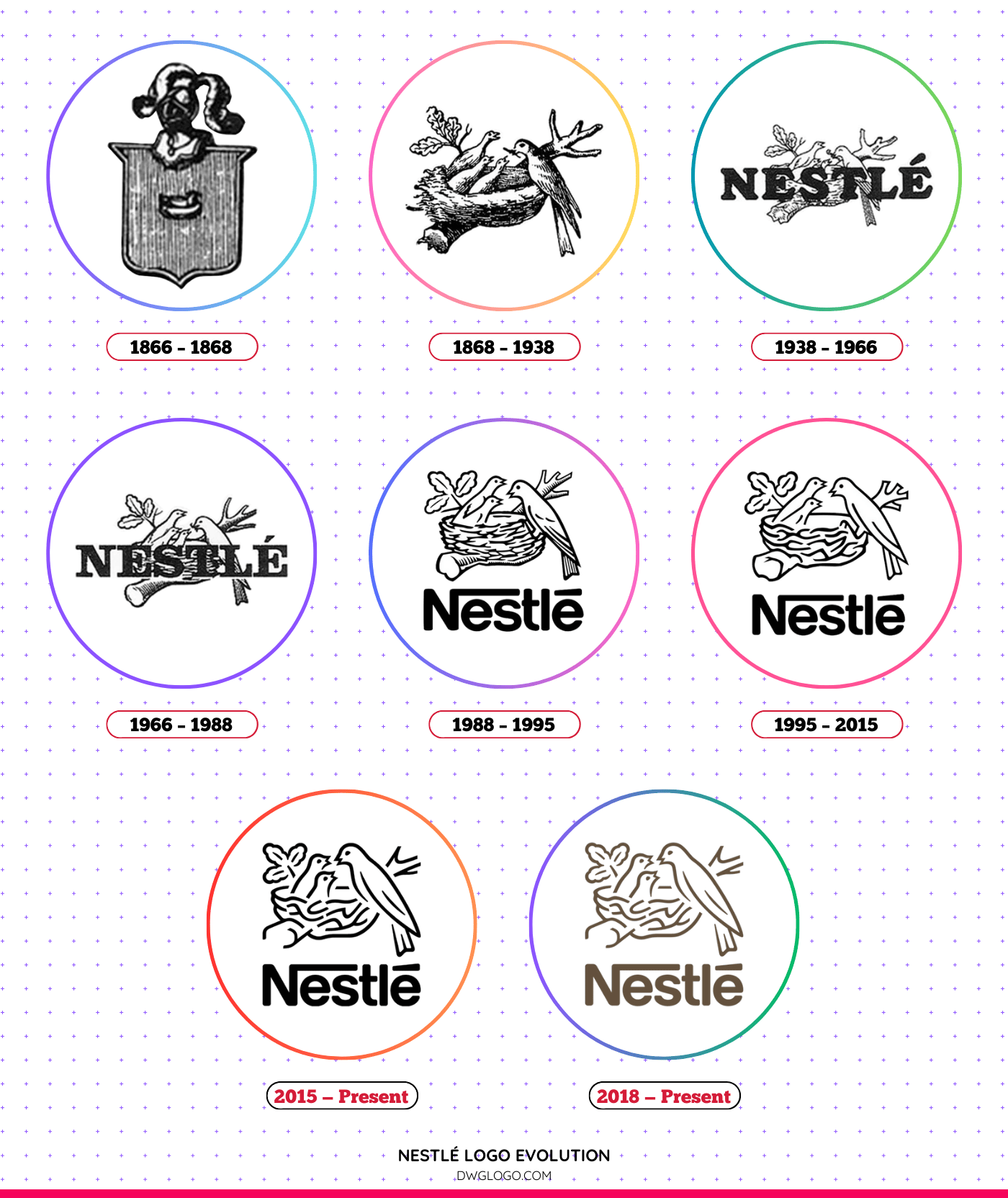
Nestlé Logo Evolution
1866 – 1868
The original Nestlé logo was inspired by the surname of its founder, Henri Nestlé, which means “little nest” in German. This early version featured a detailed nest illustration with a mother bird feeding her three chicks.
The design symbolized care and nourishment, aligning with the company’s vision of providing quality nutrition products.
1868 – 1938
In 1868, Nestlé refined its logo, keeping the nest concept but enhancing the illustration for better clarity. The design became more intricate, incorporating detailed strokes that improved its visual appeal.
This version remained for 70 years, solidifying Nestlé’s brand identity.
1938 – 1966
As Nestlé expanded, the company introduced a simplified logo in 1938. The intricate details of the nest were reduced, making the design more adaptable for different packaging and media. The typography also became more legible, marking a shift toward a more modern aesthetic.
1966 – 1988
During this period, Nestlé made another significant change. The bird illustrations were further simplified, with a bolder and cleaner nest design. Additionally, the brand name “Nestlé” was incorporated into the logo using a distinct, serif font.
This redesign reinforced the company’s corporate identity while maintaining its symbolic heritage.
1988 – 1995
In 1988, Nestlé transitioned to a more corporate look by reducing the number of chicks in the nest from three to two. This change represented a shift in branding strategy, focusing on modernizing its visual identity while keeping the nurturing symbolism intact.
1995 – 2015
To enhance brand consistency, Nestlé revamped its logo again in 1995. The nest and birds were redesigned with finer lines, and the typography was modernized. This version maintained the brand’s essence while making the logo more adaptable for digital platforms and global branding.
2015 – Present
Nestlé’s 2015 logo redesign brought a sleek and contemporary look. The lines of the nest and birds were refined for better clarity, and the font was streamlined. This minimalistic approach allowed for a more professional and sophisticated visual representation of the brand.
2018 – Present
In 2018, Nestlé introduced a minor tweak to its logo, optimizing it for digital platforms. The emphasis was on clean lines and enhanced visibility across various screen sizes. This version maintains the iconic nest and birds while ensuring a modern, scalable design.
Font and Color Palette
Font
Nestlé’s typography has evolved over the years, with a preference for clean, serif fonts. The modern logo features a refined, sans-serif typeface that ensures clarity and professionalism. The use of bold, well-spaced lettering enhances readability and brand recognition.
Color
Nestlé has predominantly used a monochrome color scheme, often appearing in black, white, or dark blue. The dark blue variation signifies trust, reliability, and global strength. This color choice aligns with the company’s values of quality and excellence.
FAQ’s
1. What does the Nestlé logo represent?
The Nestlé logo symbolizes care, nourishment, and family. The mother bird feeding her chicks in a nest represents the company’s commitment to providing quality nutrition.
2. Why did Nestlé change its logo multiple times?
Nestlé’s logo evolution reflects its growth, modernization, and adaptability to changing market trends and branding strategies.
3. What is the significance of reducing the number of chicks in the logo?
The reduction from three to two chicks in 1988 was a strategic move to simplify the logo while maintaining its essence. It also represents a shift in branding focus.
4. What font is used in the Nestlé logo?
The Nestlé logo uses a customized sans-serif typeface, designed for clarity and readability.
5. What Kind of Birds Are on the Nestlé Logo?
The Nestlé logo features a mother bird feeding her chicks in a nest, symbolizing care, nourishment, and family. But what kind of birds are they? While the logo does not specify an exact species, their design resembles common songbirds, particularly sparrows or finches, which are widely associated with nurturing and community.
Final thoughts,
Nestle’s logo evolution is a testament to the company’s commitment to innovation and brand consistency. From its humble beginnings in 1866 to its modern, sleek design today, the logo has remained a powerful symbol of quality and trust.
Over the years, the logo has been refined, but the fundamental theme of a bird feeding its young has remained. By adapting to changing trends and maintaining its core values, Nestlé continues to be a leading global brand, recognized and respected worldwide.
Reference: [1]